Wolfskin Tech Lab
A microsite for the new Jack Wolfskin collection.
UX/UI, Web design, Art direction
Challenge
Jack Wolfskin asked us to create an online experience for the new Tech Lab collection — a collection that differs from their usual outdoor wear and focusses on life in the city. The experience should explore this new concept and its innovative technology and provide easy access to the full product range.
Approach
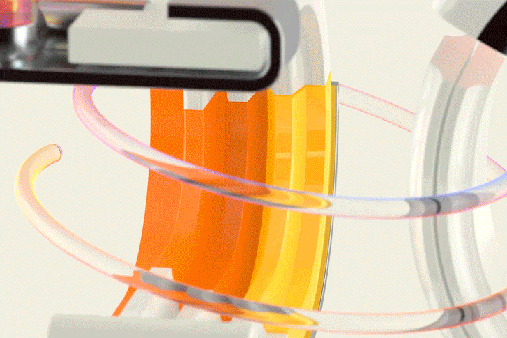
To highlight Tech Lab’s innovative approach, we created a standalone microsite, detached from their main online store. A combination of impactful images, video snippets, and animations inside a full-screen format allows the user to dive deep into the world of Tech Lab.
Client
Jack Wolfskin
Agency
Machinas, Barcelona
Role
Lead designer
(Concept, art direction and UX/UI)
Date
August 2016
Deliverables
Microsite, newsletters and web banners
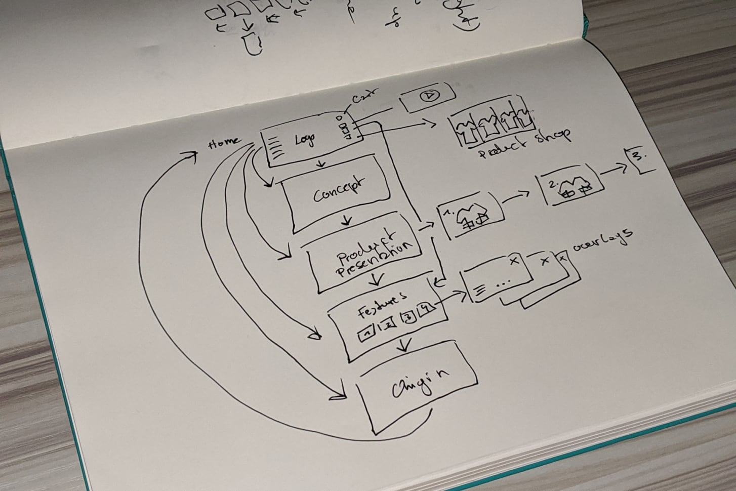
Concept and structure.
We created a flexible flow where the user could decide whether he wants to immerse himself and get inspired or jump directly to a specific section like features or product range
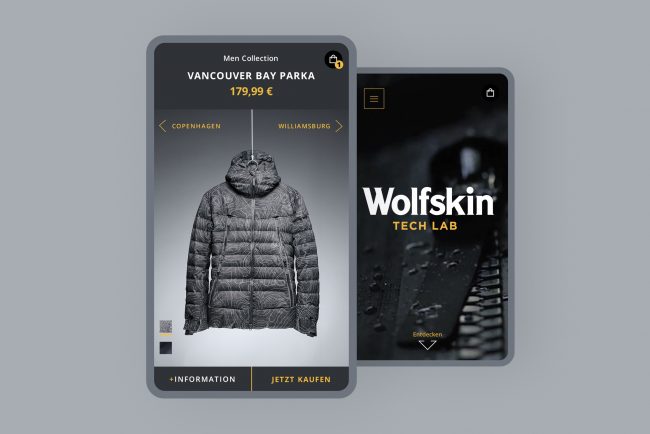
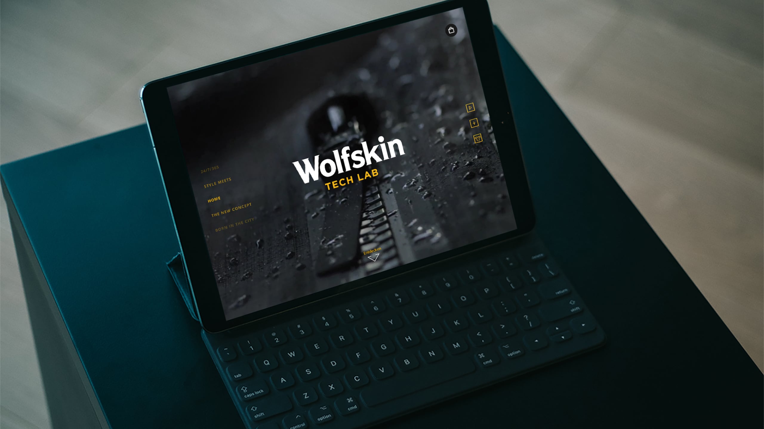
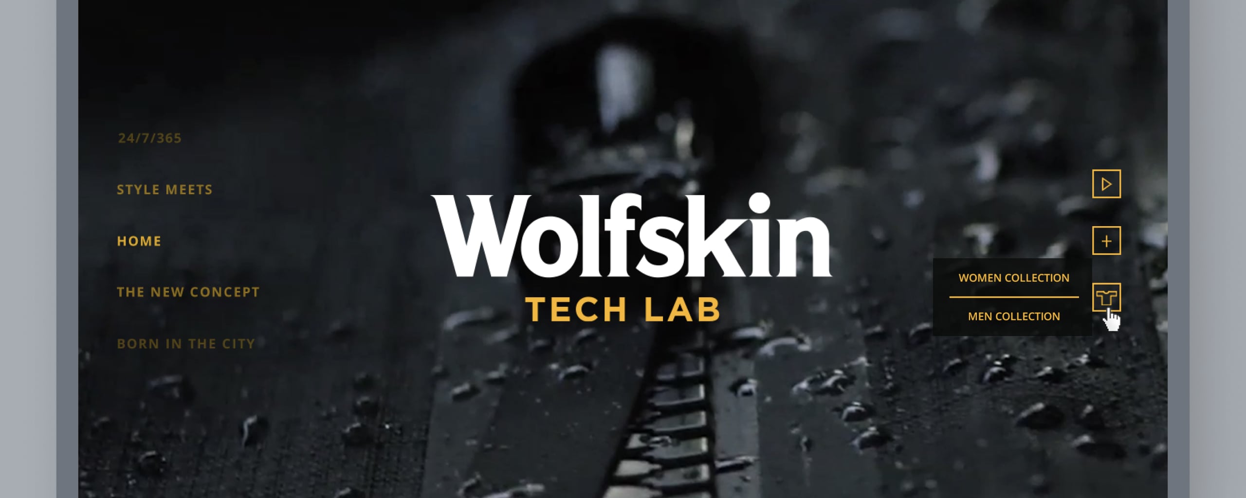
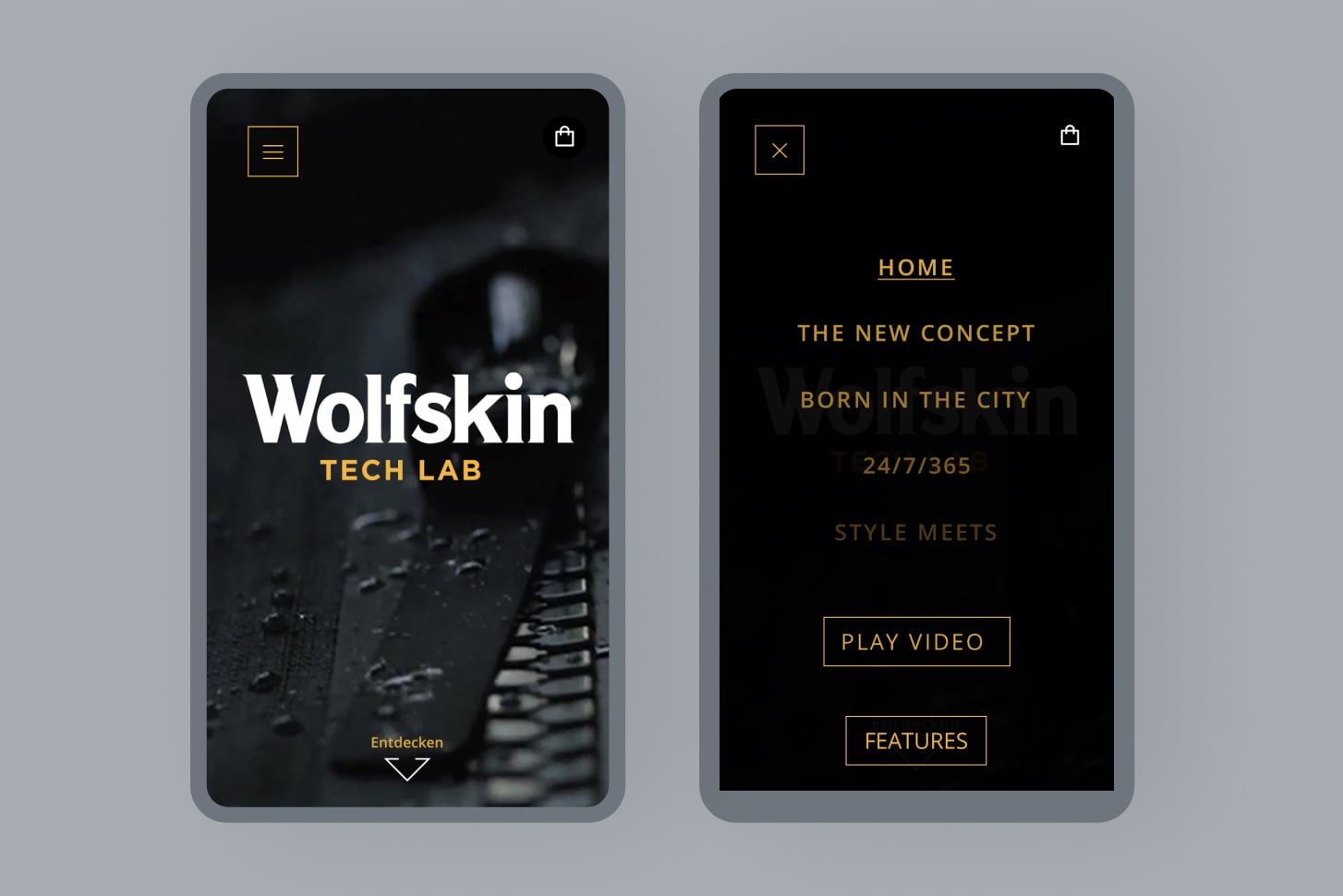
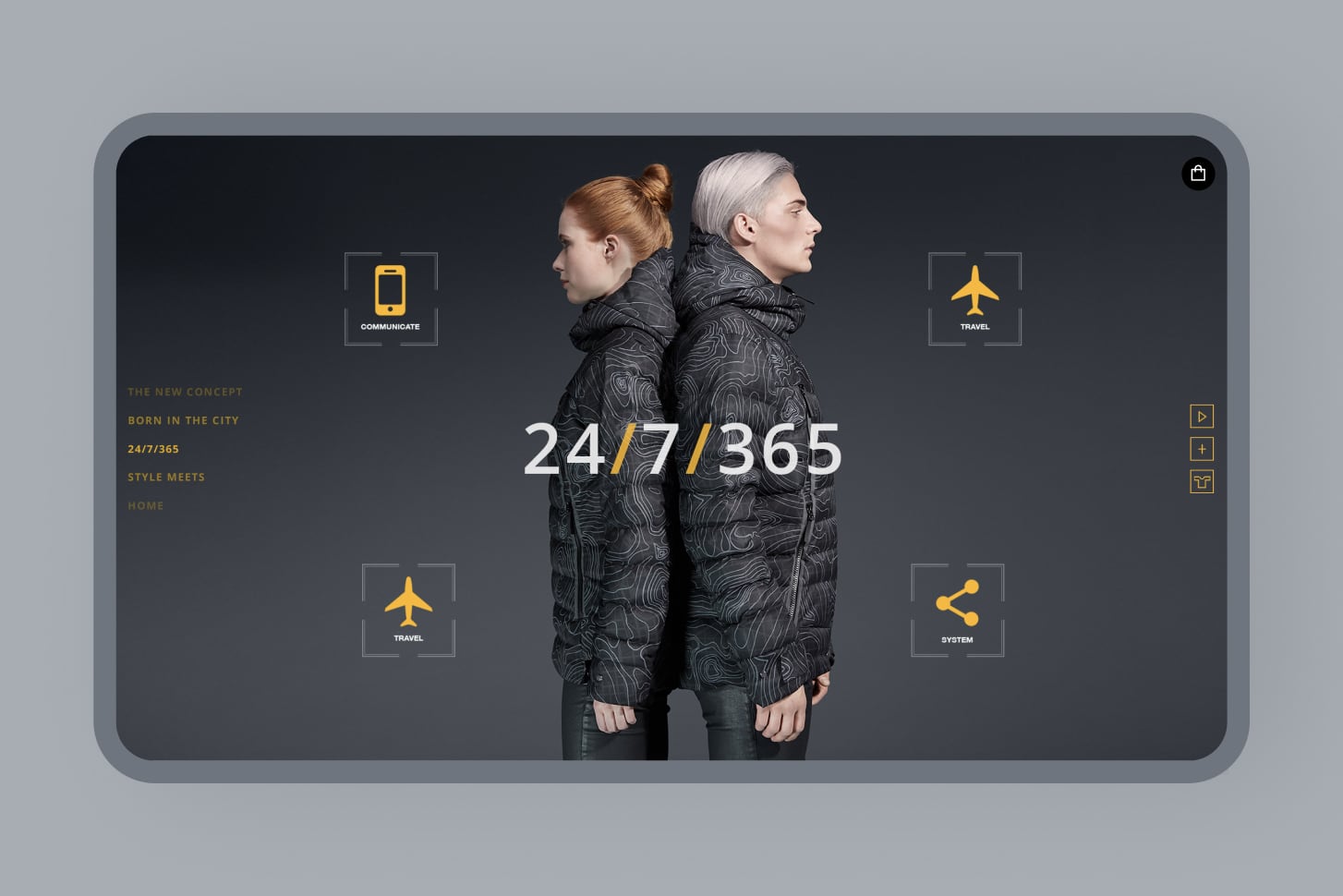
Home
Video immersion.
A clean and simple start page features the collection’s brand film in the background to attract attention and create curiosity.
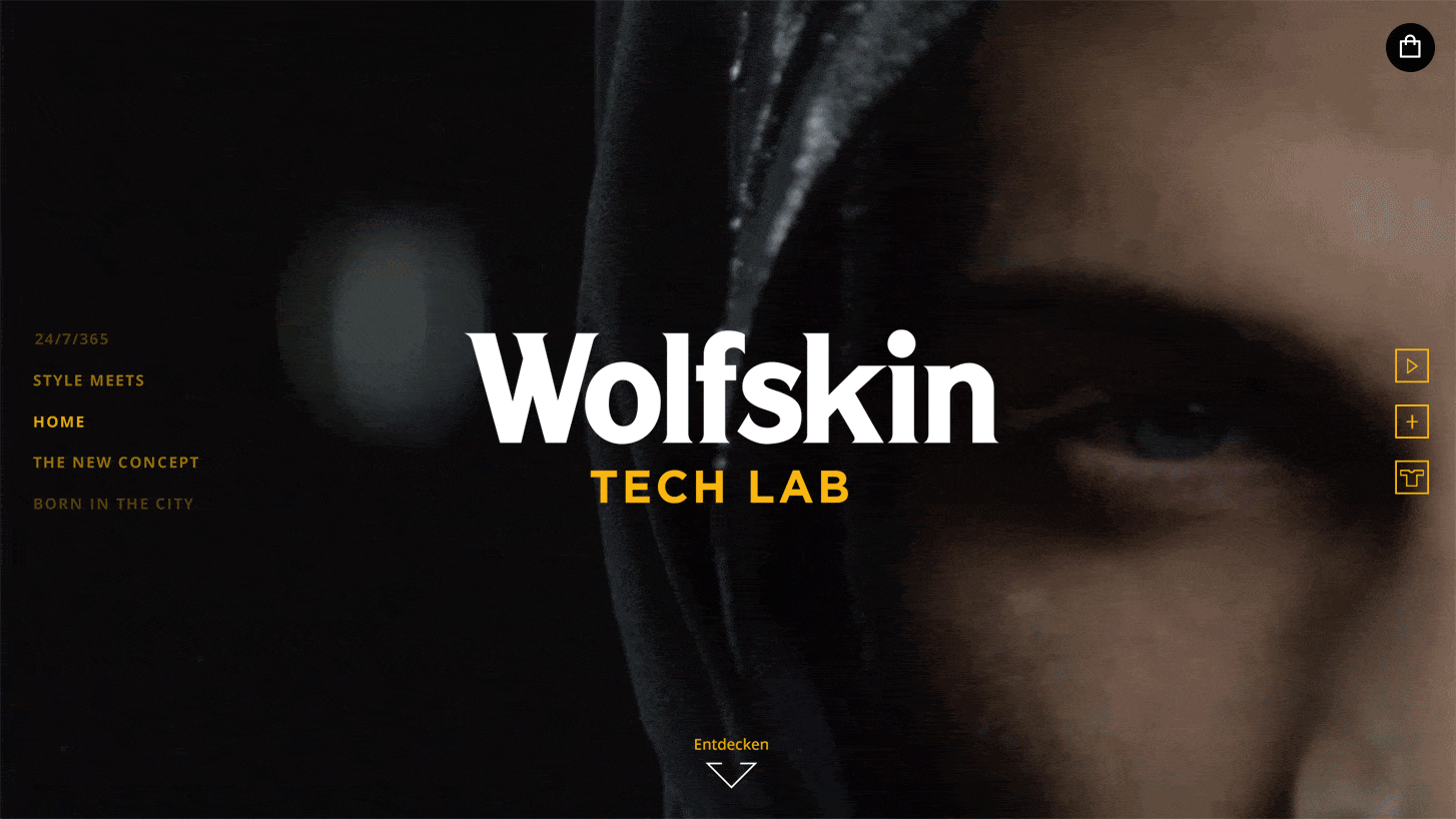
Navigation
Inspiration vs. direct access.
Vertical scrolling or the left side navigation explores the more conceptual and inspirational pages. The icons on the right take the user straight to more technical pages like a video page, a features overview, and a product range.
The shopping cart is always visible in the top right corner.
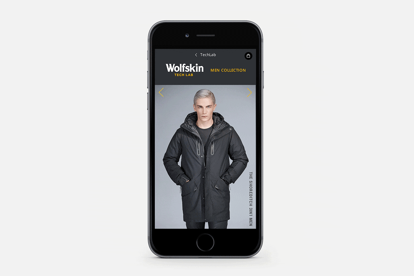
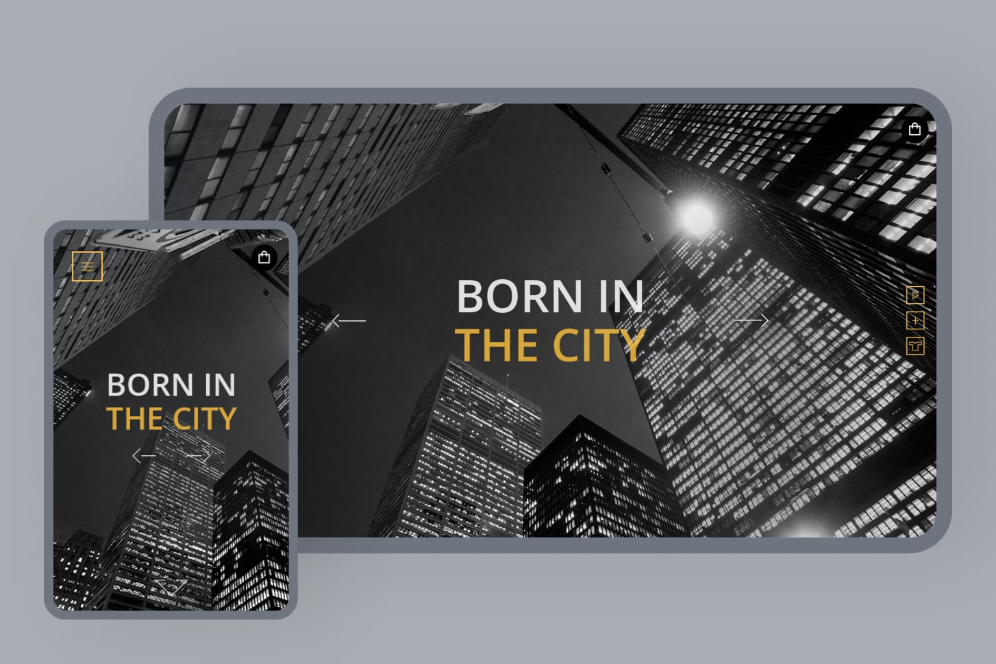
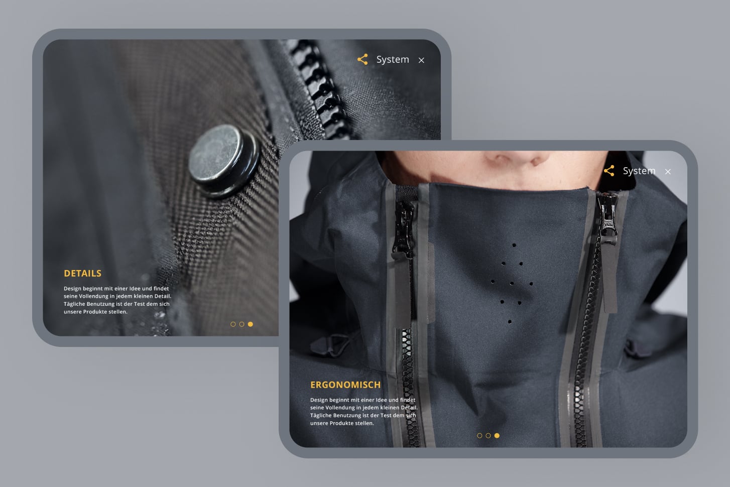
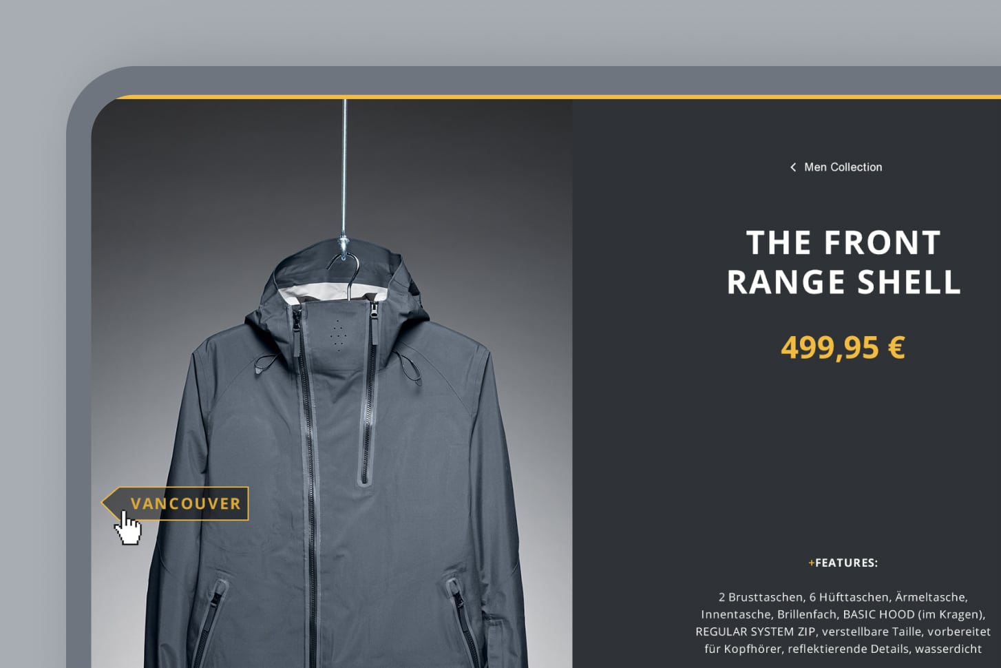
Deep dives
Horizontal scroll and modals.
On some pages, the user can encounter a horizontal scroll or overlays for more in-depth information.
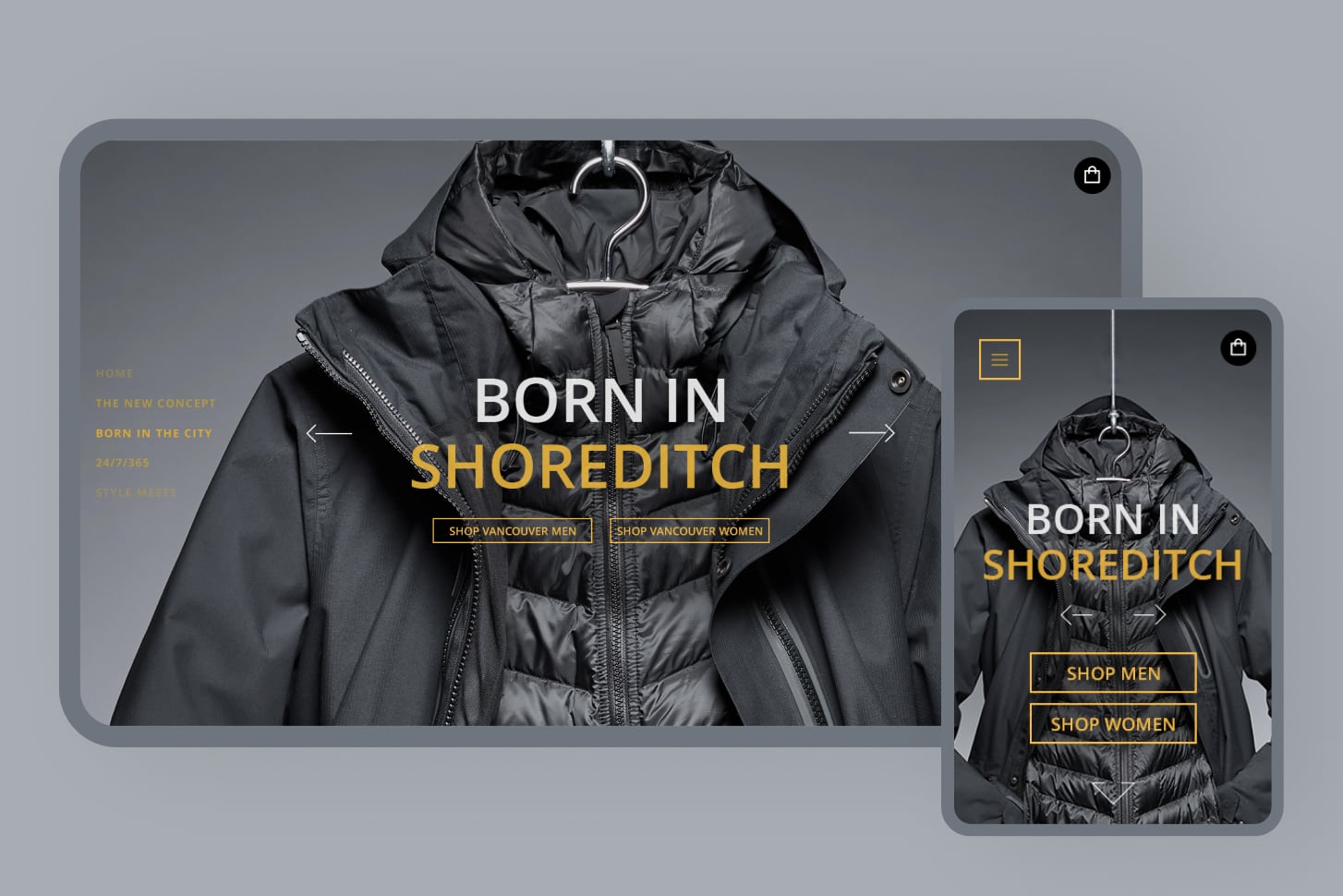
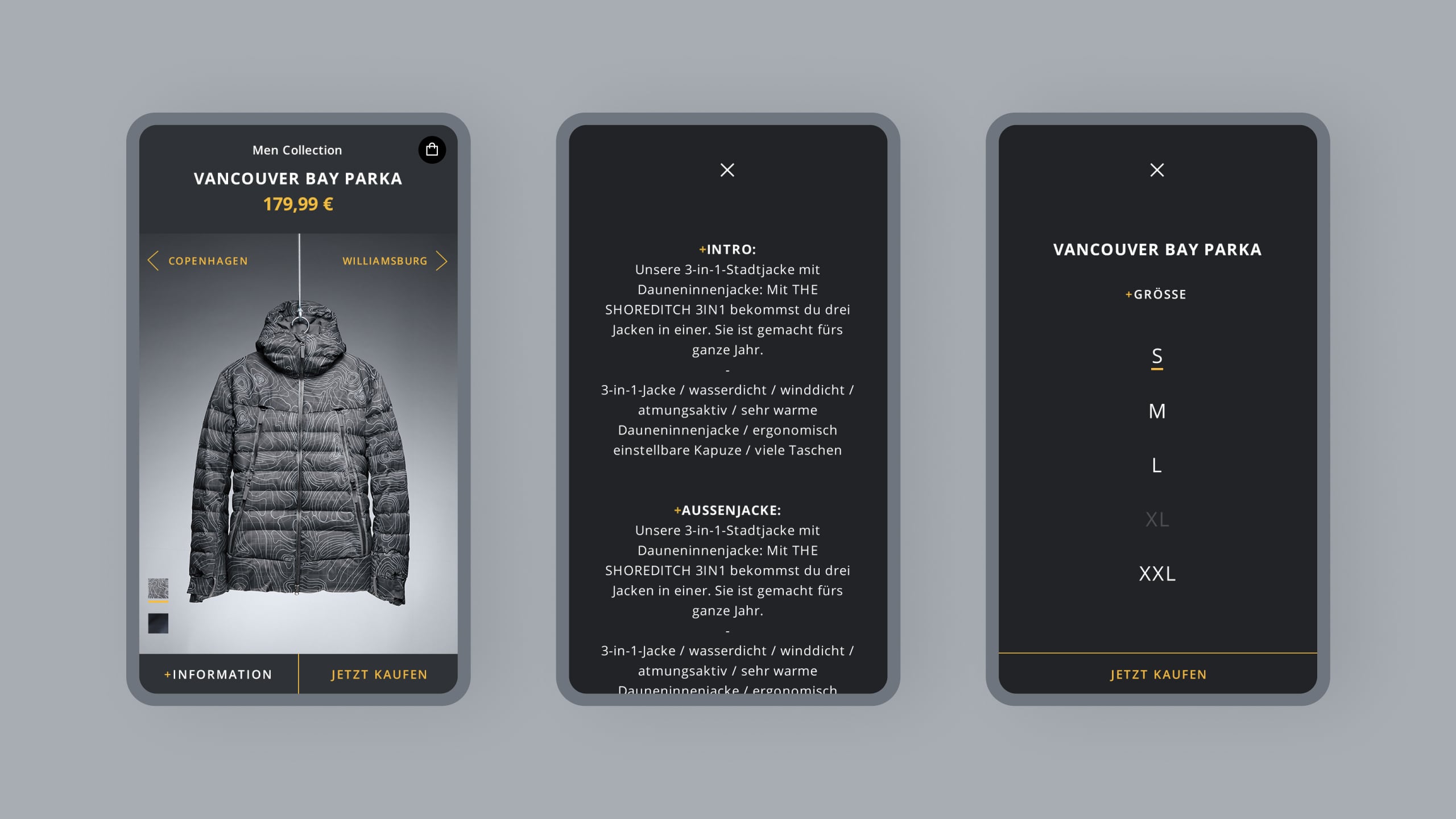
Purchase.
Being able to select and add a product to the shopping card directly within the experience was an essential requirement of the user flow.
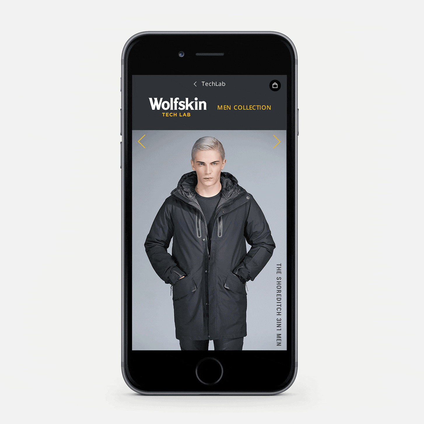
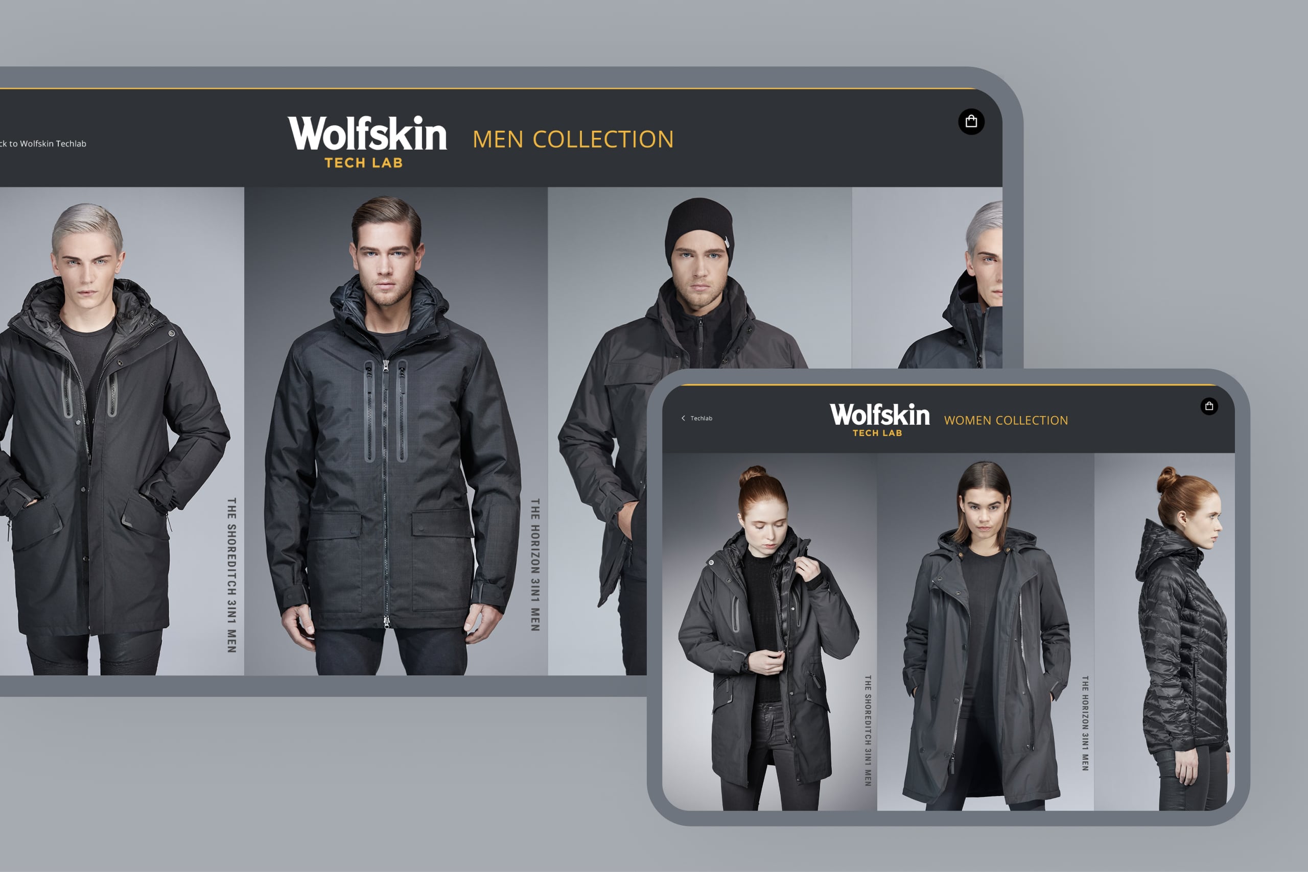
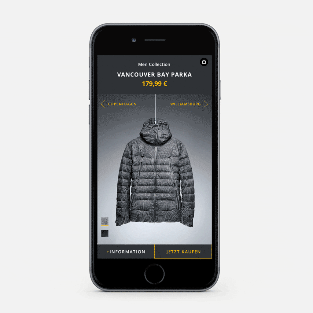
Product range
A slider to explore.
We opted for a slider to showcase the product range because
- we don’t have more than nine products per gender
- a slider allows us to stay within the full-screen format
- it’s easier to compare the products side by side
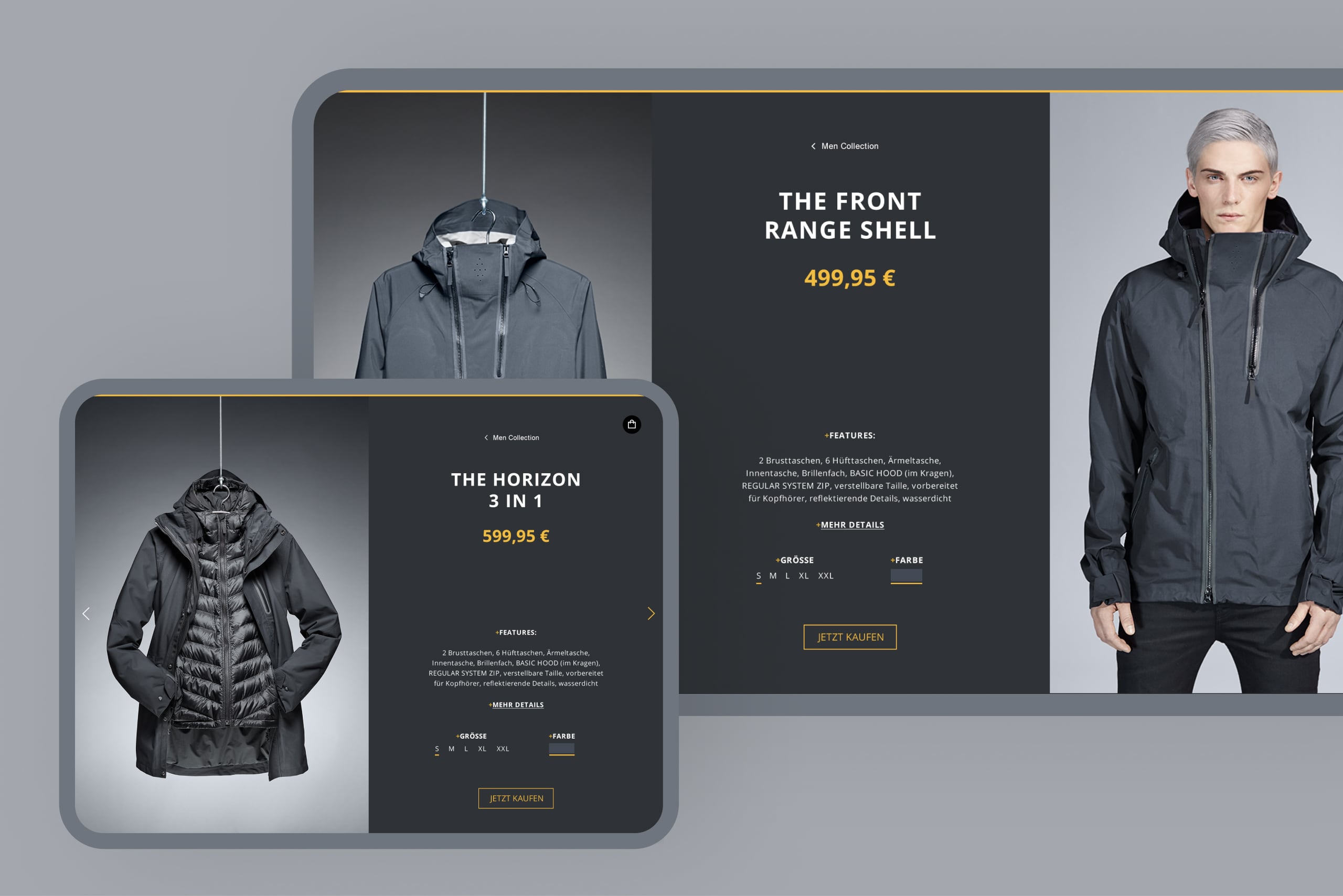
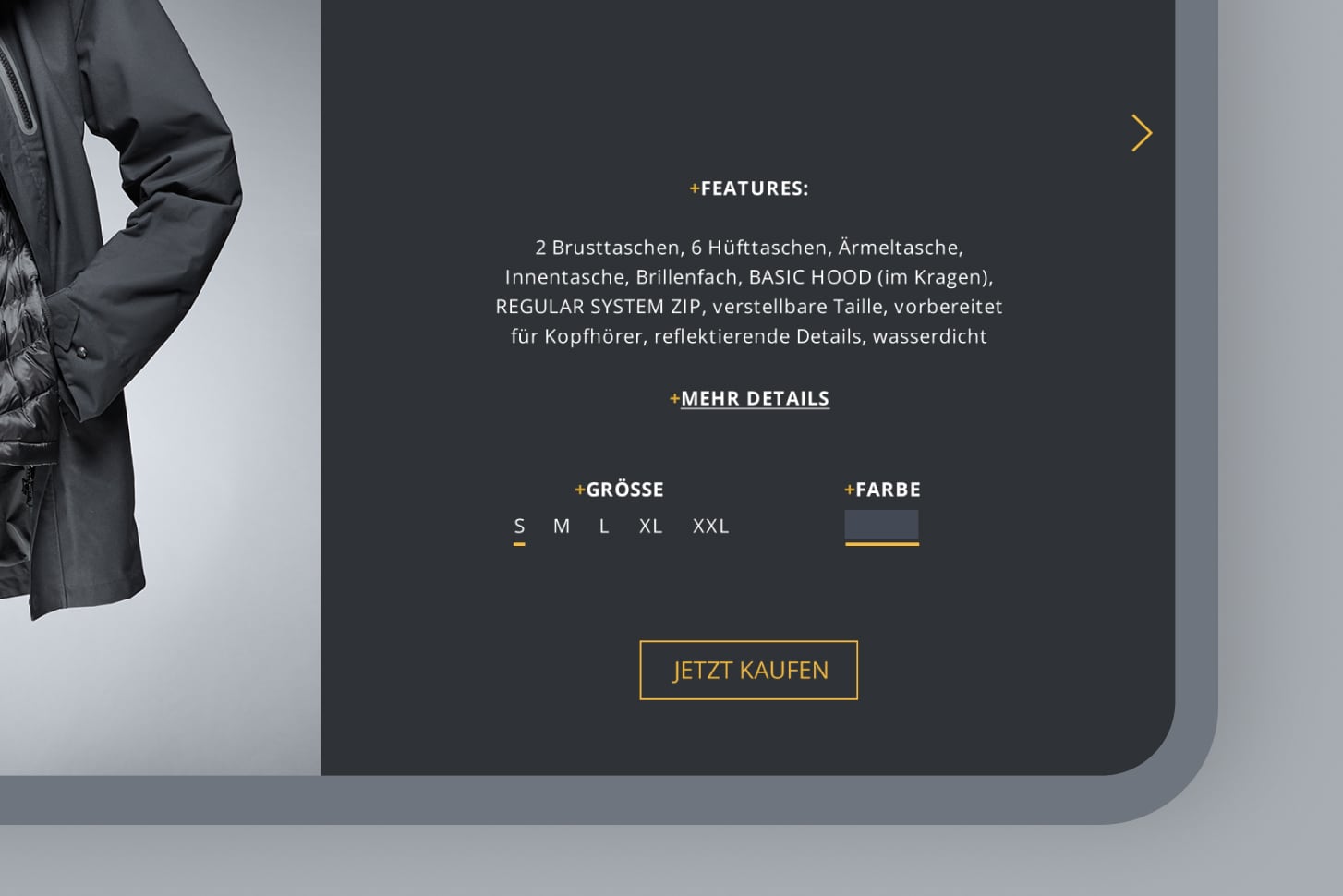
Product details
Selection and purchase.
The user can select the color and size and add the item to the shopping basket.
Technical restrictions prevented us from implementing a checkout process in this microsite — when clicking on the shopping basket, the user is kindly asked to complete the checkout on the main website.
See also