Away
An app for planning travel itineraries.
UX/UI, App design
Context
AWAY is the result of a personal project I developed during a two month UX design online course.
Challenge
Nowadays, most people organize their travel itineraries themselves, but this requires a lot of planning. There are endless ways to gather information, but it’s nearly impossible to find that perfect route. My goal was to create a tool to organize travel itineraries more efficiently.
Approach
An app with an extensive database of destinations and routes, where the user can filter by interests and activities to find almost bespoke itineraries. The app would serve as a community platform where users can upload their itineraries, evaluate, and categorize them.
Course title
UX Design
Duration
100 hours
Academy
Springboard, San Francisco
Mentor
Luca Longo
Date
September 2017
Tools
Sketch, Invision, Google Forms, Optimal Workshop
Key features.
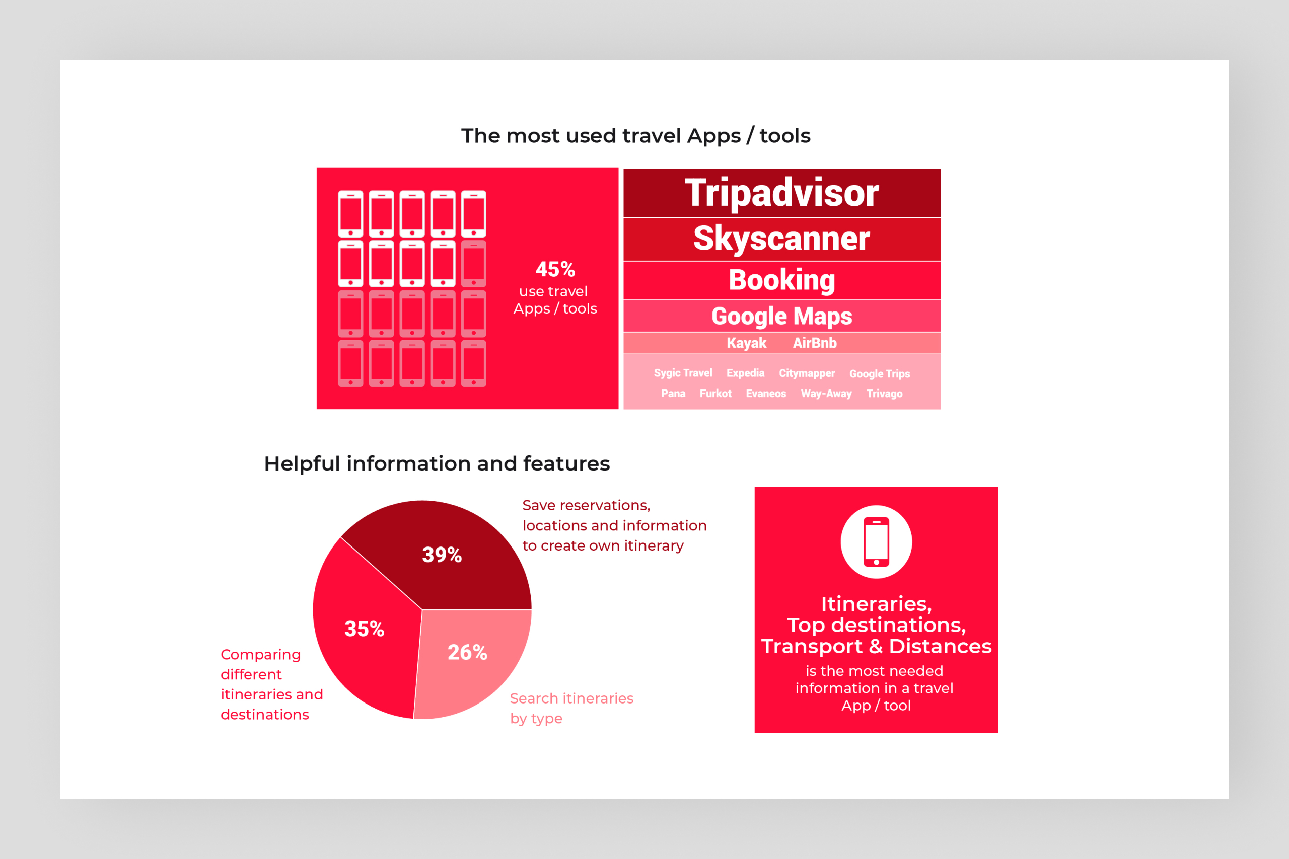
Research, surveys, interviews, and personal experience helped me define the App’s most important features that the user would need for planning a trip.
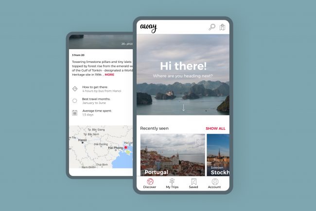
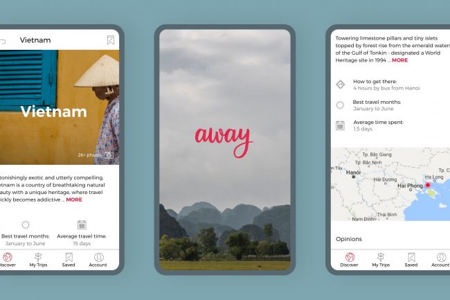
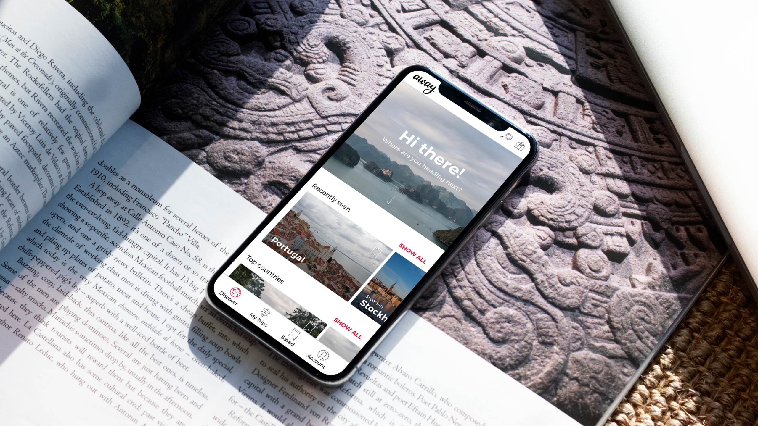
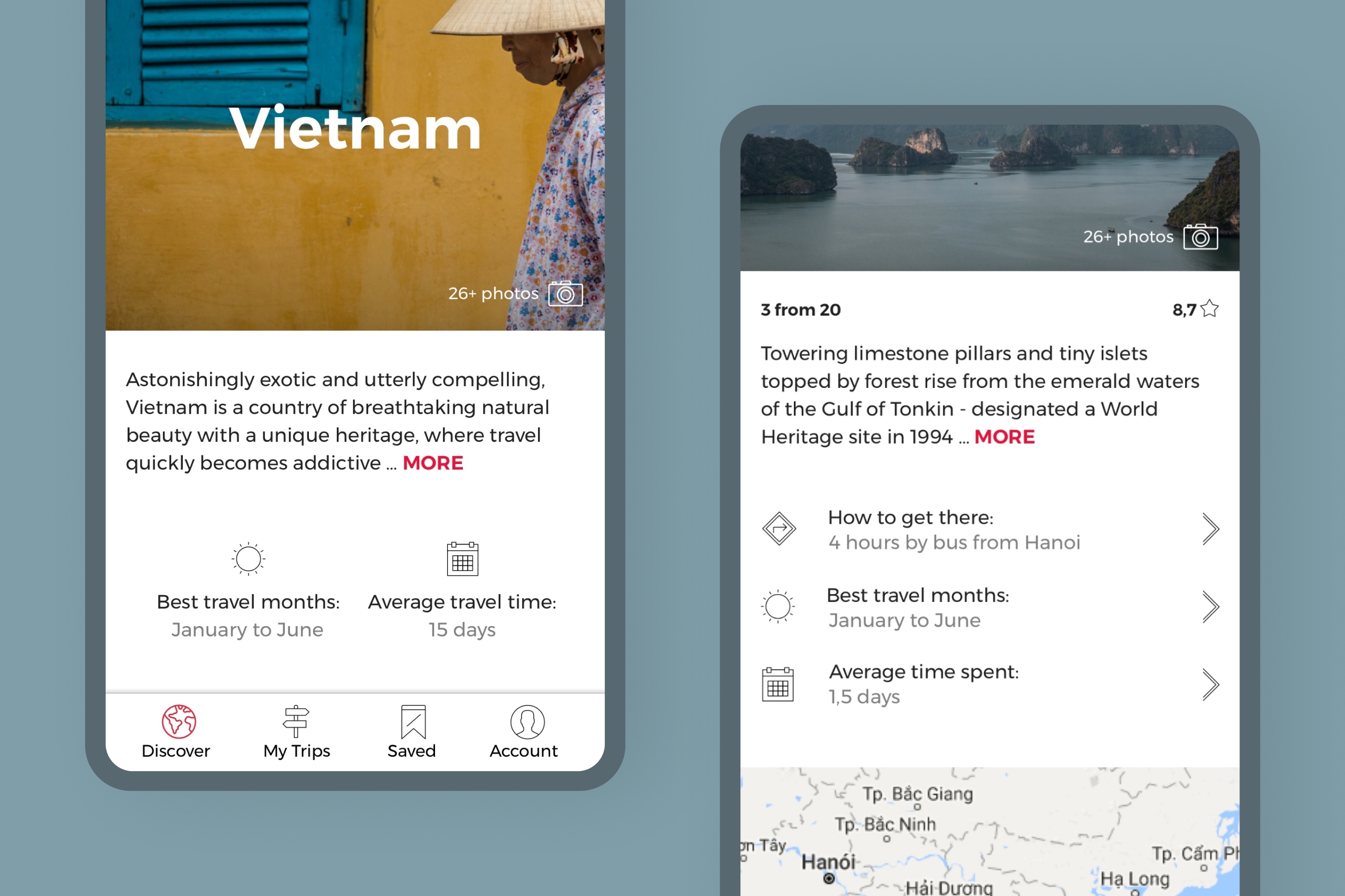
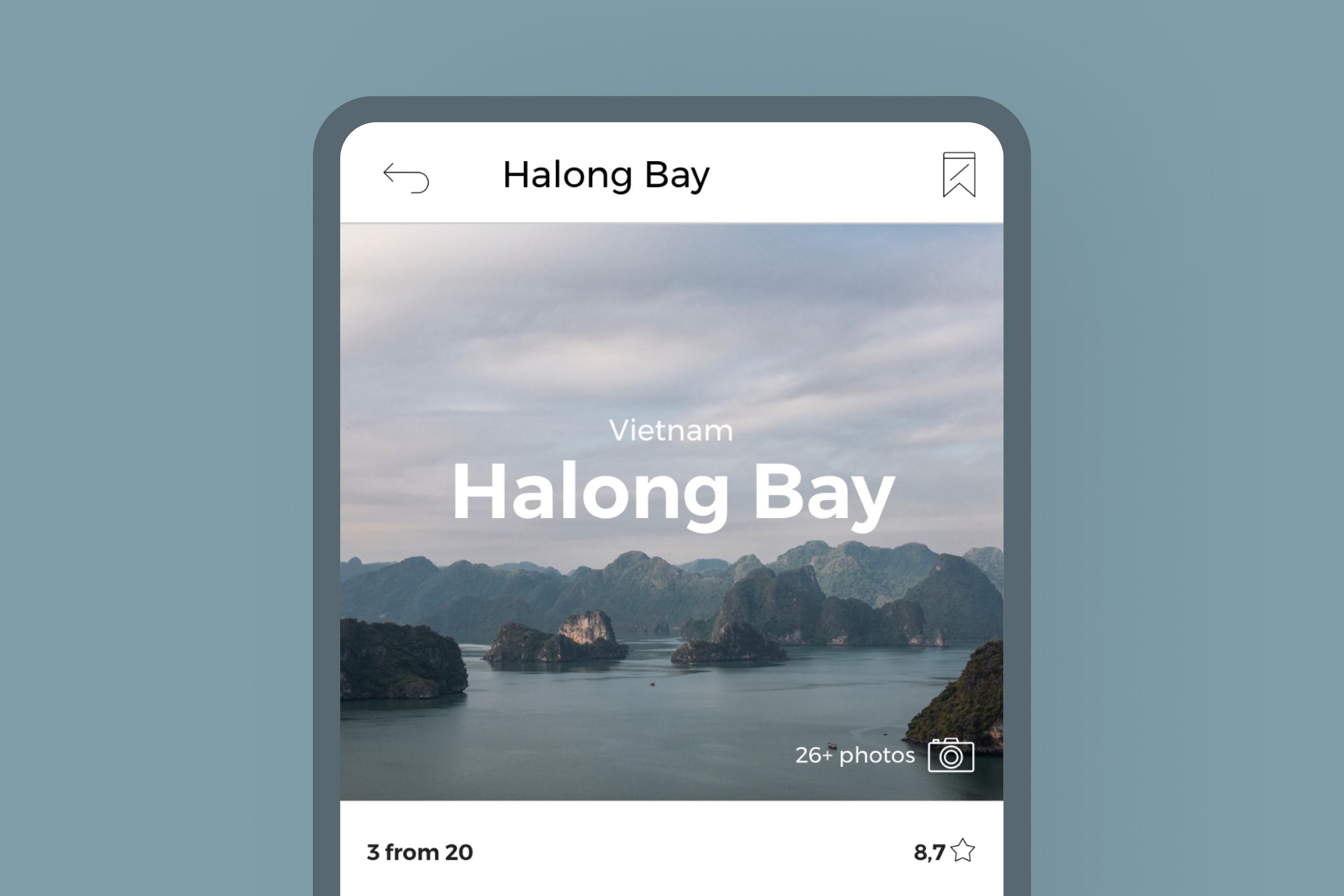
Concise and relevant information.
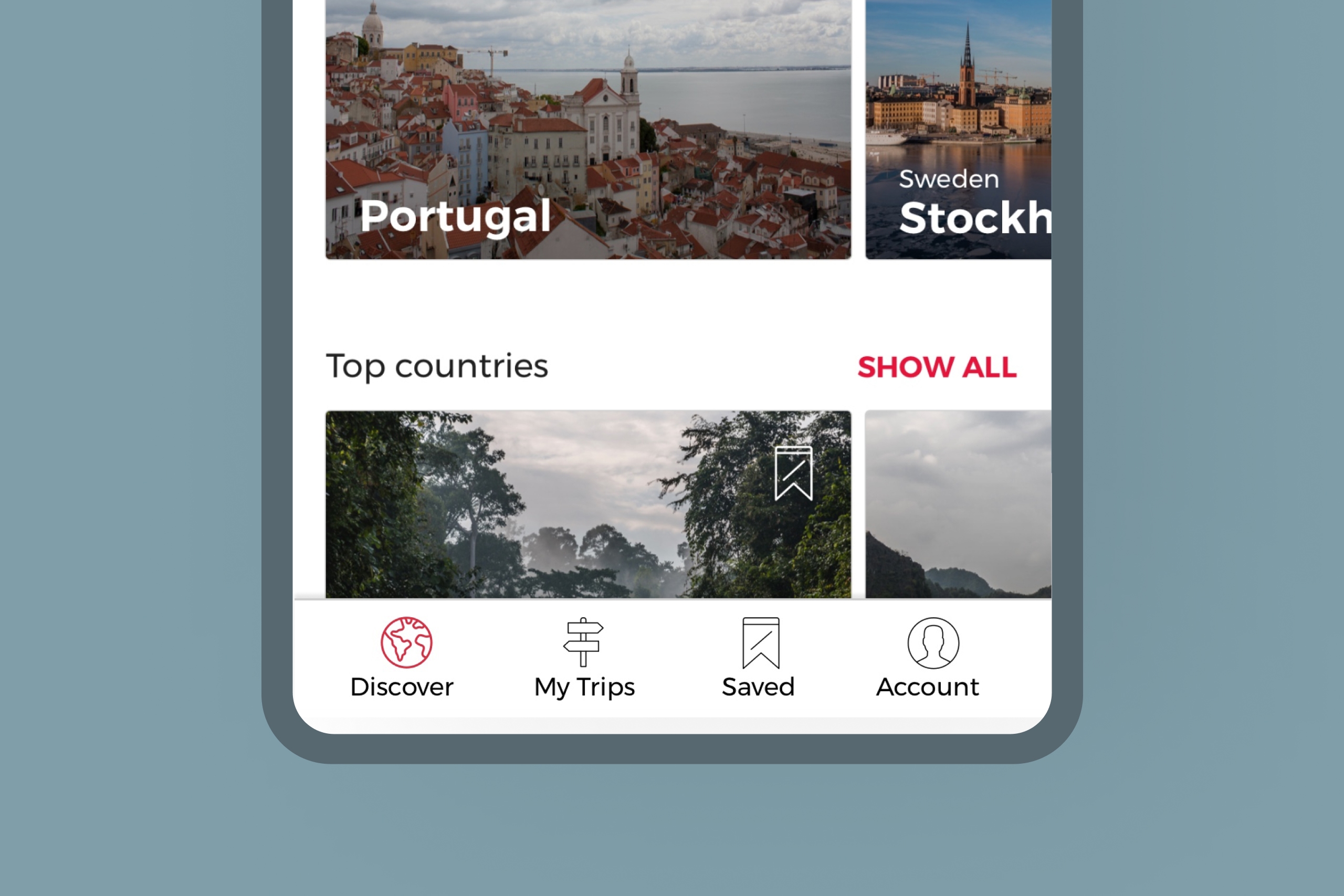
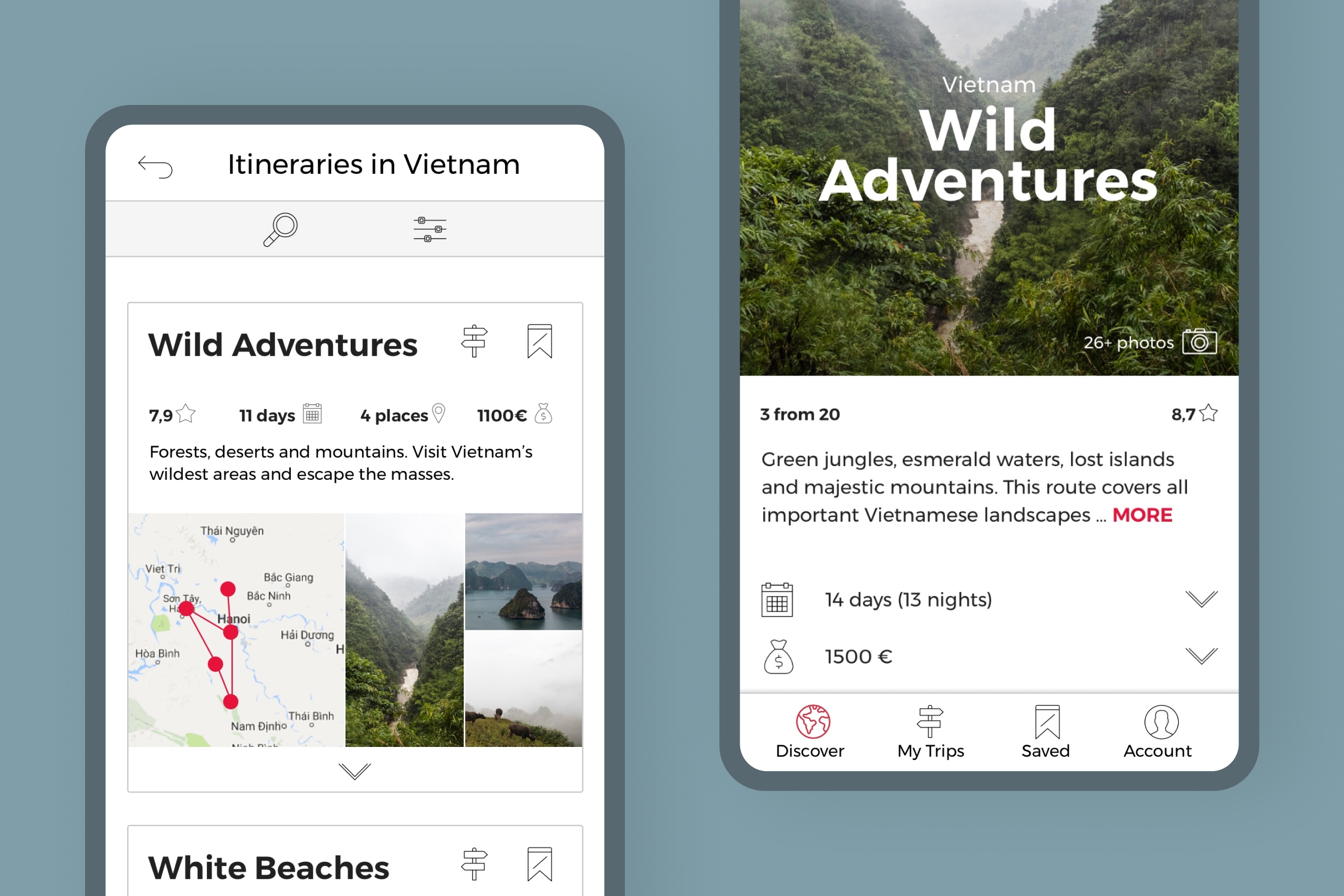
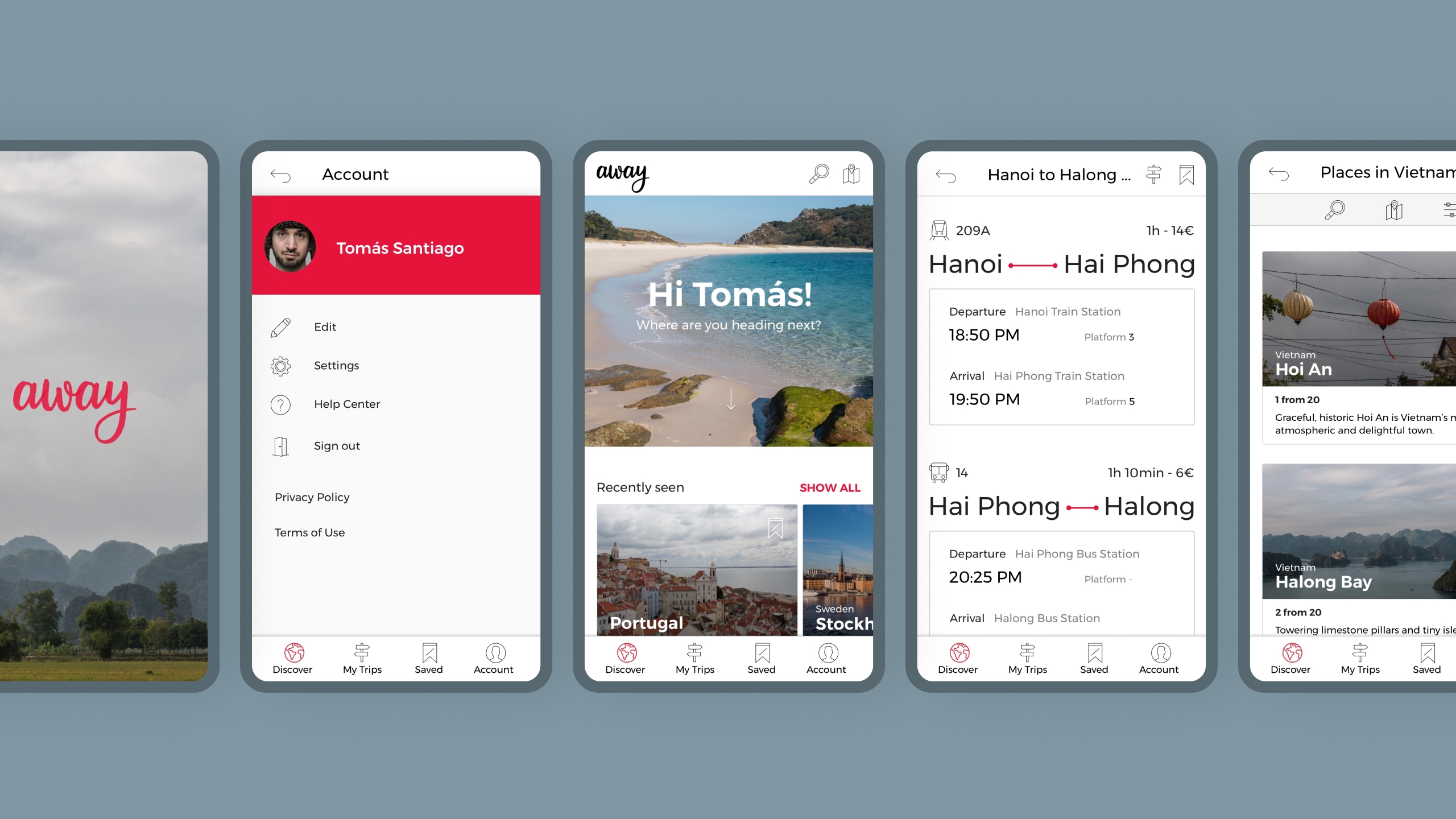
AWAY offers an overview of the most essential information to help the user decide which places are worth visiting. He can always dive deeper by browsing other user’s opinions.
Quick and direct access.
The main sections are always visible and can be easily reached through the bottom navigation.
Comparing itineraries.
The user can search, filter, and compare itineraries which have been created by other users — he can even use them as a template for starting a new one.
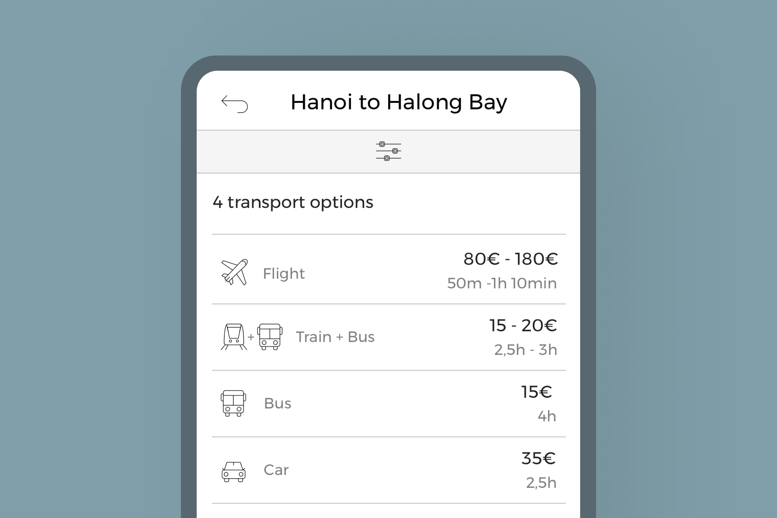
Distances and transport options.
The user can easily search for the quickest or cheapest option to get from one place to another.
Intuitive search function.
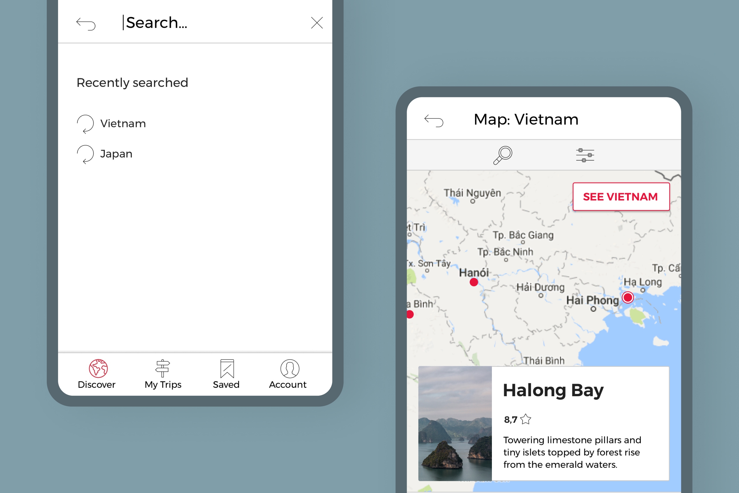
The user can quickly find what he is looking for through the search field or interactive maps.
Collect information.
All information can be saved and added to the user’s itinerary through icons.
UX design process.
The design process was characterized by a user-centered approach — based on well-founded assumptions, validations, and reviews.
Different techniques, like heuristic analysis, interviews, empathy maps, card sorting, prototyping, and usability tests were applied to guarantee a user-friendly experience.
Competitors
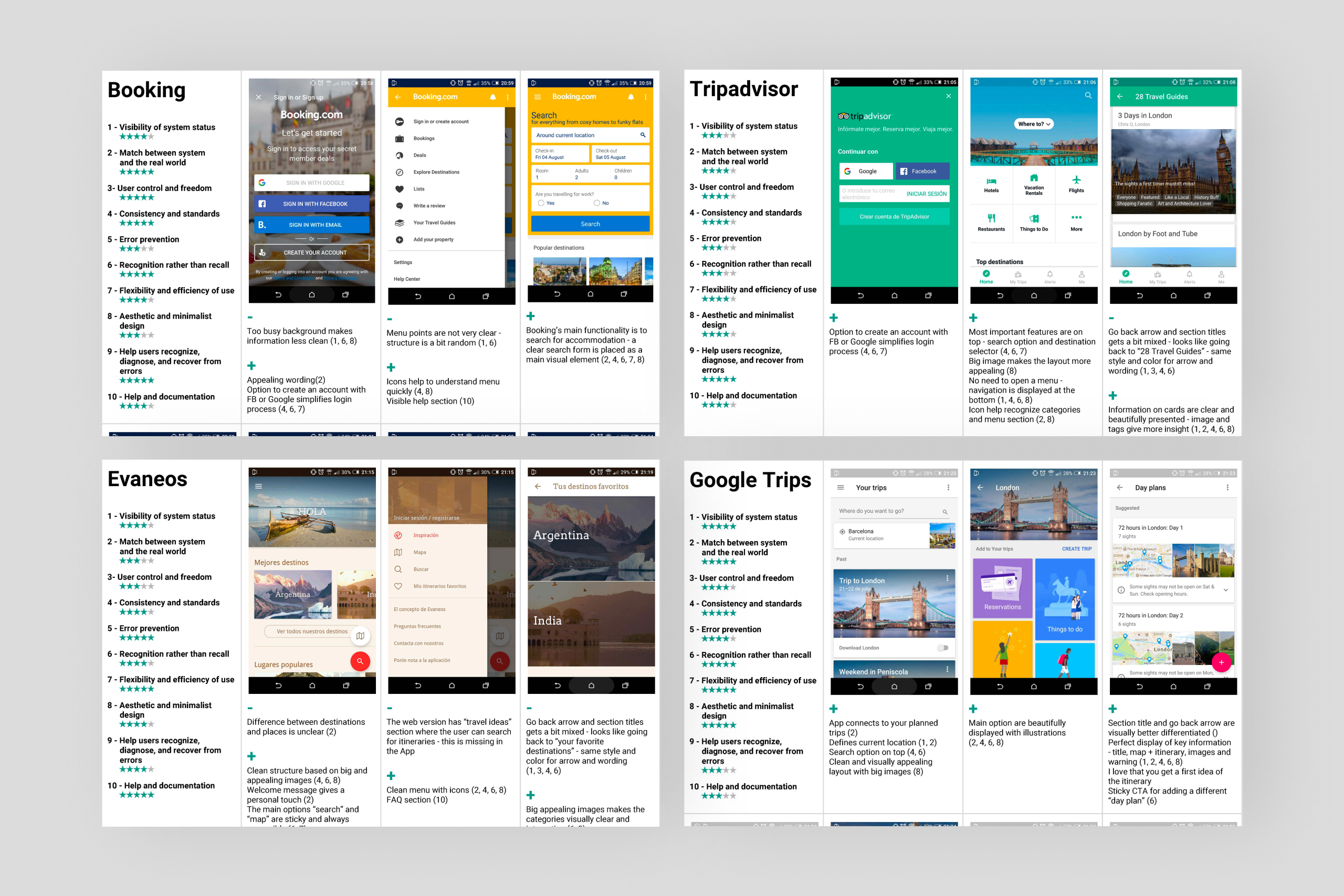
Heuristic analysis.
This helped me to determine what features already exist in other travel Apps — which of them work, which don’t work and why not, what features are missing.
Results: Other travel apps don’t offer the option to compare and choose from multiple itineraries.
The user
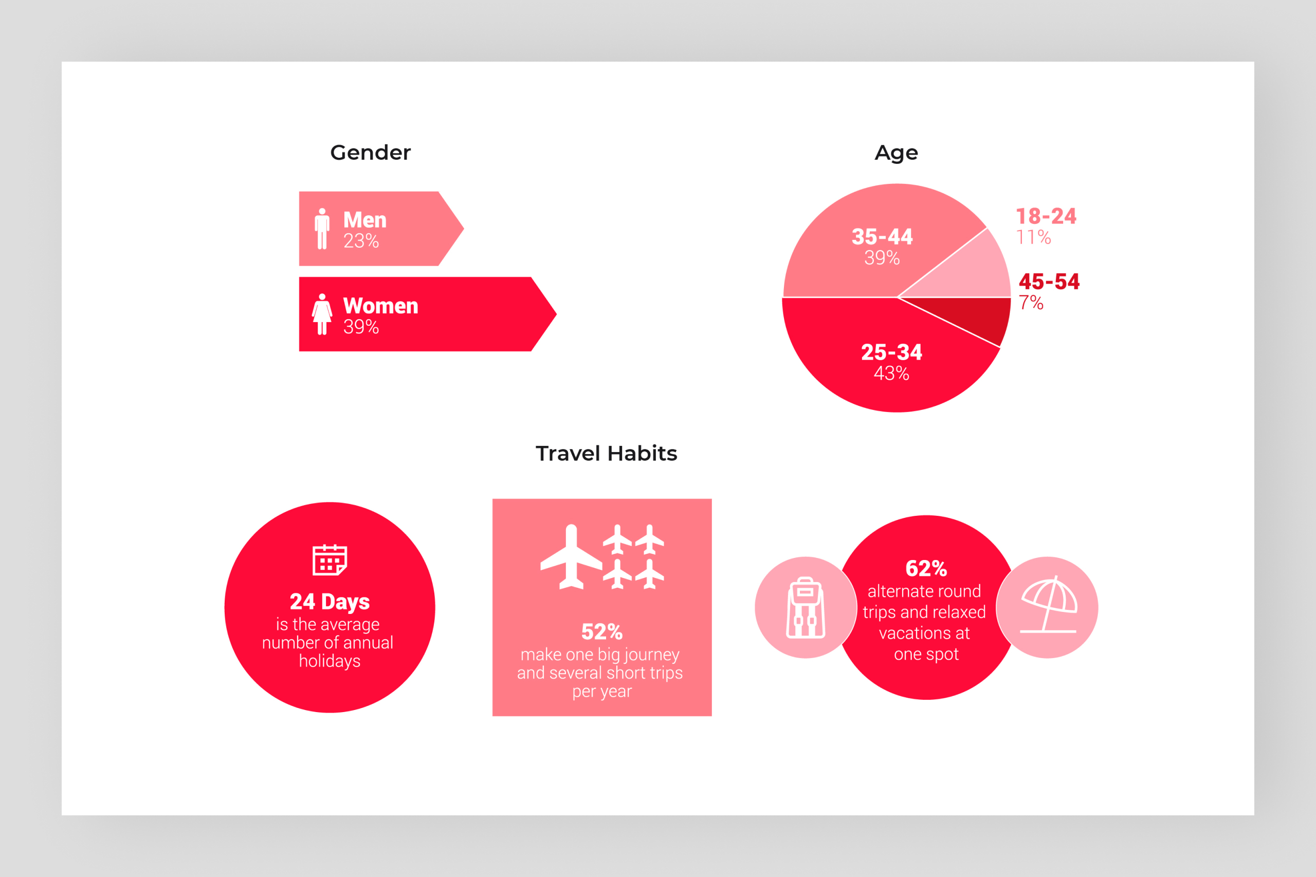
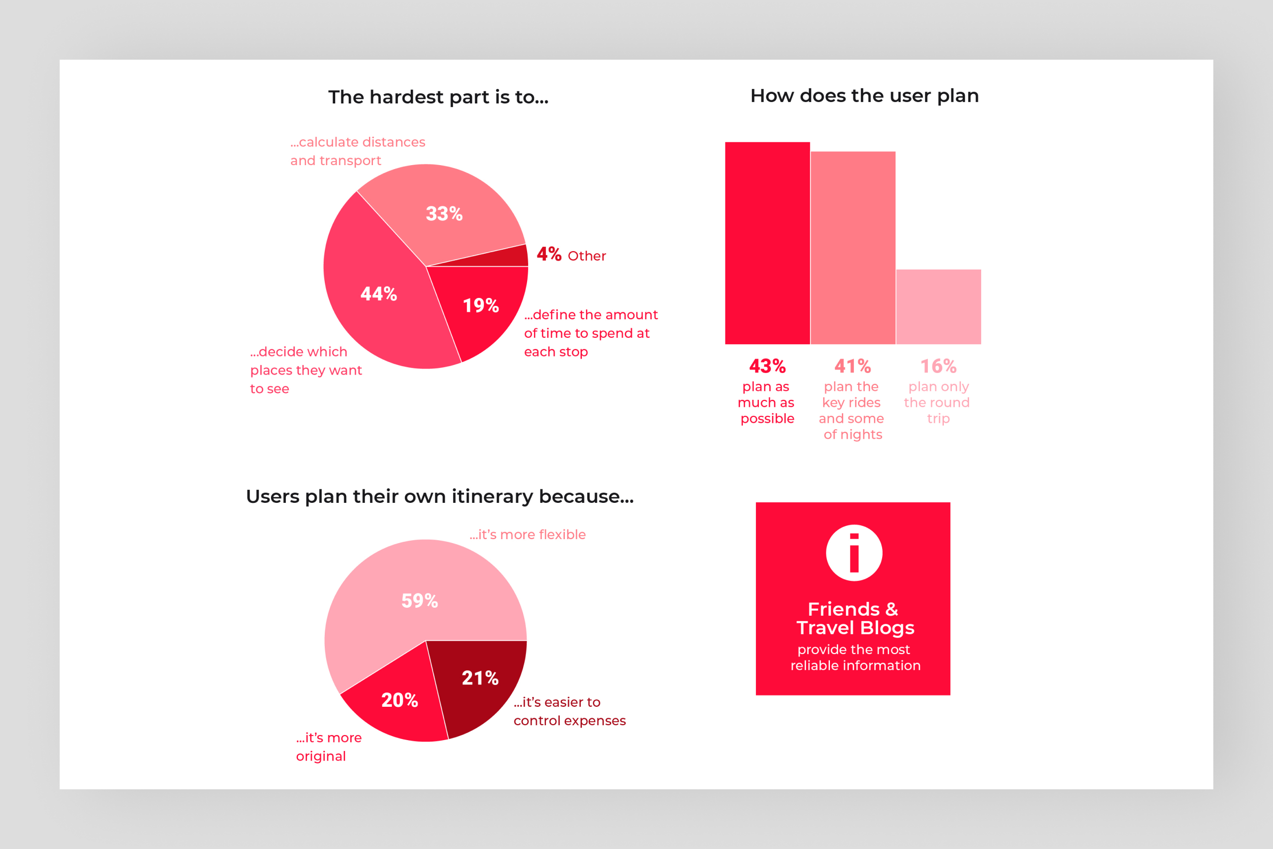
Research, interviews & personas.
I started by interviewing friends and colleagues for insights and qualitative information on the topic (and confirmation to my assumptions). These first inputs helped me to determine the survey questions, where I could access a broader number of people.
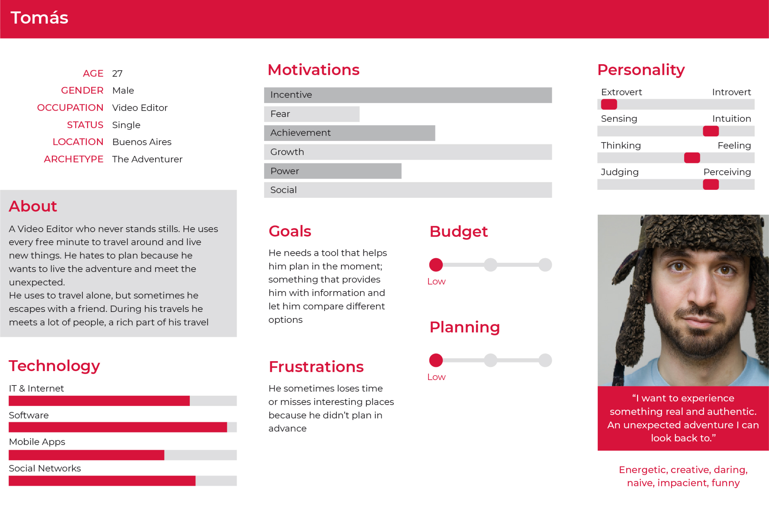
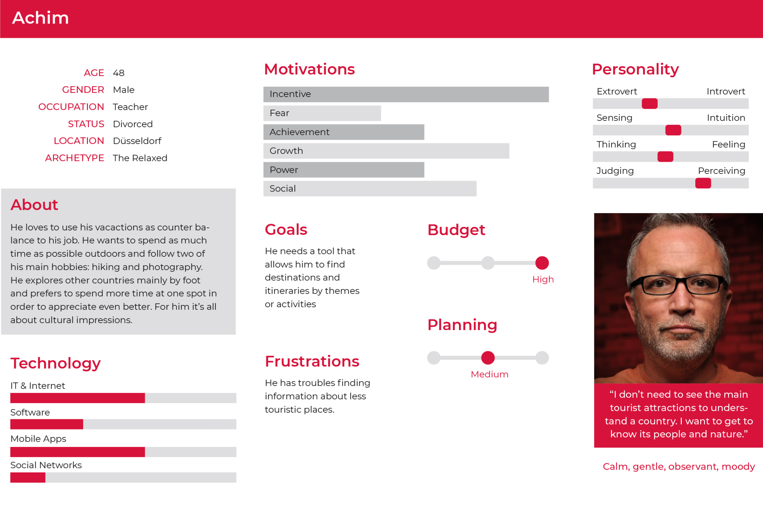
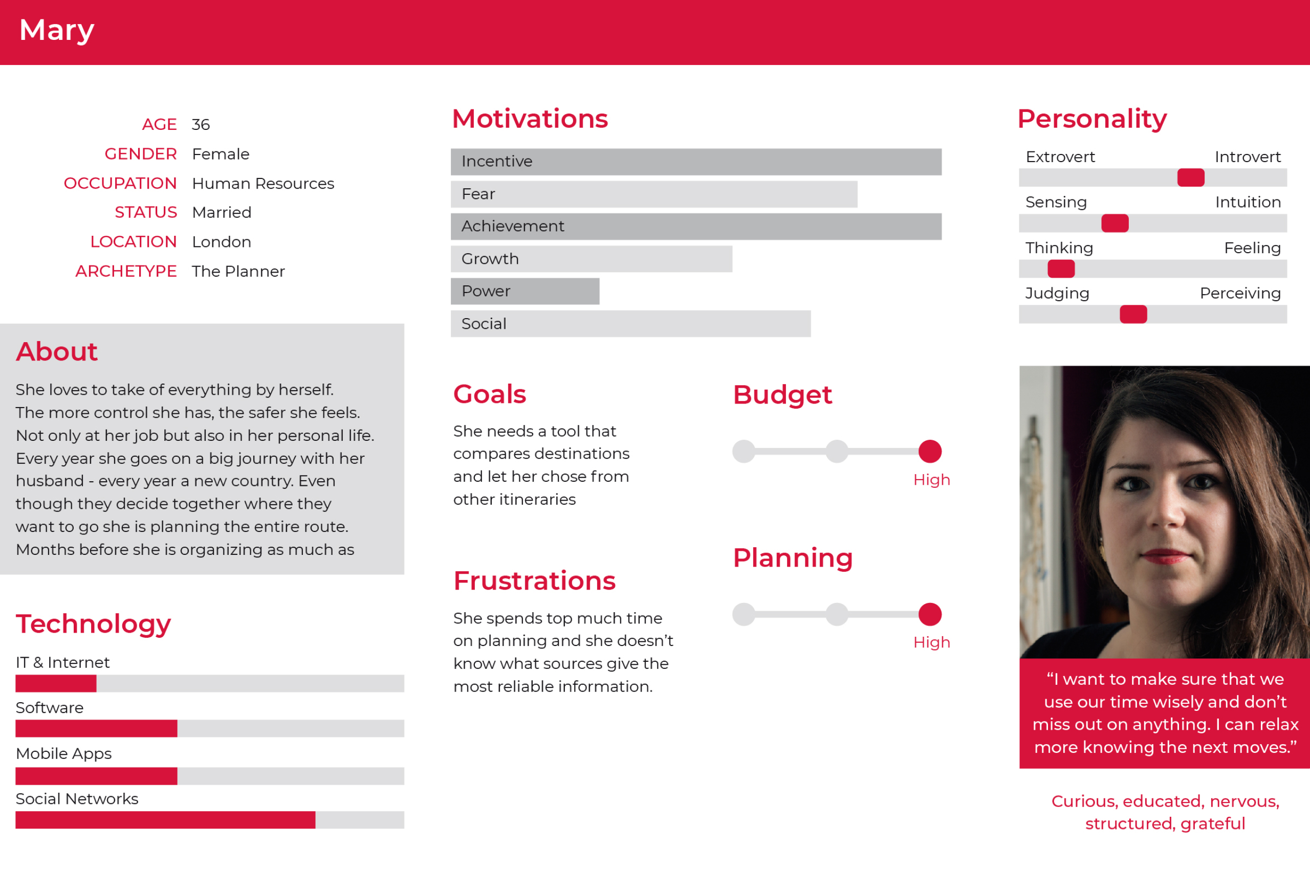
The outcomes helped me then to define the personas — each one with its own goal when using the app.
Results: The fact is that people spend a huge amount of time planning their itineraries — and the product I had to design should help them reduce this time.
Structure
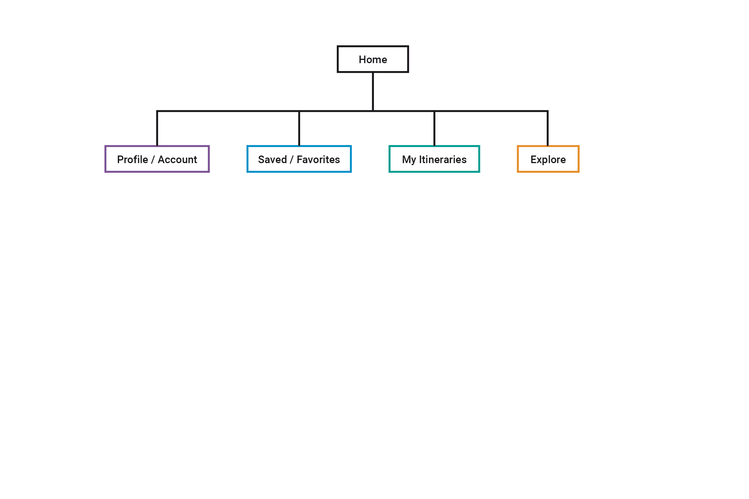
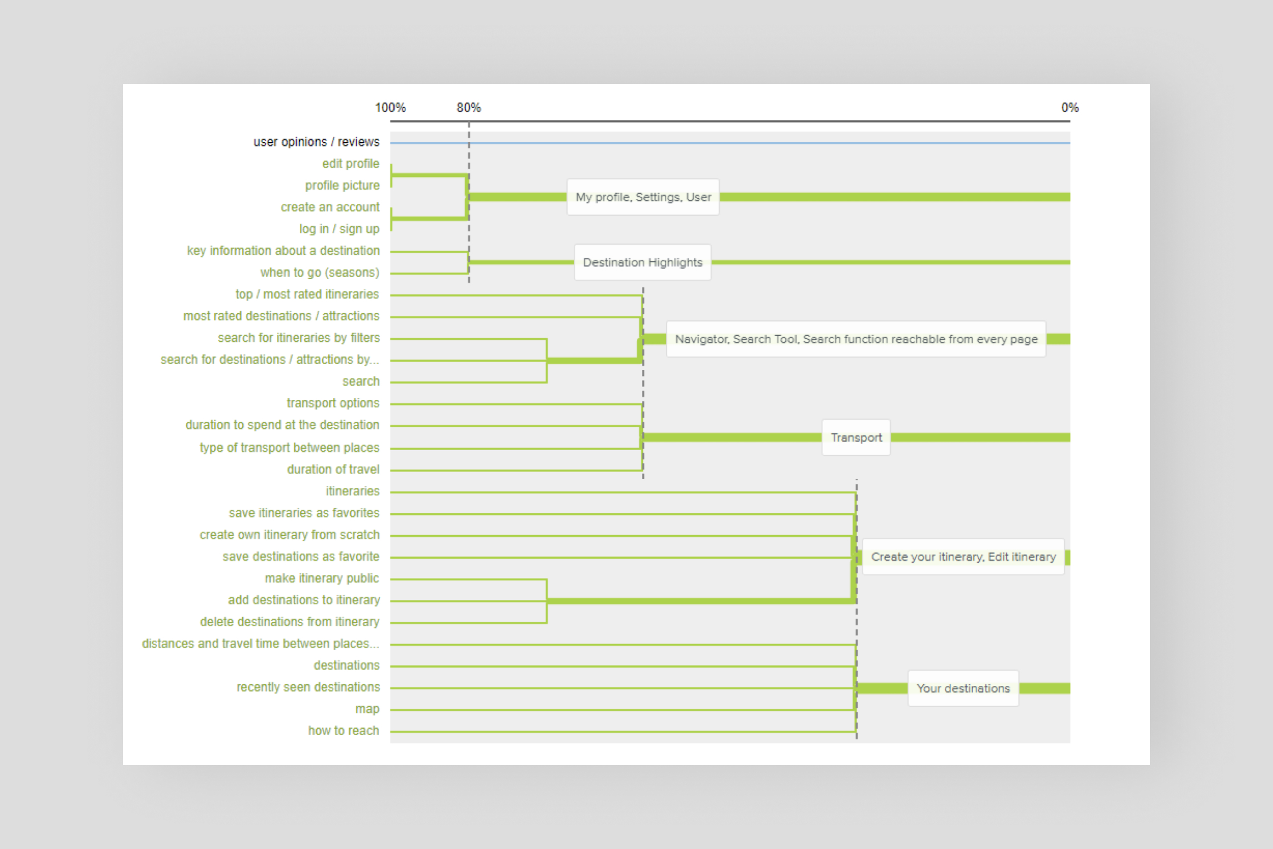
Card sort & sitemap.
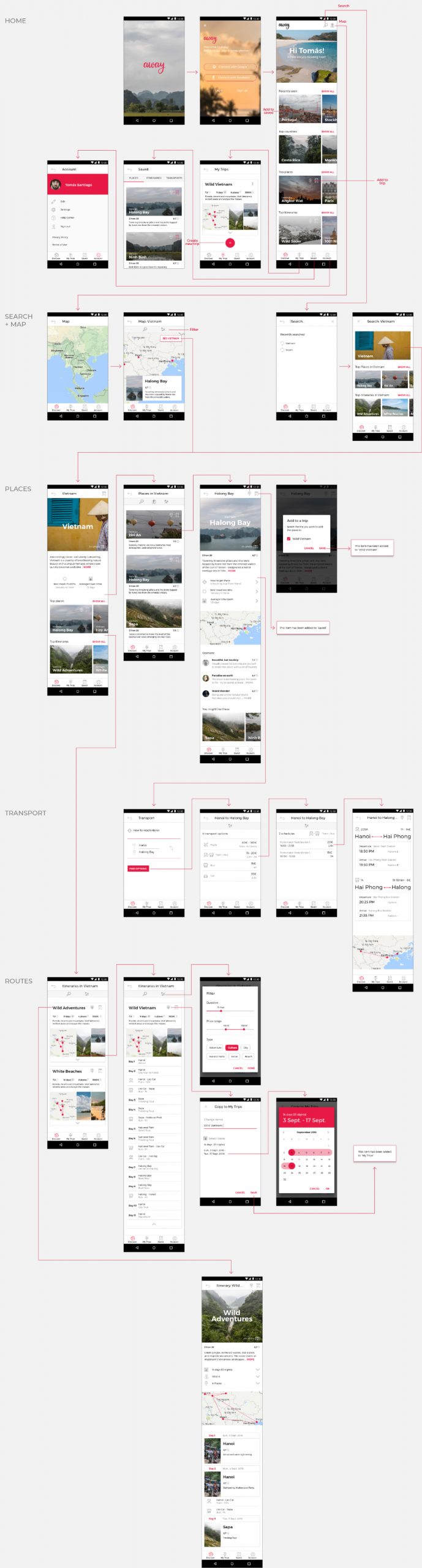
The dendrogram and participant-centric analysis pointed out three main topics — User, Itinerary, and Destination. Converting these topics into a sitemap required a lot of sketching and redoing.
Results: The user needed to explore, save and collect, create, and access his account.
Navigation
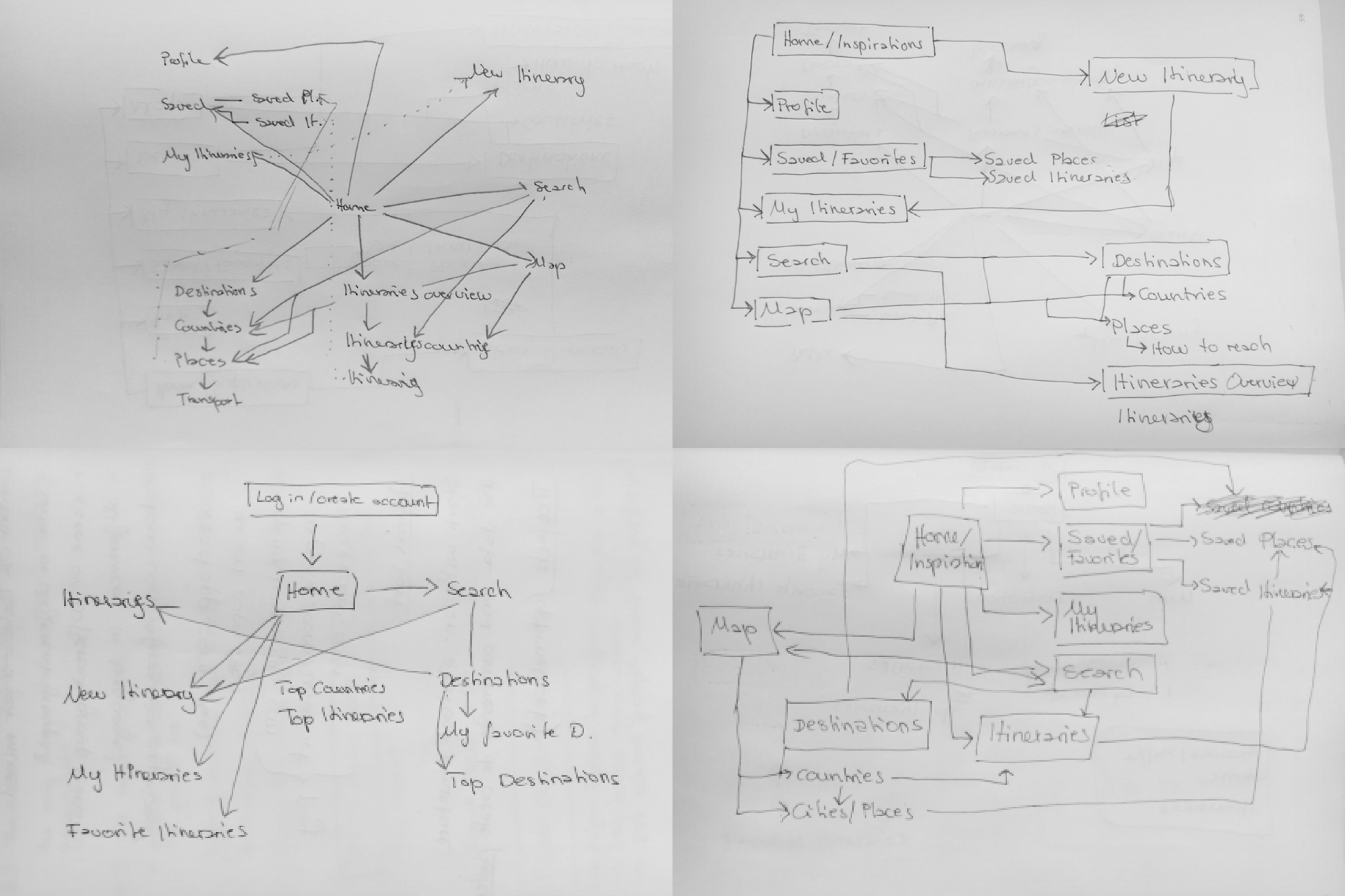
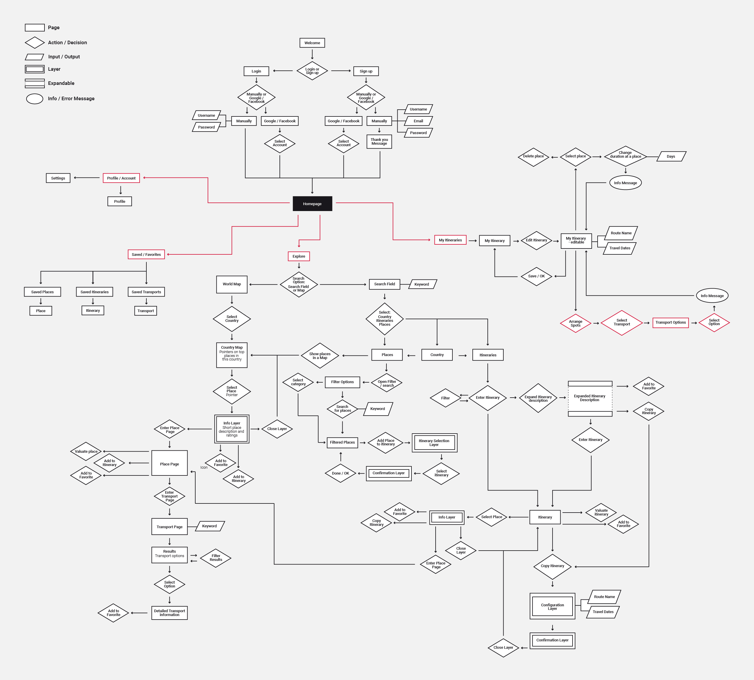
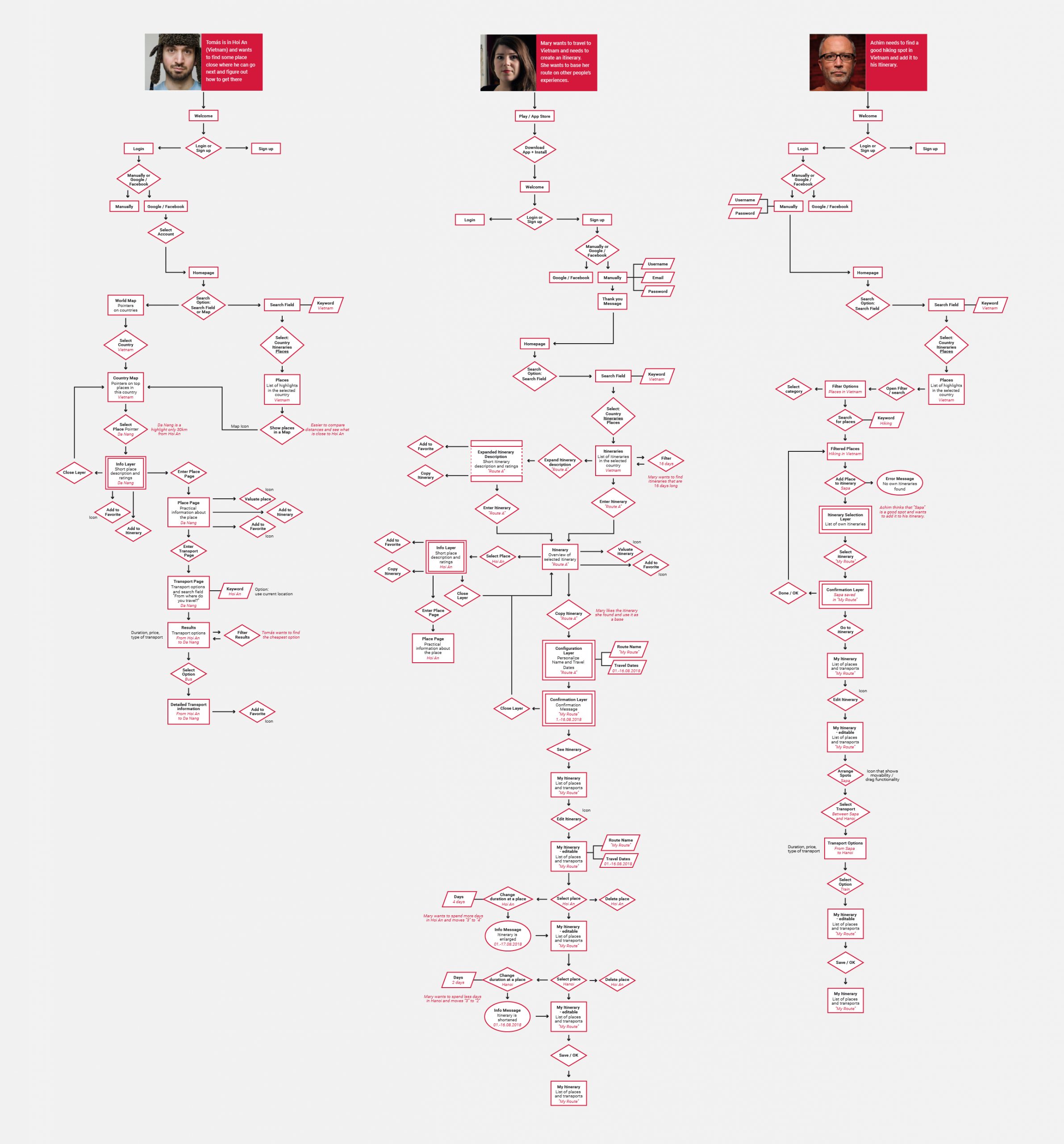
User flow.Once the sitemap was done, I had to test if the flow worked for all three of my personas and their diverse purposes. I gained a good sense of all relevant components and how they needed to be connected.
Results: Each persona needed three clicks or less to get to the section they were looking for. The flow confirmed the previously designed sitemap.
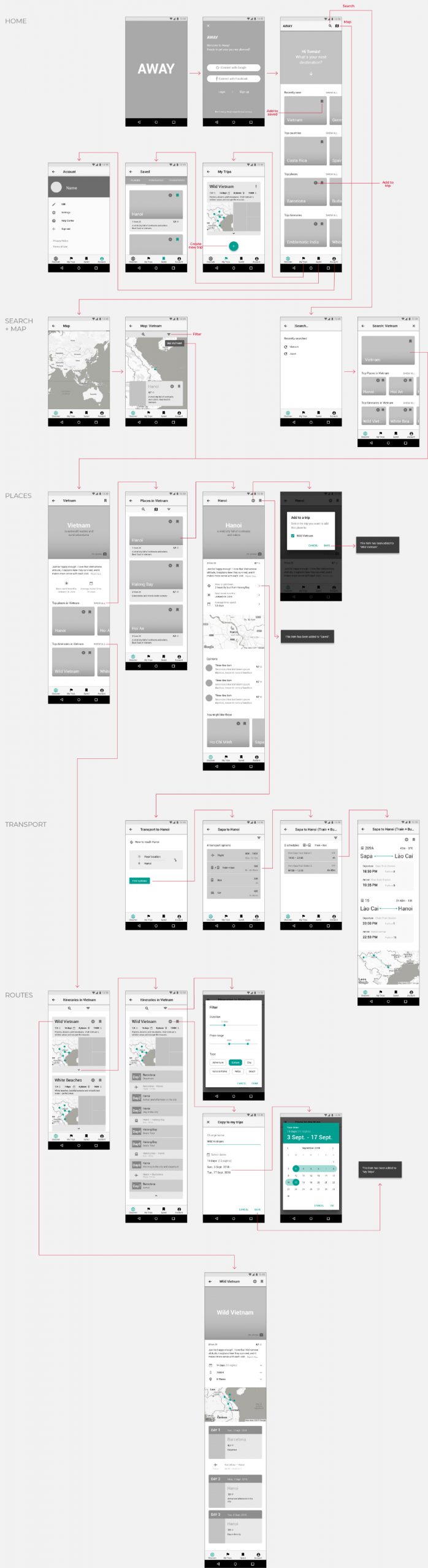
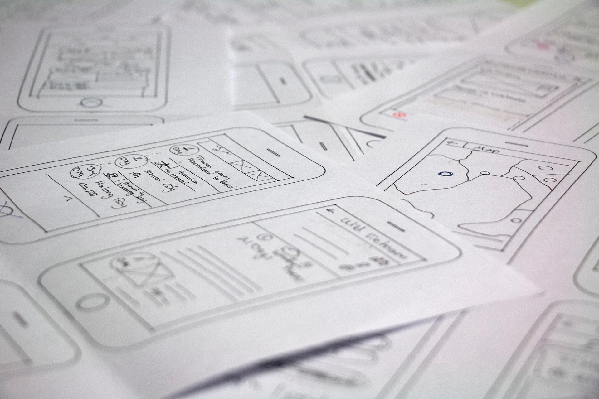
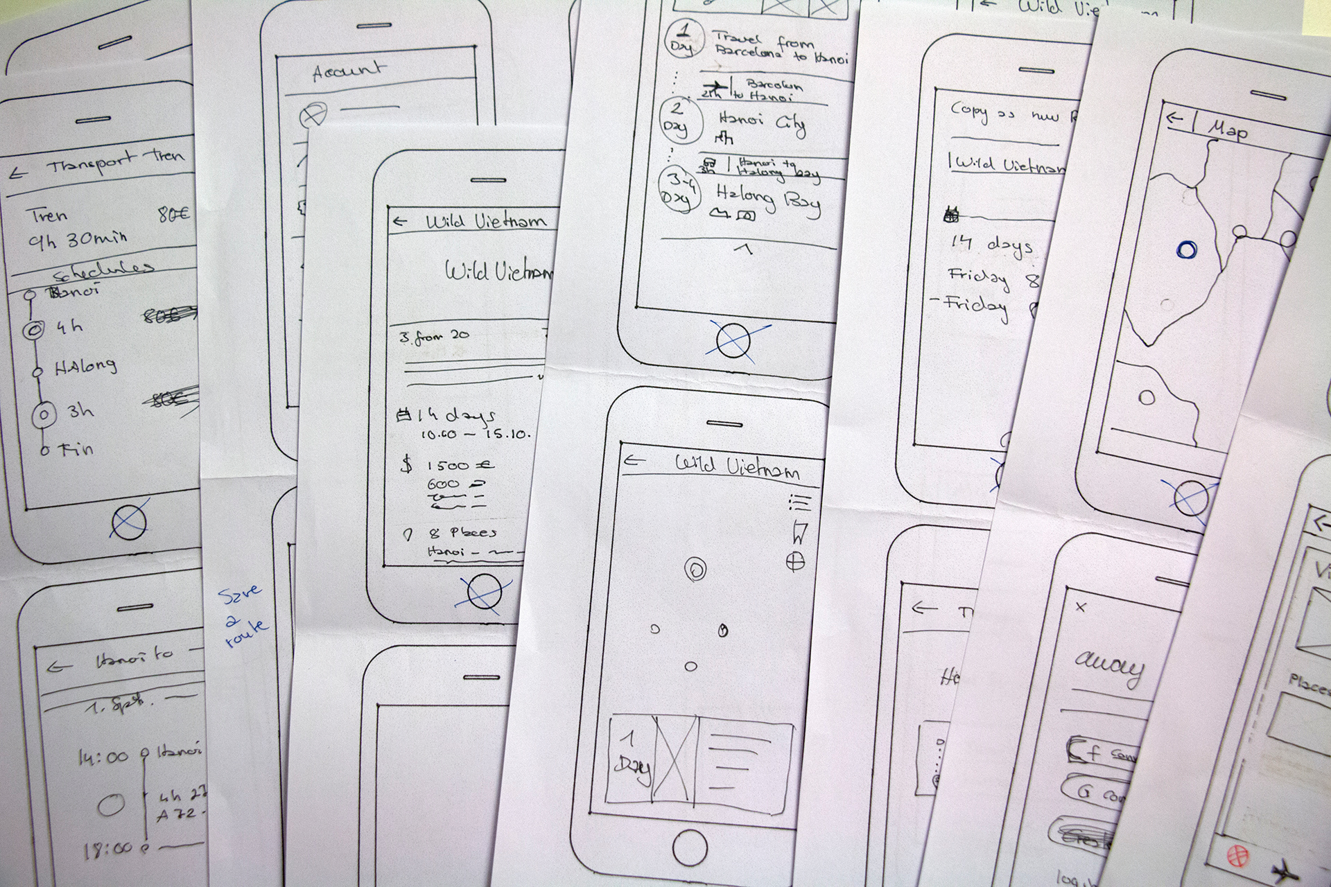
Wireframes
Prototyping and user-testing.
The most challenging part was to keep everything simple and consistent, so the user wouldn’t experience any pain points. I did some quick user tests with low-fidelity wireframes before I created a high-fidelity online prototype (Invision).
Then, I shared the link and used the feedback to improve the overall app experience.
Learnings: Using an erasable pen on printed templates was the most efficient technique for me.
Look and feel
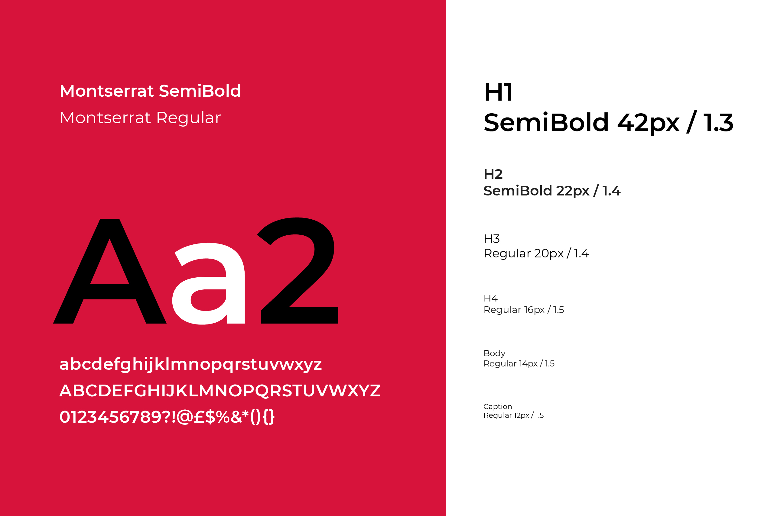
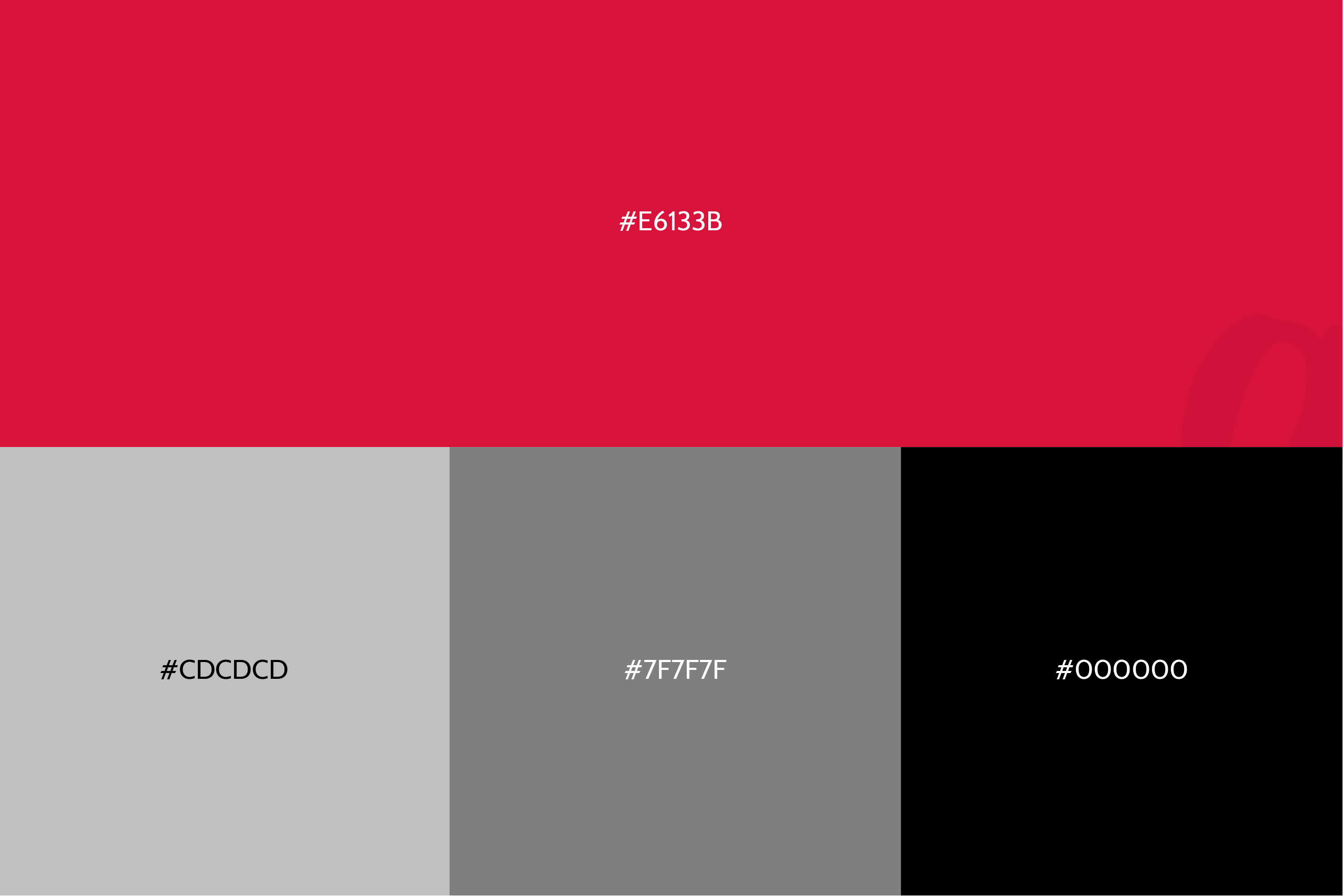
Visual design.The visual design is kept minimal to help the user concentrate on the information without any distraction.
Final prototype.
I created yet another prototype with the applied visual design and ran some more user tests. These helped to validate my choice of color and typography hierarchy and confirmed that the iconography was understandable.
Retrospective.
AWAY is a personal project I had in mind for some time. I started with a very clear idea of how the app should work, but thanks to research, interviews, and user testing, I learned that the app needed to offer something slightly different.
I guess that’s the main lesson I’ve learned. You can make your assumptions and have your ideas, but in the end, you have to pay attention to your target’s needs and aspirations.
See also.