Mambu
A flexible brand for a fintech company.
Visual identity, Art direction
Context
More than ever, banks are under pressure to become digital, flexible, and fast. MAMBU offers a building-block-like banking platform that allows financial entities to evolve quickly, in an agile way and prepare them for changes.
Challenge
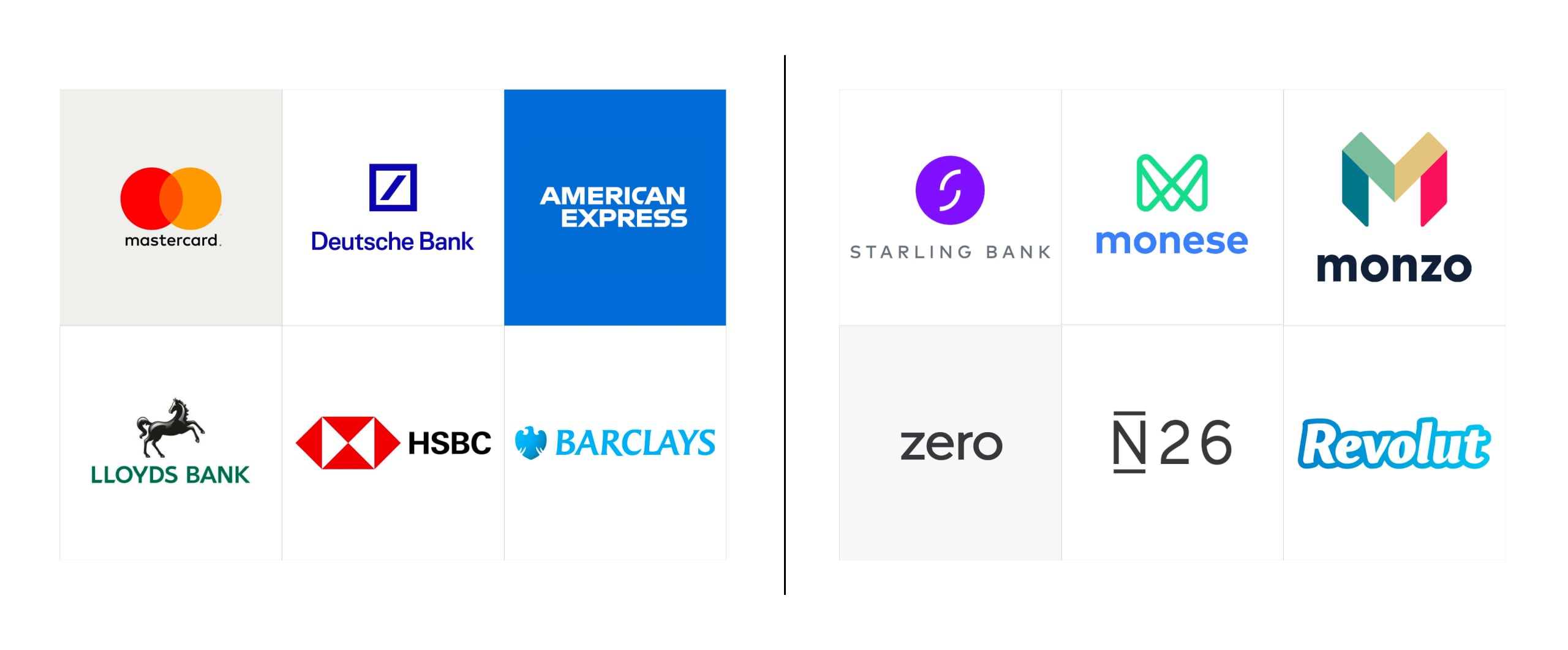
In the financial world, looking established is a vital part of being trusted. But MAMBU needed a new identity that would resonate both with established traditional banks and new digital banks – mature and young at the same time.
Approach
We developed a flexible and playful design system that allows MAMBU to hover between being established and disruptive – moving more towards one or another depending on their needs.
Client
Mambu
Agency
Velocity Partners, London
Role
Lead designer
(Concept, visual identity, brand guidelines, overseeing and creative direction)
Team
Vinny K-Maddage, Emilie Deneuvelaere, Edu Escanho, Harendra Kapur, Matthew Horsnell, Matthew Roundell, Jessie Tracy, Sanna Lousaari
Date
August 2019
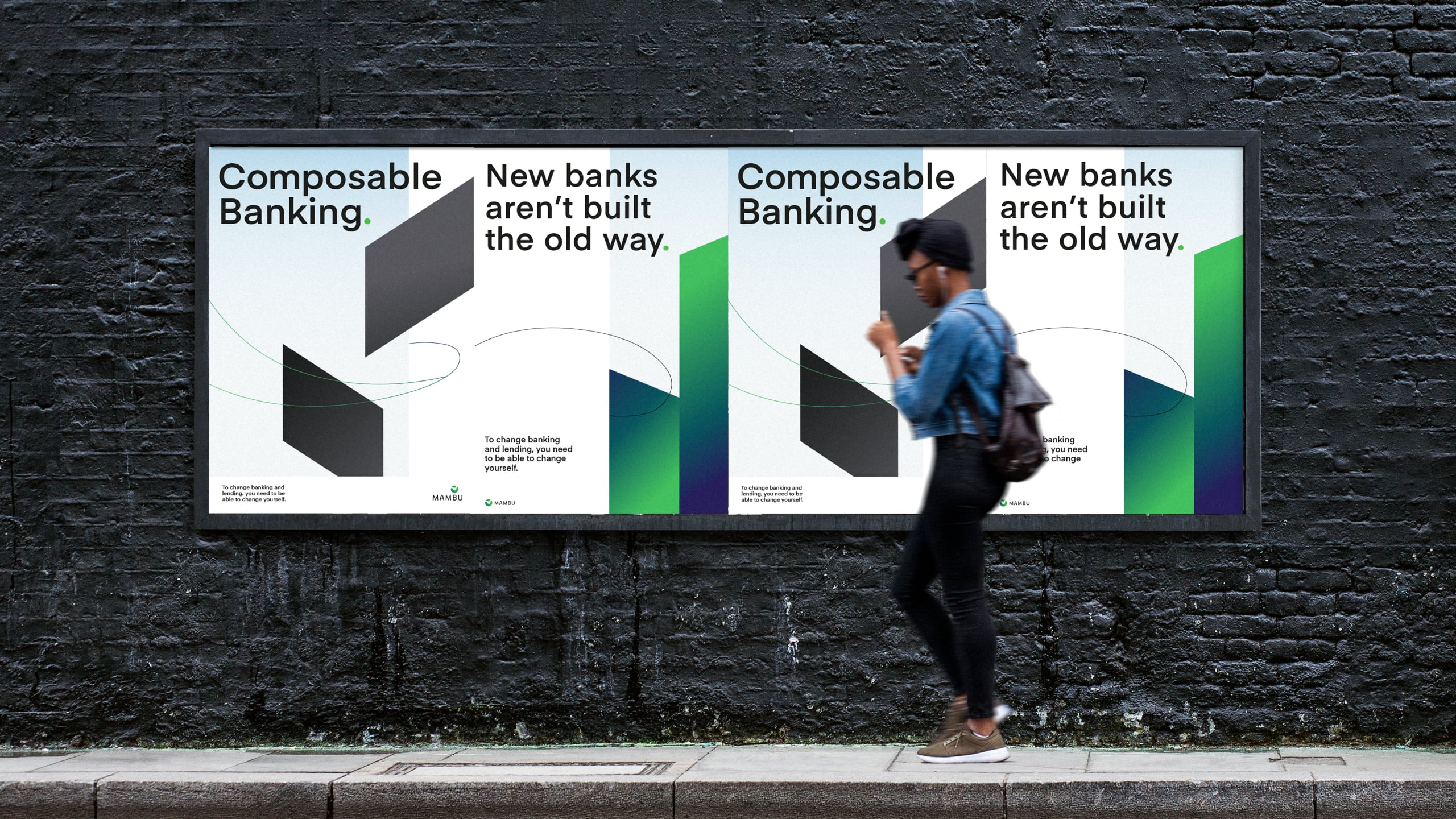
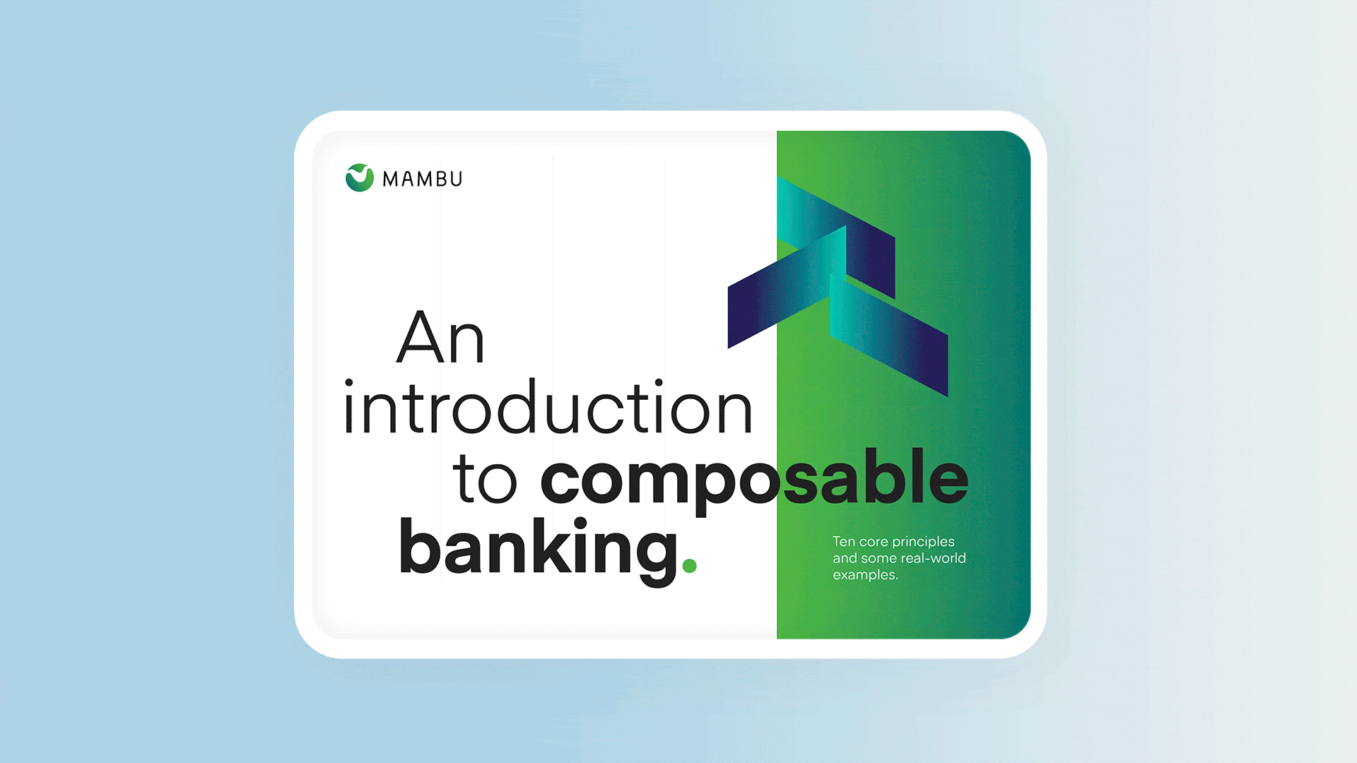
01. Positioning & immersion:
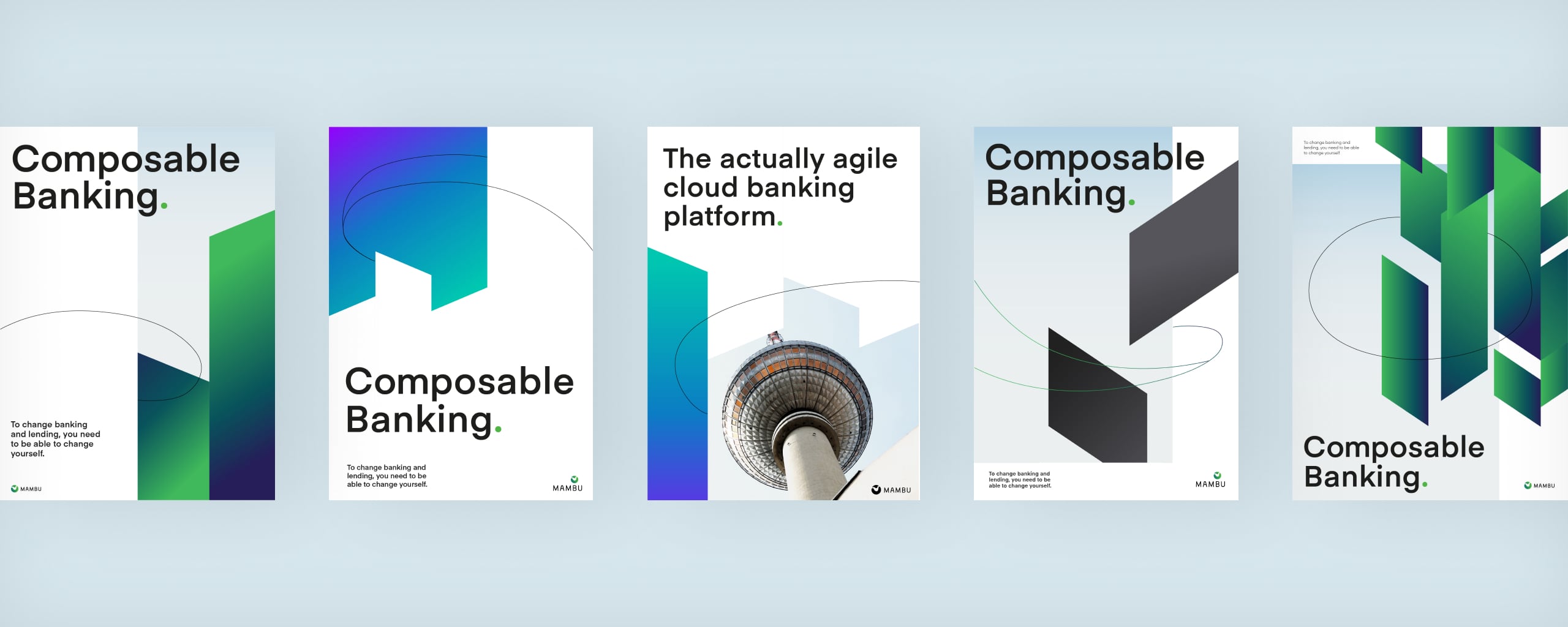
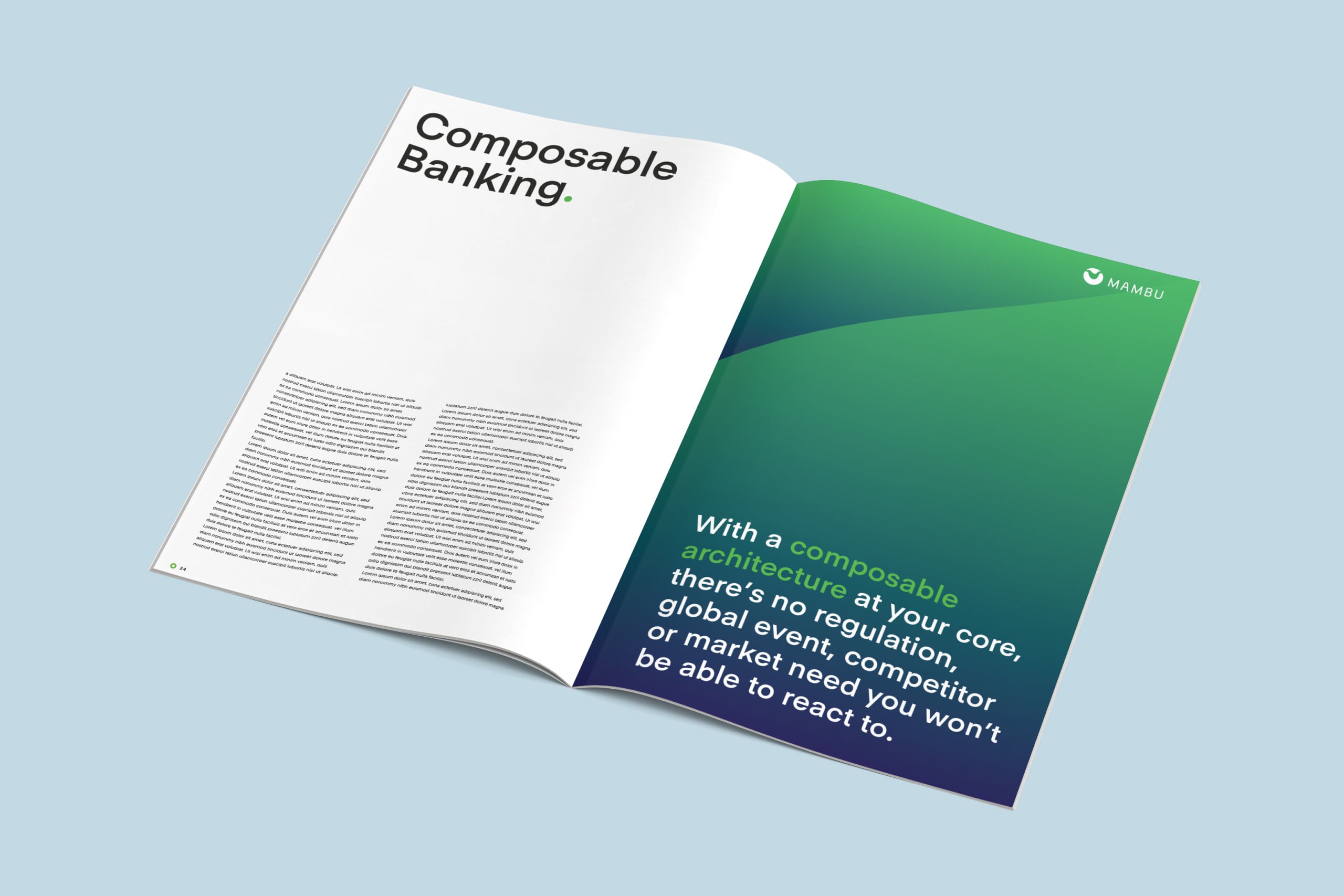
As we started working with MAMBU, it became quite clear that the flexibility of their product is what makes them stand out – so we came up with the idea of “Composable Banking.”
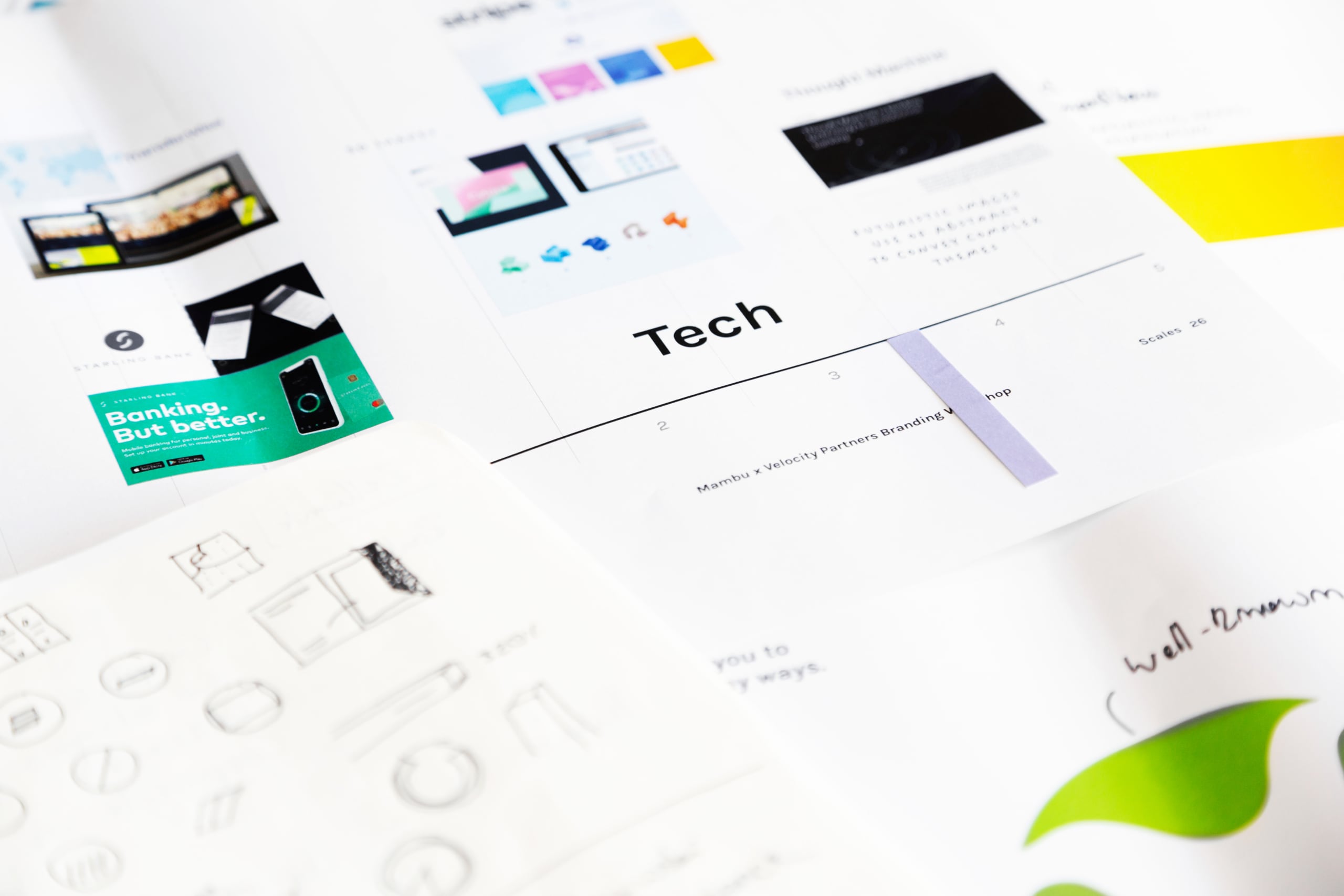
Client workshop
What we learned.
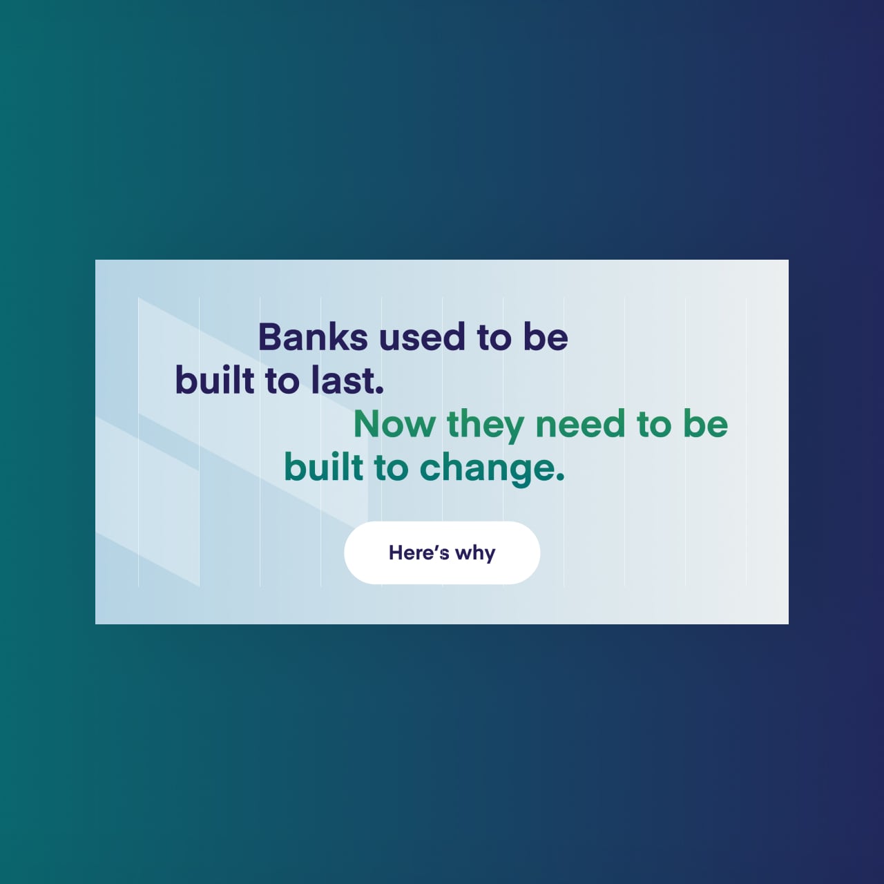
Mambu has changed from being a tech start-up to a recognized player in the fintech landscape. And the way they sound and look needed to reflect that.
We had to communicate credibility and confidence, but also playfulness and flexibility.
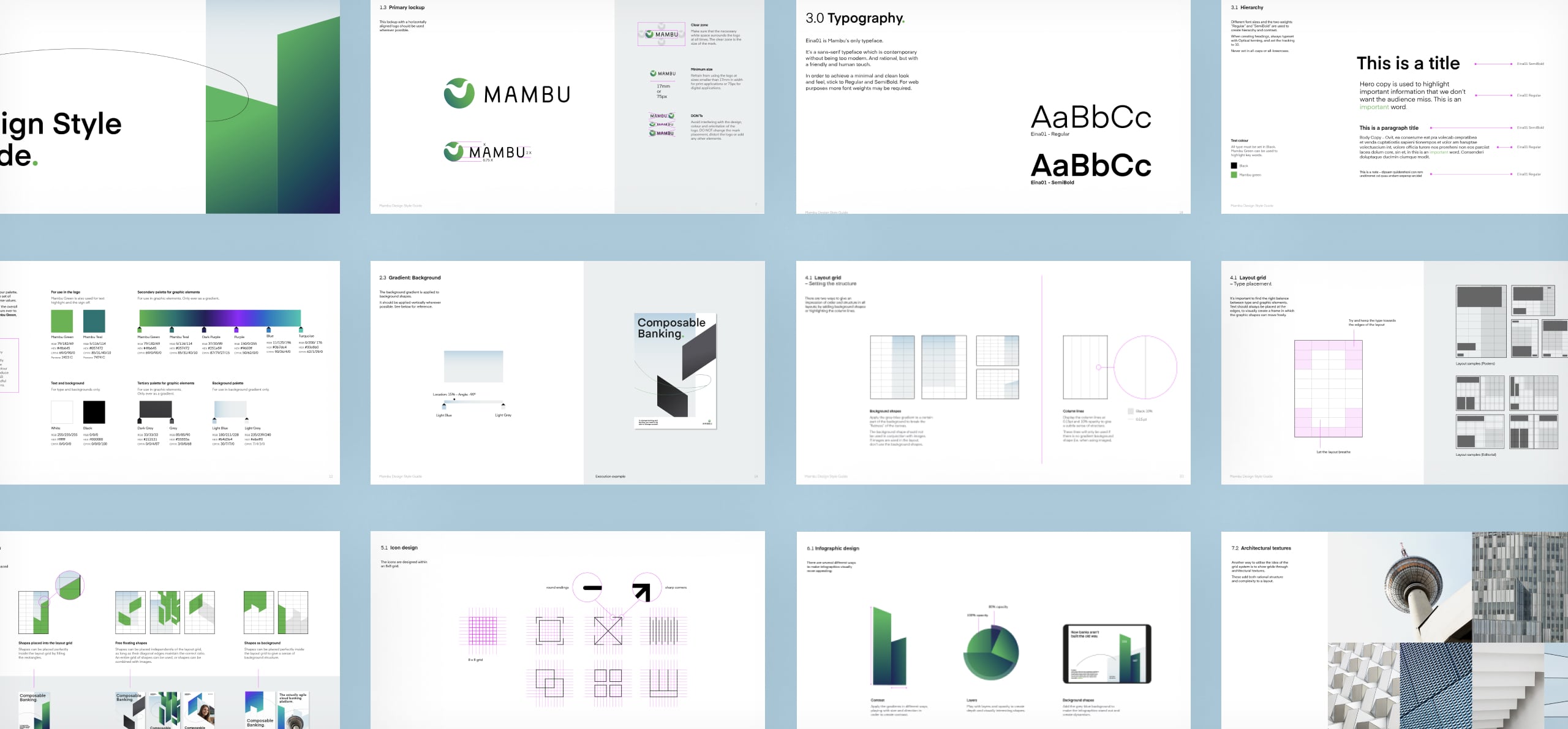
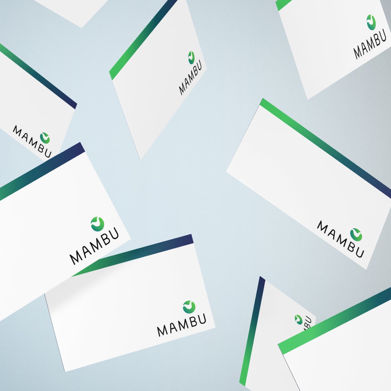
02. Logo
The current MAMBU logo is already well-known in the fintech landscape, that’s why the client asked us to modernize it but keeping its core shape.
Logo refinement
What we did?
- Colour: we changed the previous lime to a fresher, more energetic green gradient
- Typography: MAMBU asked us to keep the font – so we simplified and matched the stem feet and apex, and increased the kerning for a more spacious feel
- Lock-up: we increased the mark symbol to provide a more balanced composition
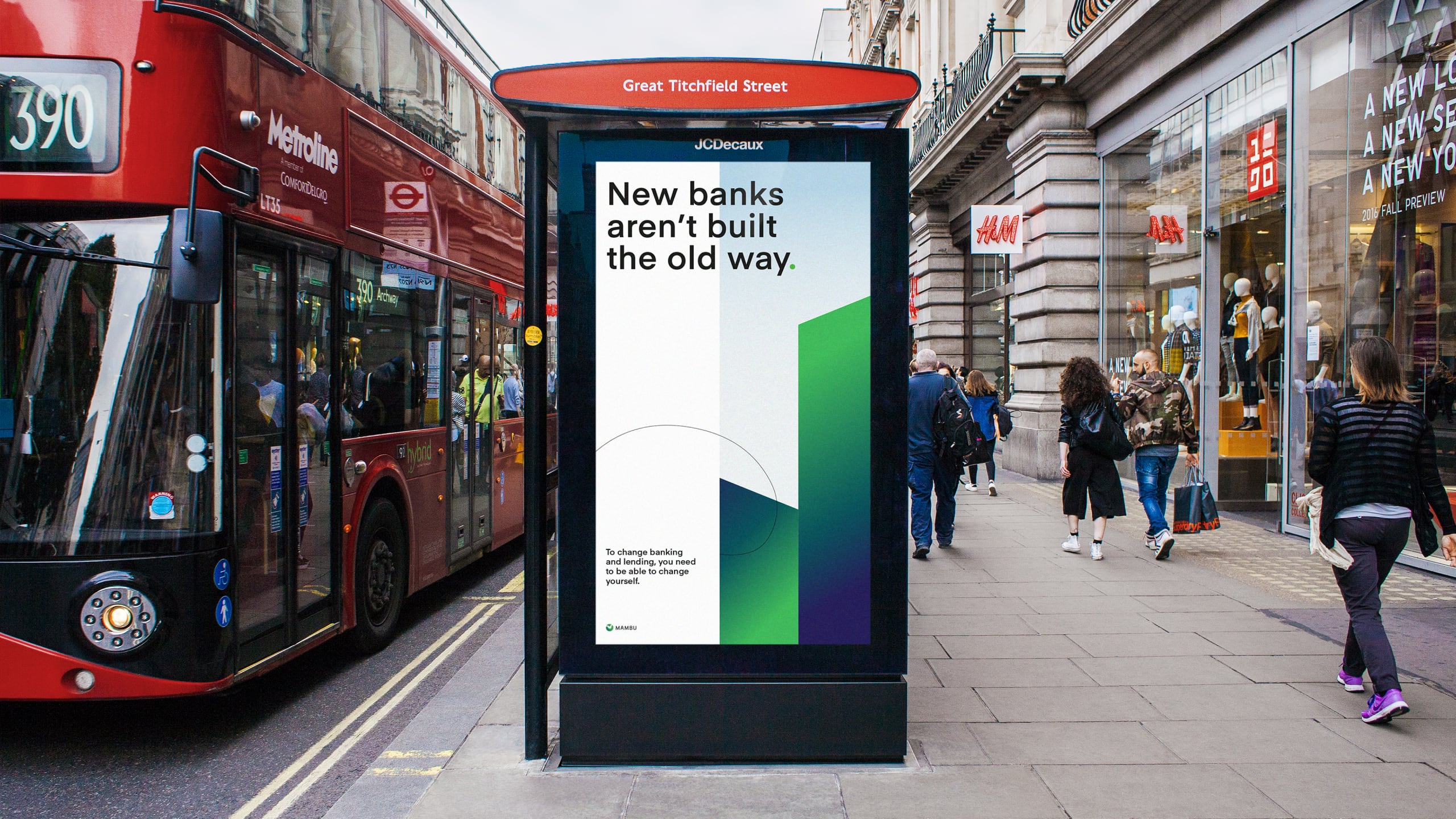
03. Visual language
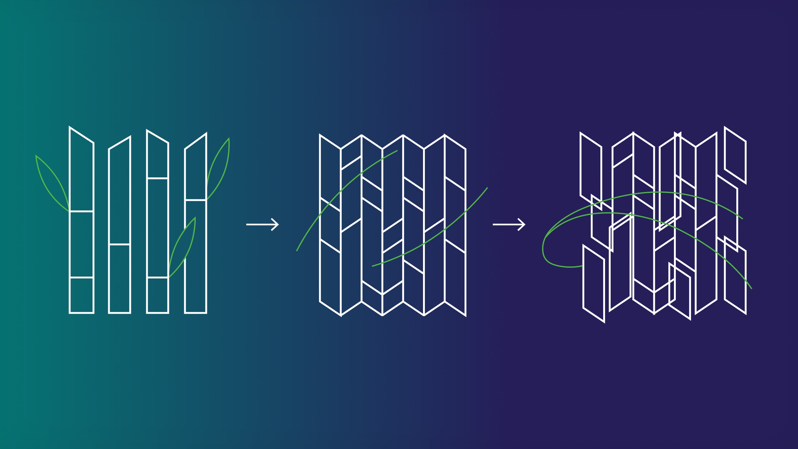
We decided to base the entire visual identity on bamboo, the origin of the name MAMBU. It’s flexible, grows quickly, and provides stability – like MAMBU’s product. This visual theme allows us to communicate structure and flexibility simultaneously – a brand that is composable through-and-through.
Our concept
The bamboo grid.
The bamboo structure is the foundation of our main grid and graphic shapes. The grid is decomposed and can be rearranged in any possible way.
The organic lines derive from the leaves and represent the more human part of the company.
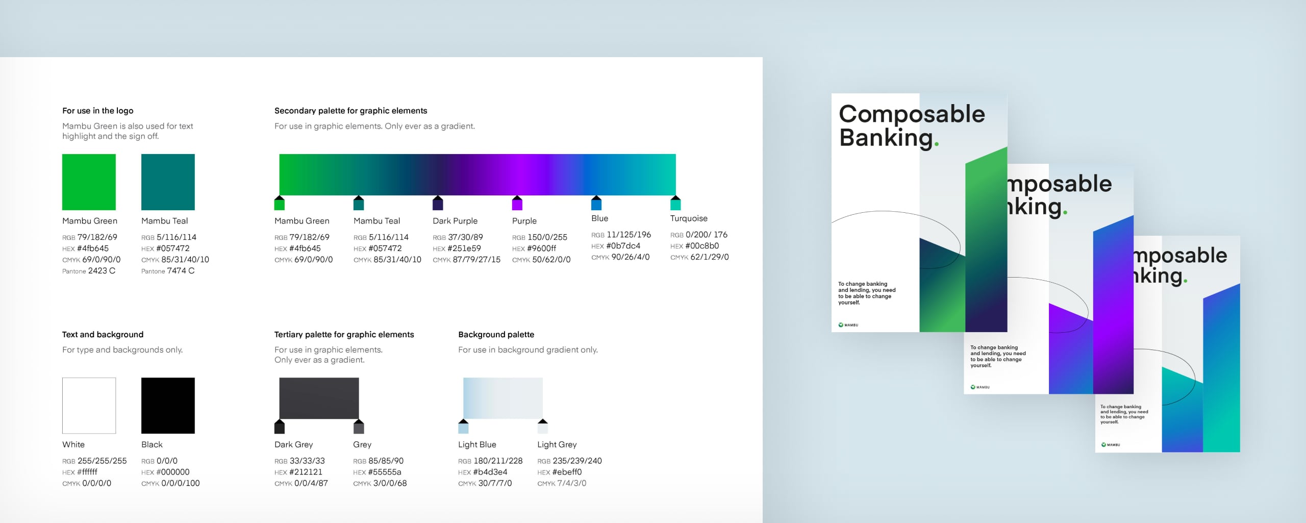
Colour
A flexible spectrum.
We were asked to keep the green as their primary color – so we updated their lime color to a fresher green tone.
We also added darker blue tones for more grown-up and sophisticated collateral and messaging, and vibrant purple and turquoise tones for a young, modern and energetic appearance.


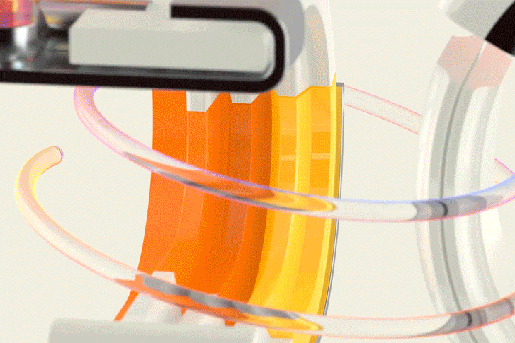
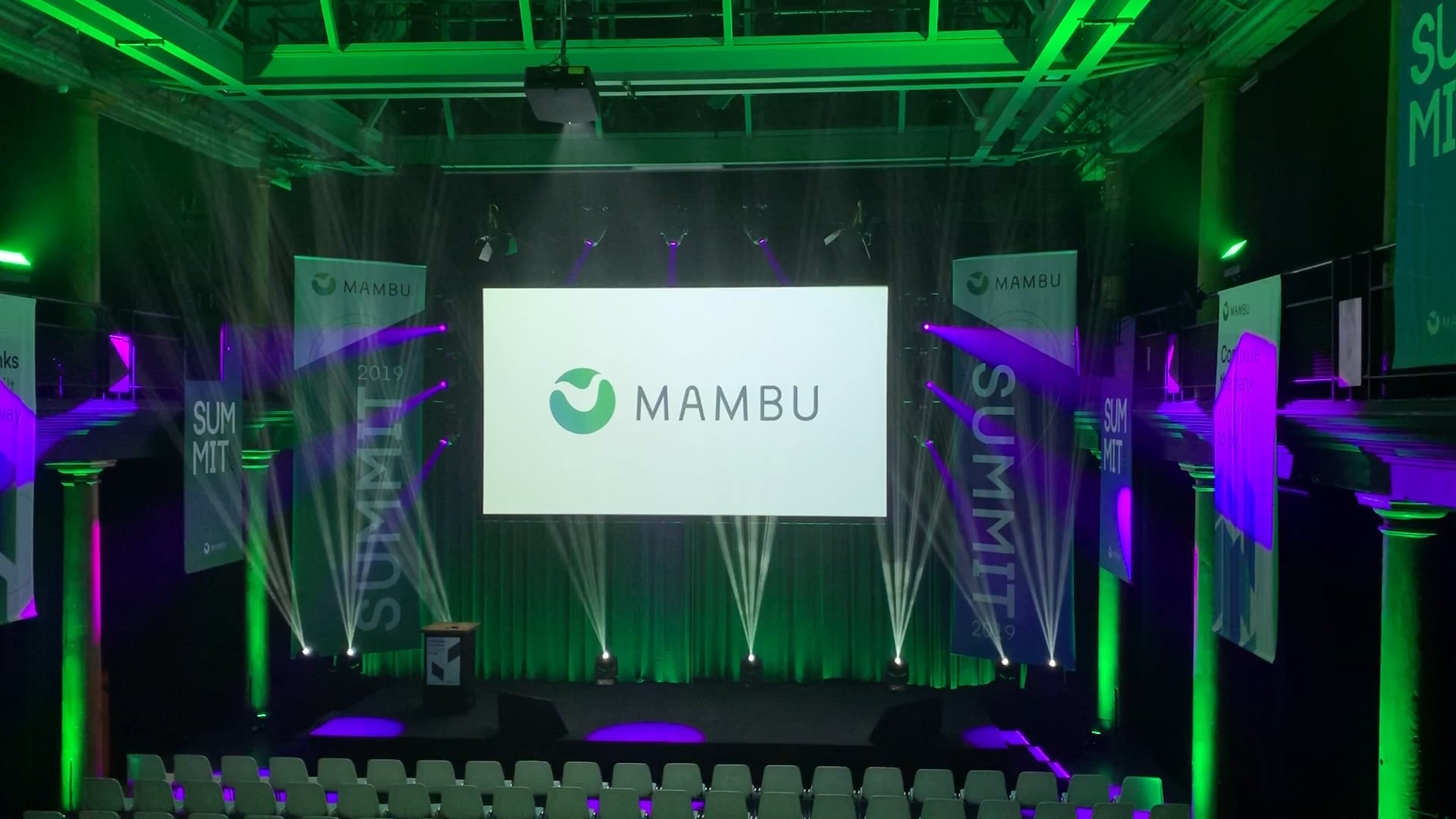
Animations
A brand in motion.
From the very beginning, we knew that motion would be an essential part of the brand to fully bring their story to life – the visual language allows us to be as abstract and playful as we need to be to explain their product offerings.


Final results


“We absolutely love it! So happy. Thanks for all the help.”
— Mambu
See also