Sprint Business
A campaign to explain 5G.
Digital campaign, Concept, Art direction, Web design, UX/UI
Challenge
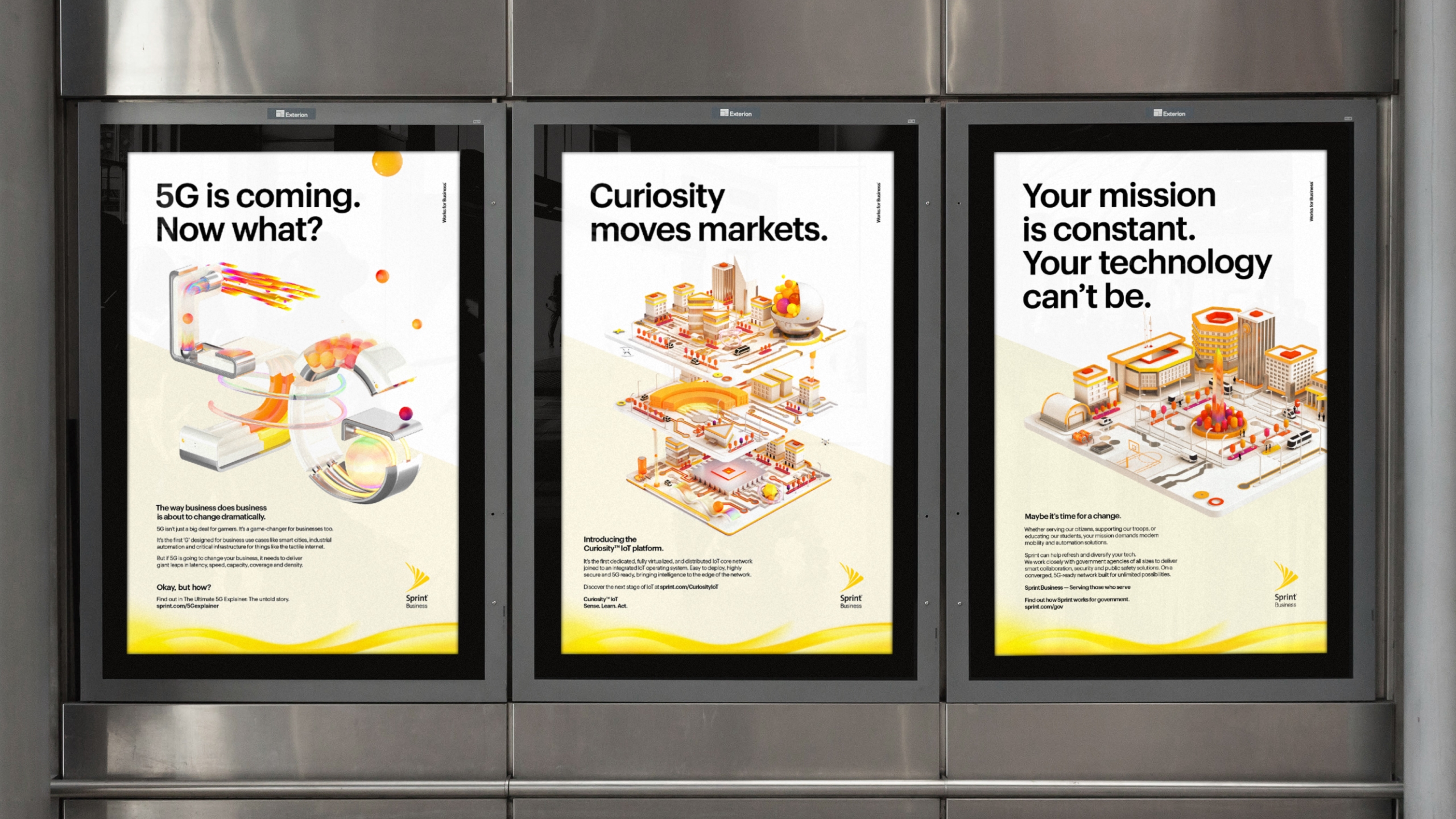
Sprint Business wanted to position themselves as the leaders in 5G — they asked us to create a disruptive campaign with two purposes: separate them from their competitors and explain how 5G will affect businesses.
Approach
After a lot of research and interviews with experts in the field, we created a distinctive campaign treatment and set up a digital hub — a scrolling experience that drives the user to in-depth content like glossaries, use case and a YouTube series called ‘Okay, But How?’.
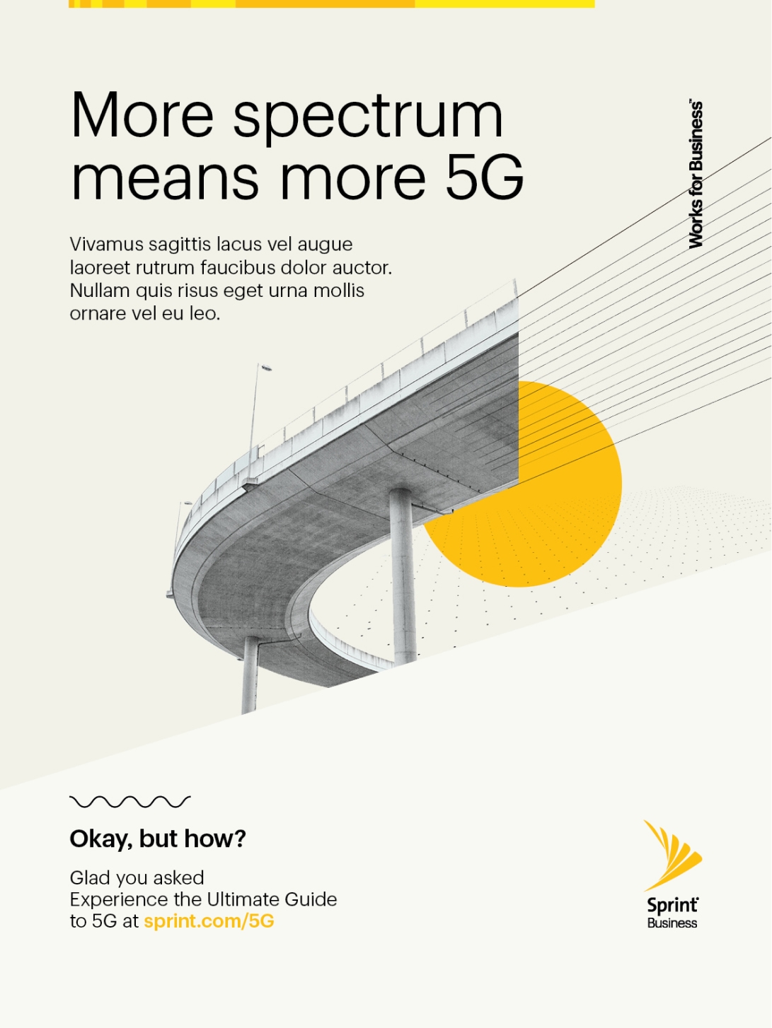
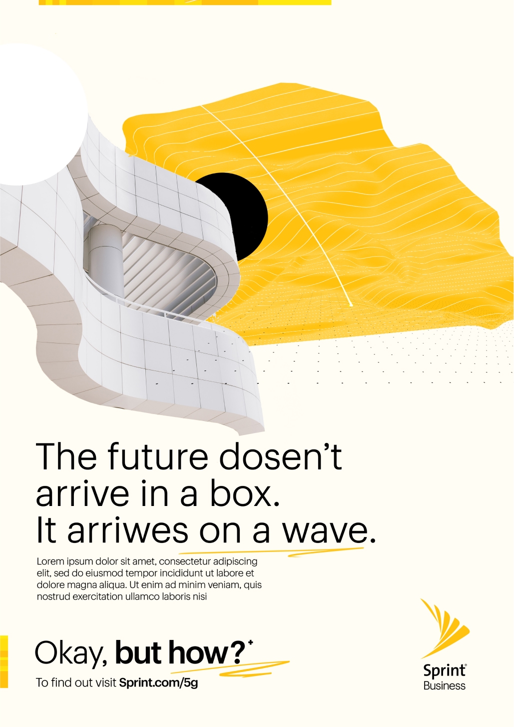
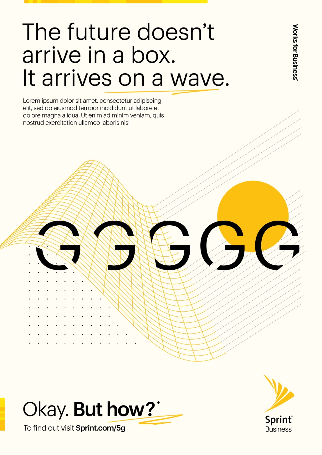
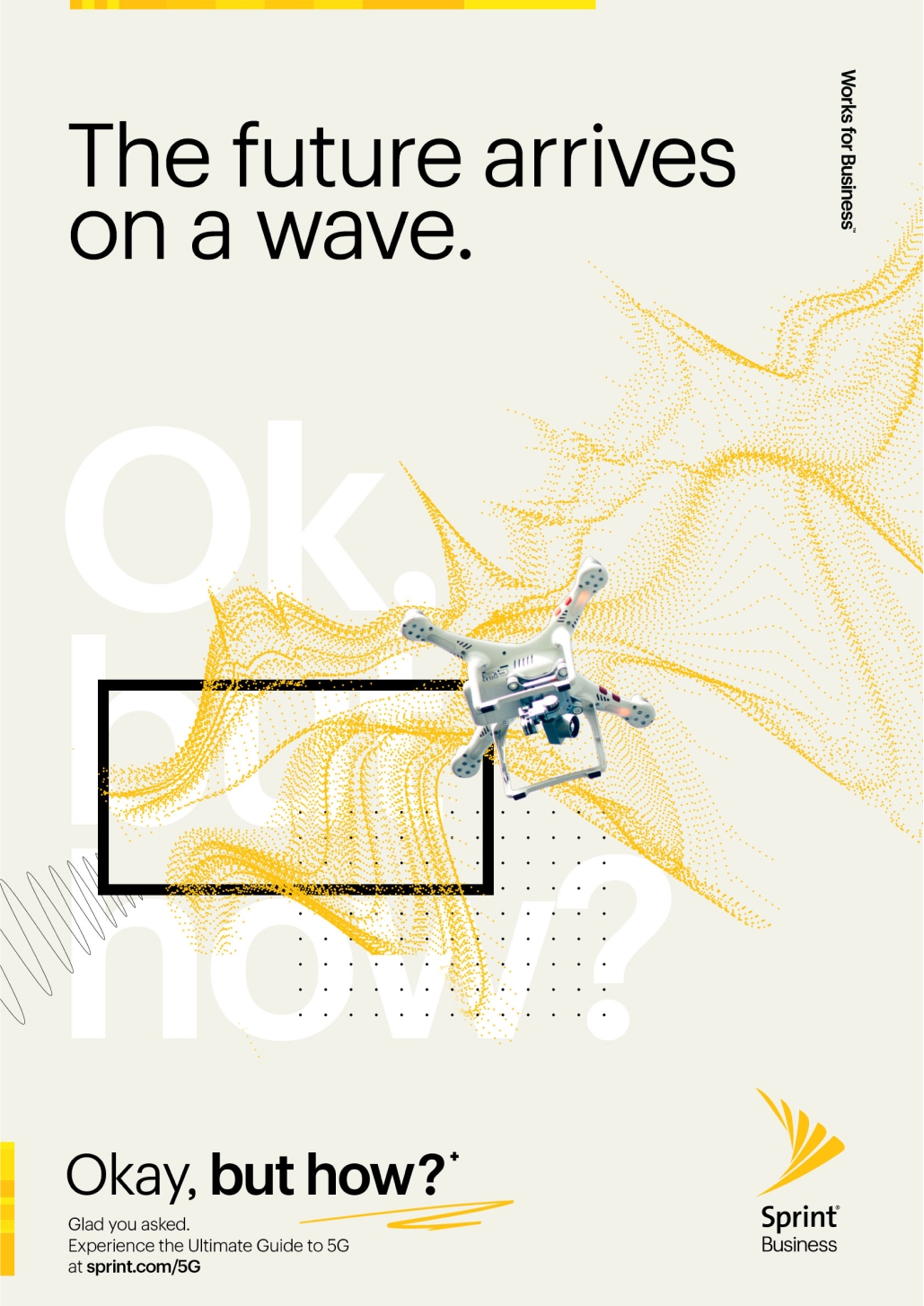
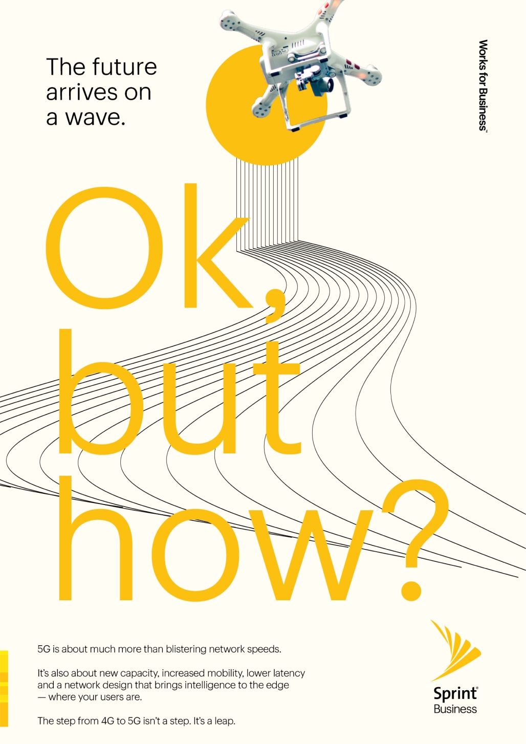
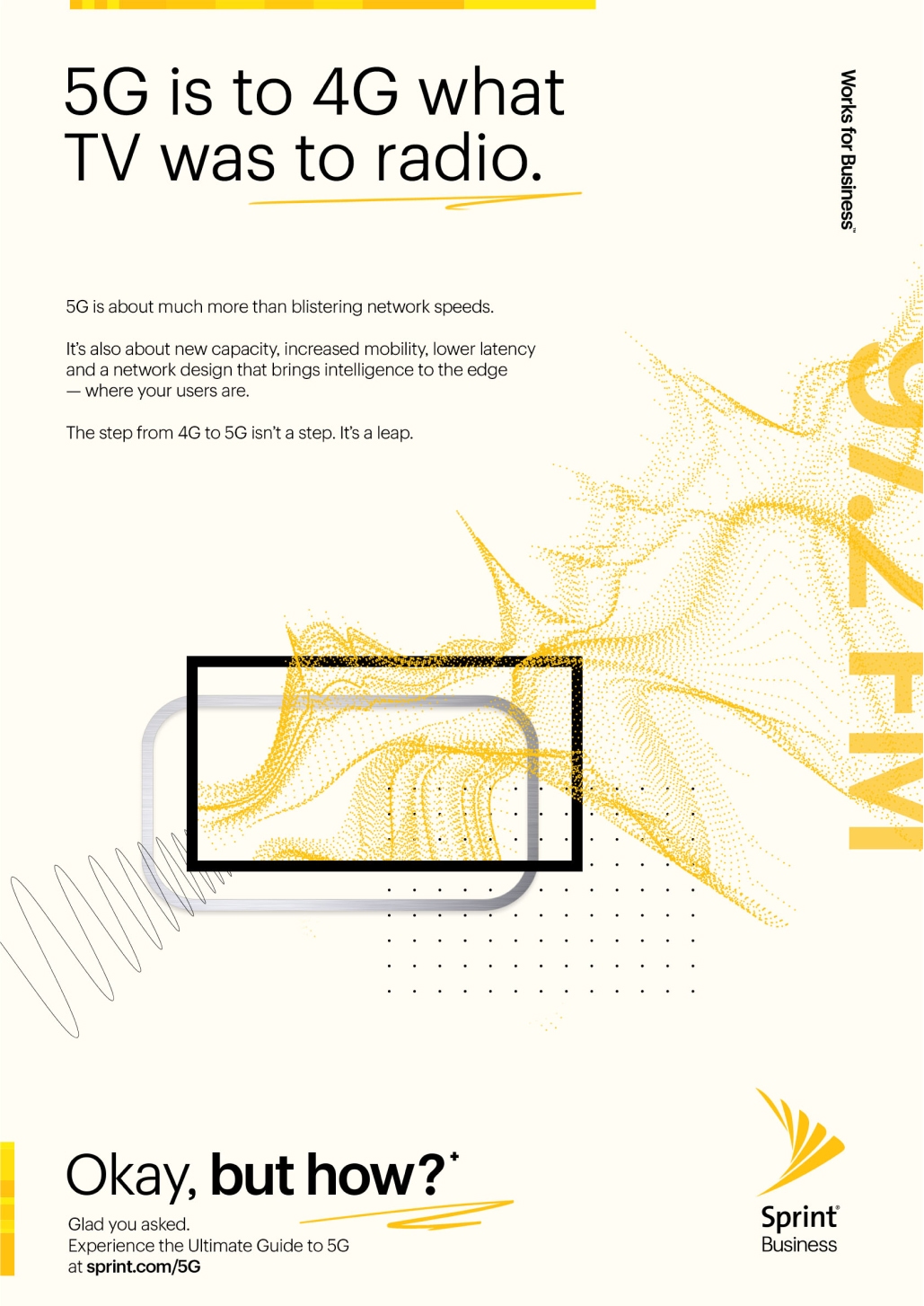
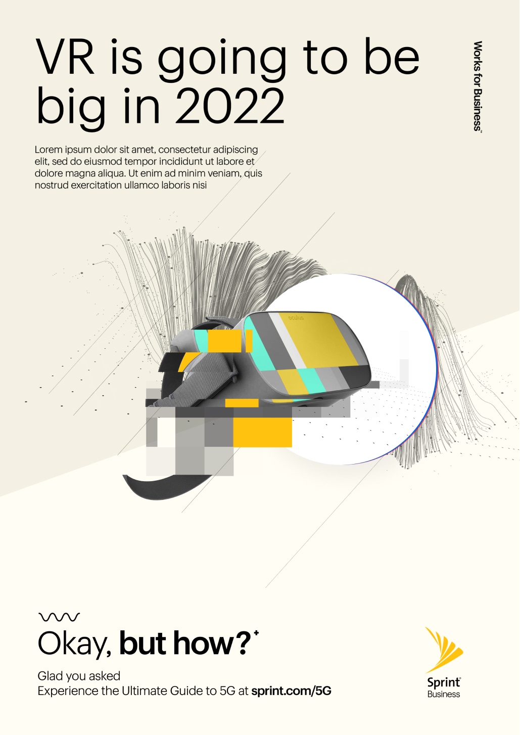
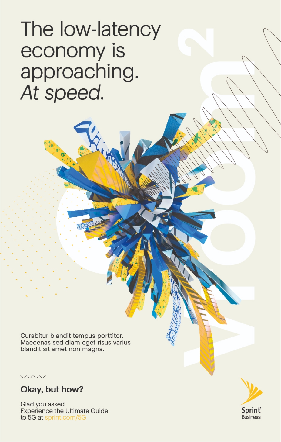
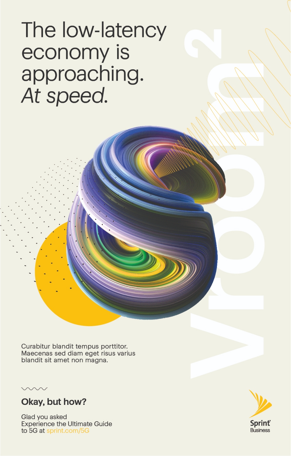
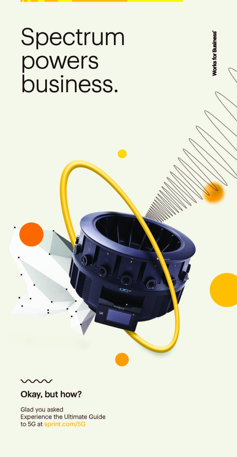
Everything is supported by a huge media coverage such as online banners, social media promotion, print, and outdoor advertising.
Client
Sprint Business
Agency
Velocity Partners, London
Role
Senior designer
(Concept, art direction, design system, hub page design)
Creative team
Daniel Buxton, Ákos Sándor, Edu Escanho, Chris Robson, David Leach, Scott Madill, Sean Leahy
Date
August 2018
Results.
24%
more brand awareness among enterprises following the launch of the 5G campaign at the end of August 2018.
Campaign concept.
We knew we had to come up with a campaign that would both draw attention and illustrate the 5G technology and its challenges efficiently and in detail — all based on the existing brand elements.
Exploration
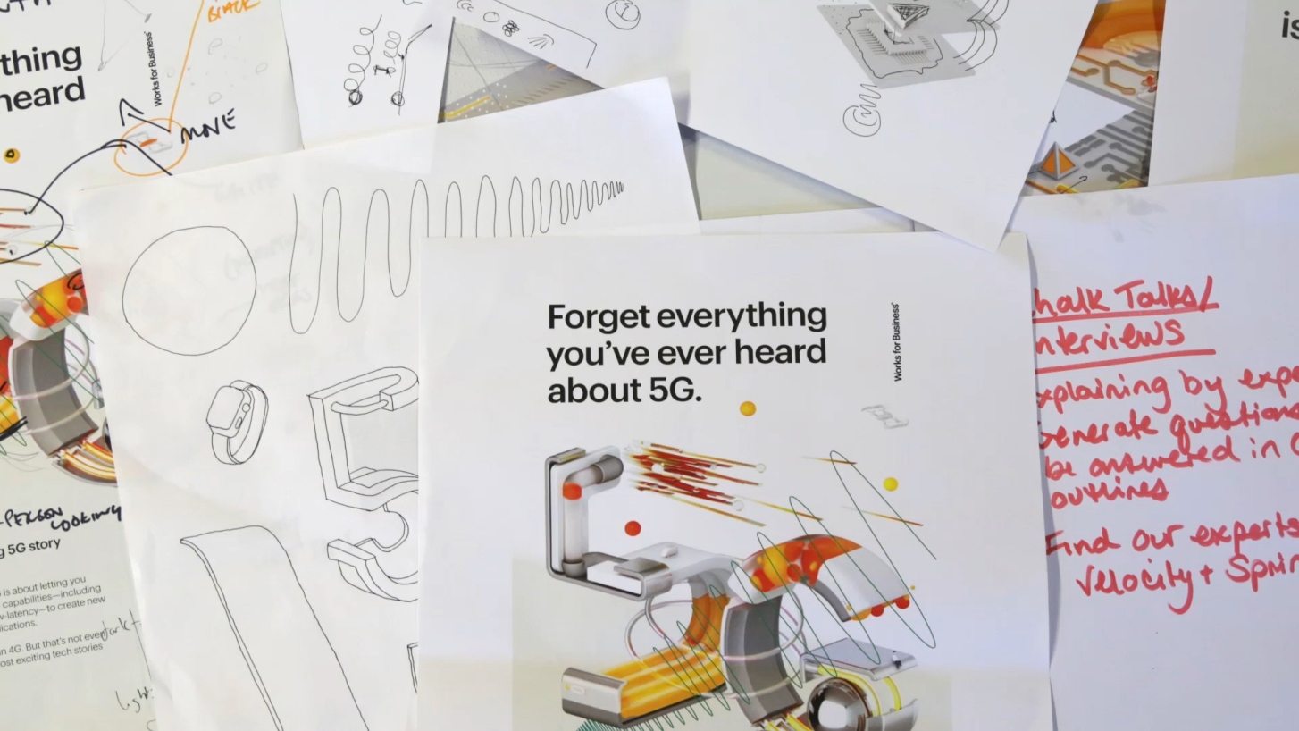
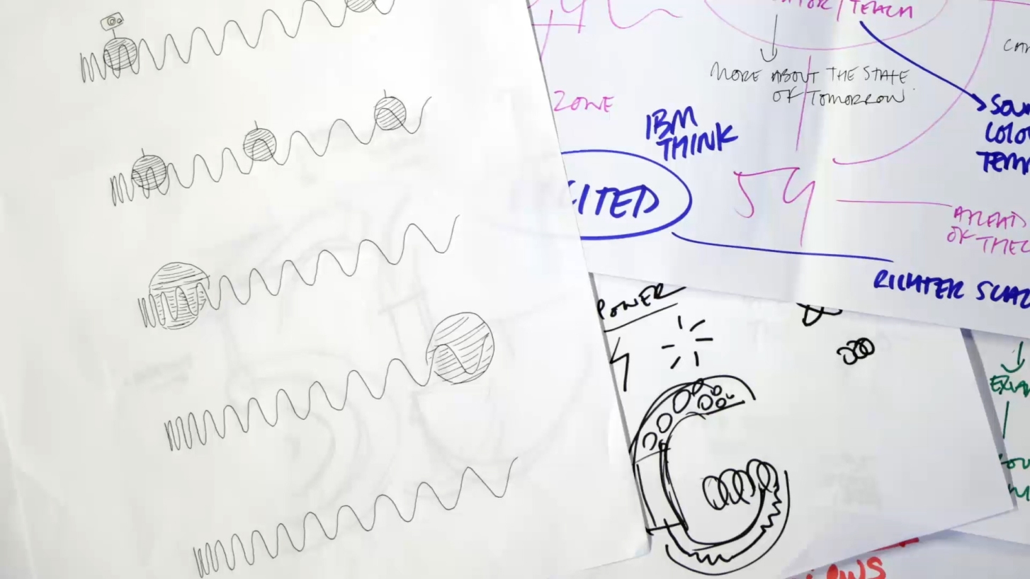
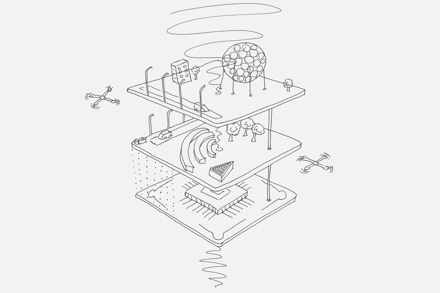
From collages to CGI.
How do you visualise something as abstract as a technology?
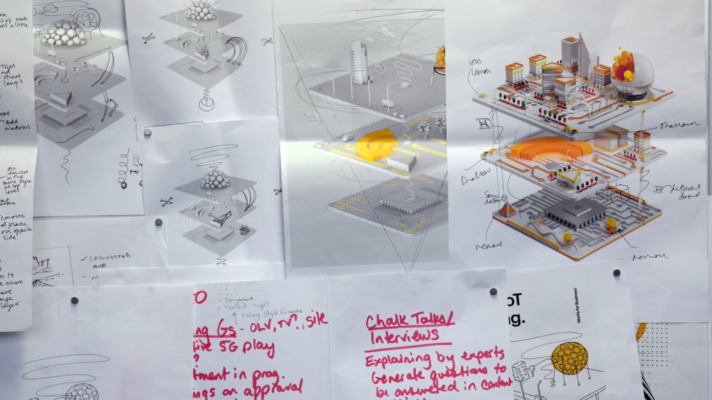
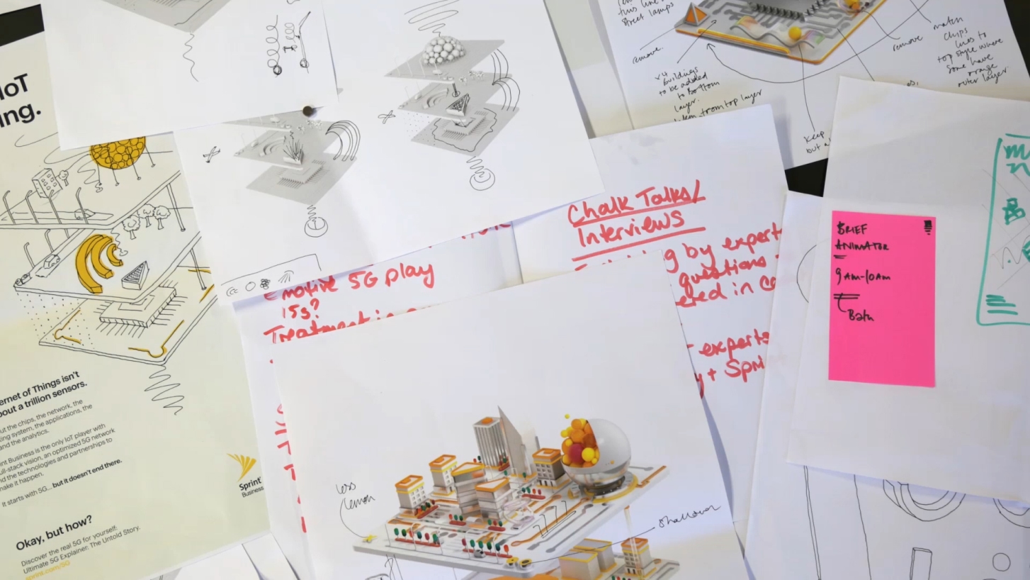
After some initial tests, we decided that “collages” were a promising technique — they would allow us to combine different elements and styles to tell one story. But collages can easily feel too arty or too retro, and we were aiming for a digital aesthetic — that’s why we started approaching CGI.
Below, an overview of our exploration process:
Structure
Aiming for consistency.
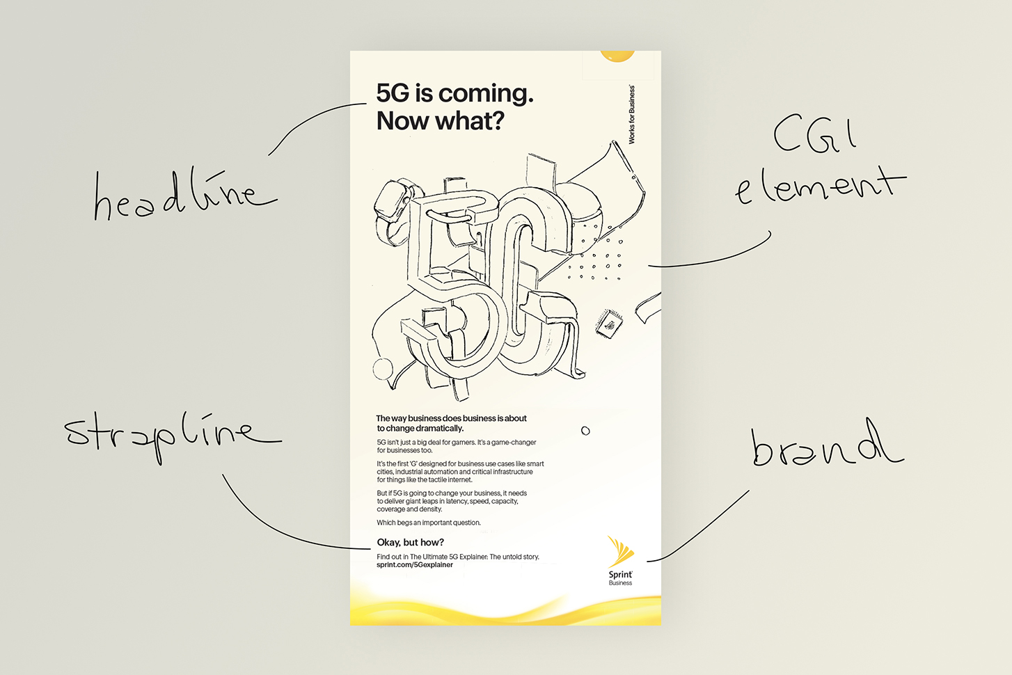
After several design sprints, we decided on a simple layout structure for our campaign that would provide consistency across our assets and assure recognition by the user.
Rationale
The system that ties it all together.
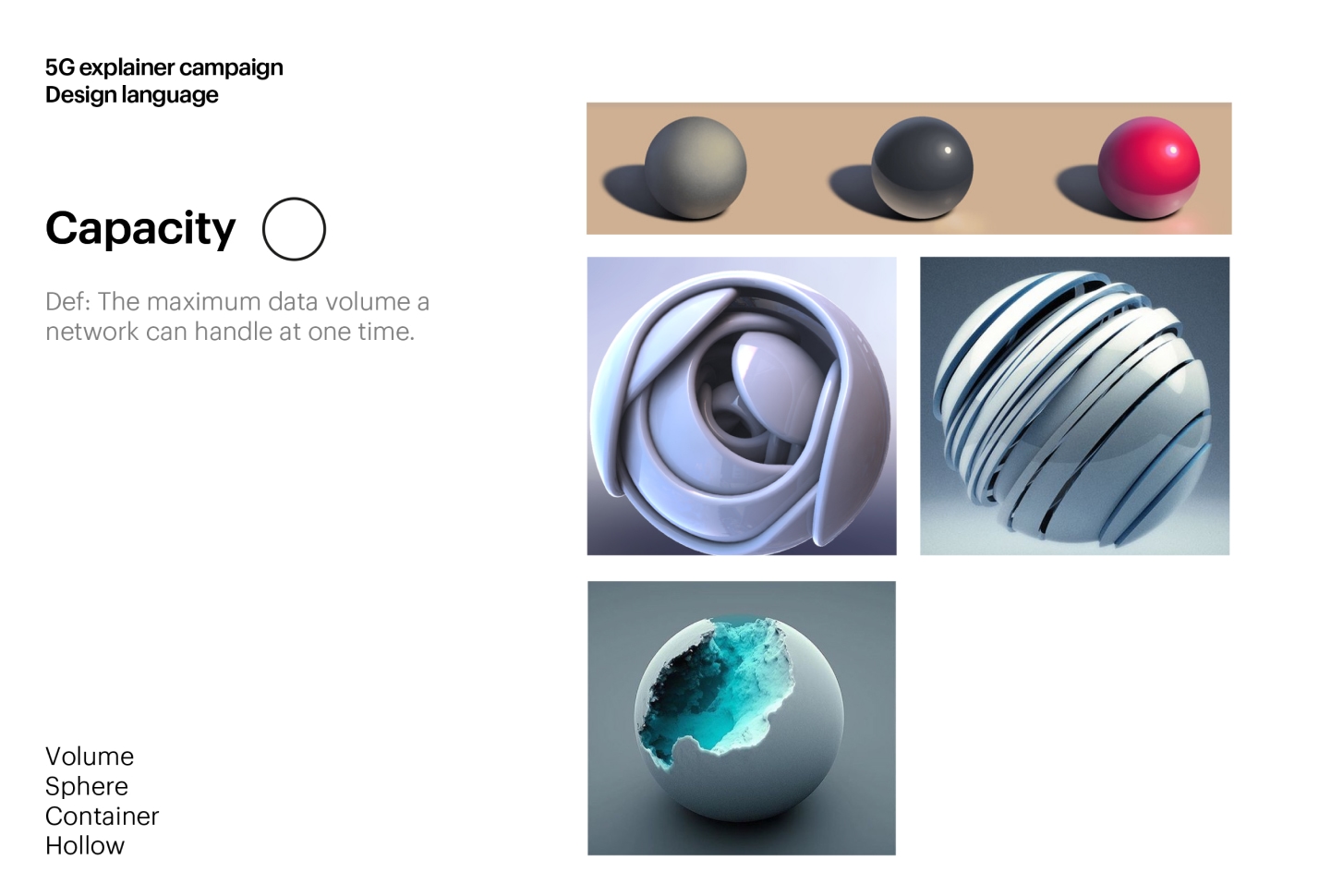
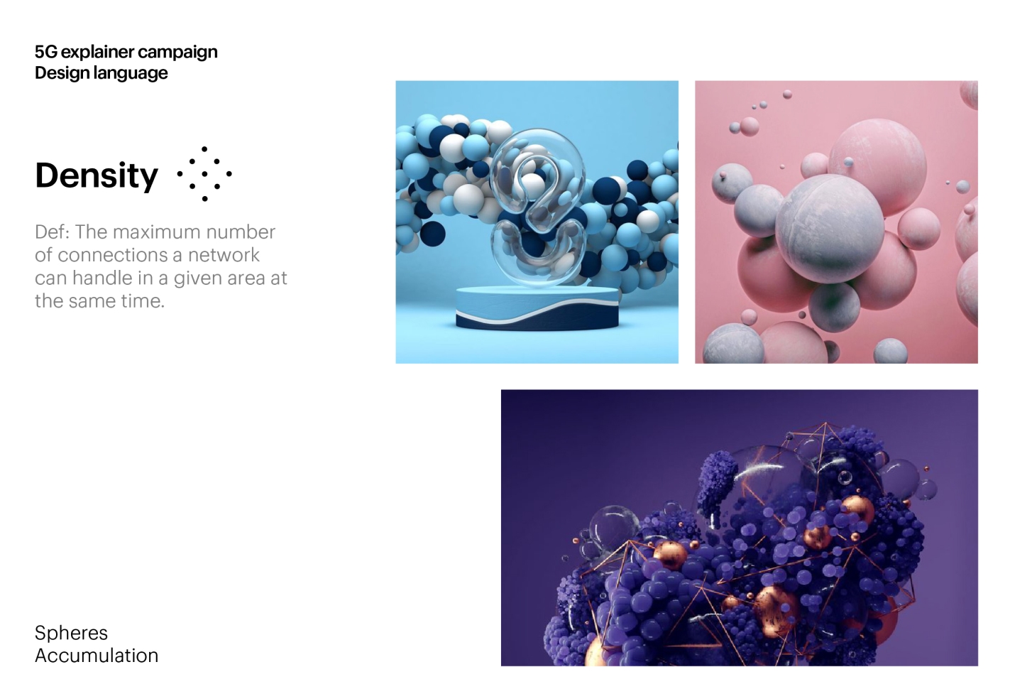
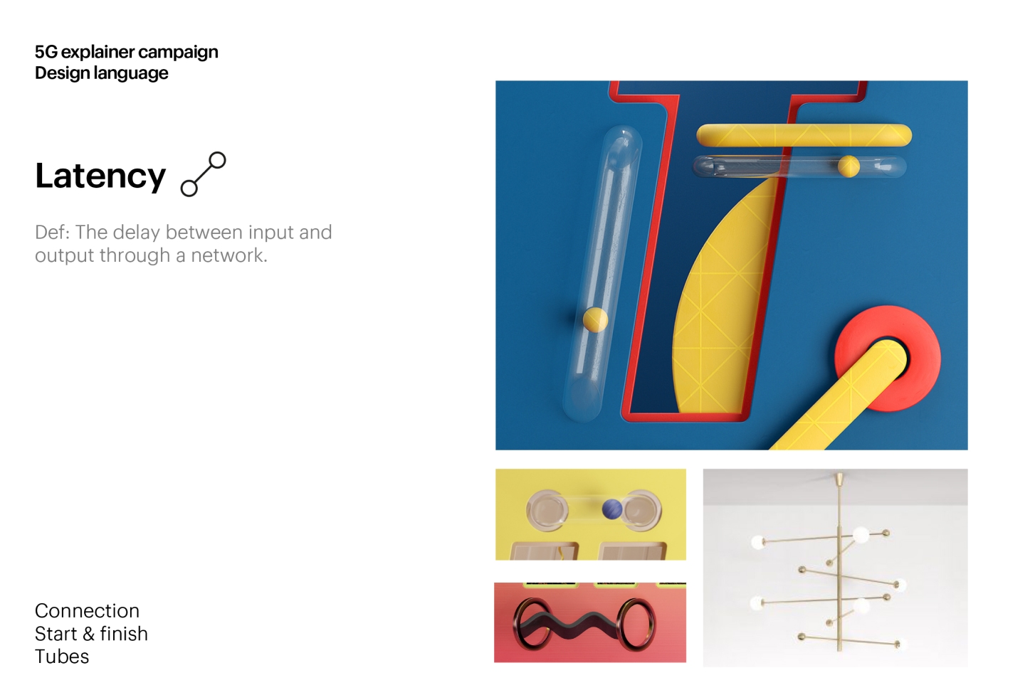
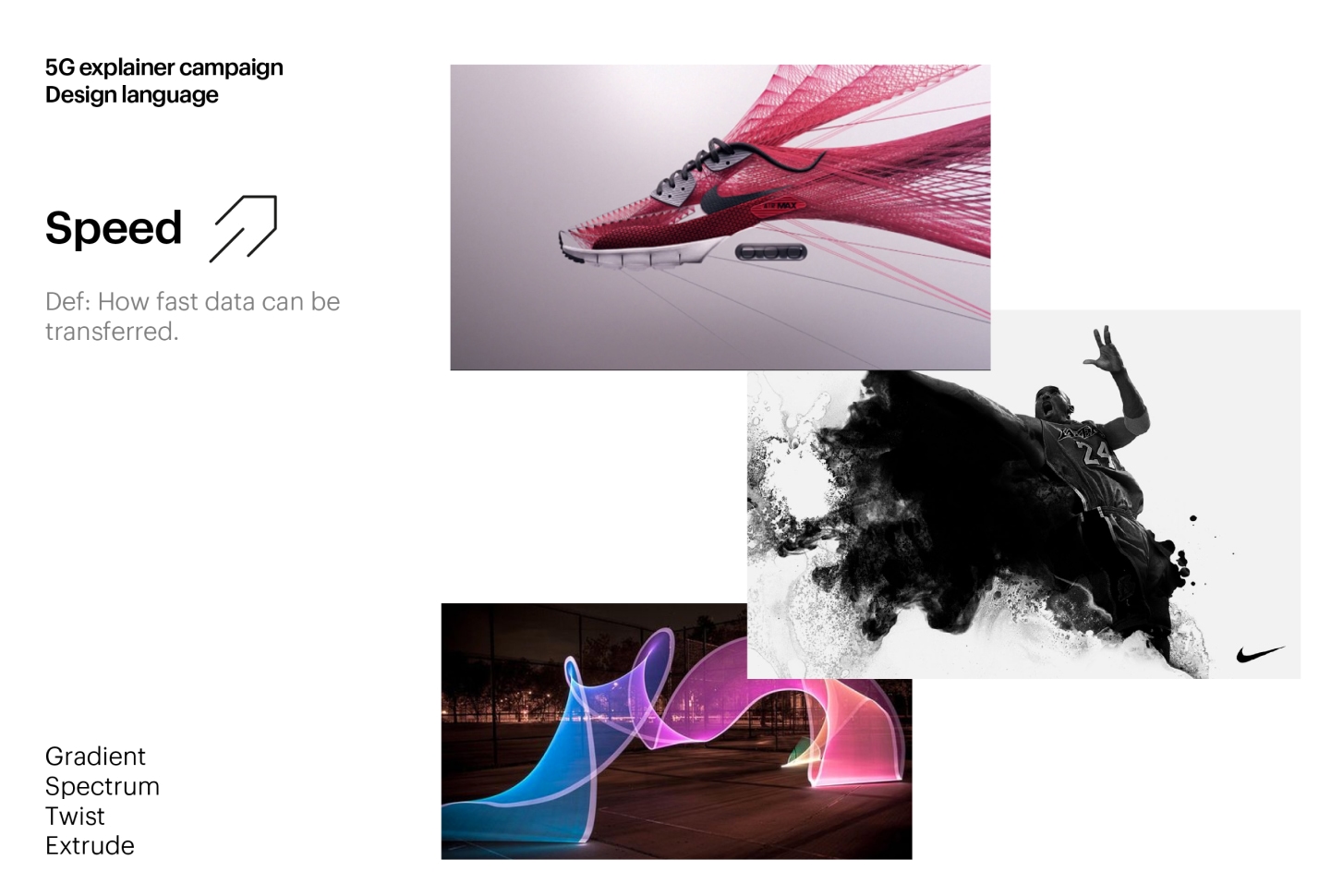
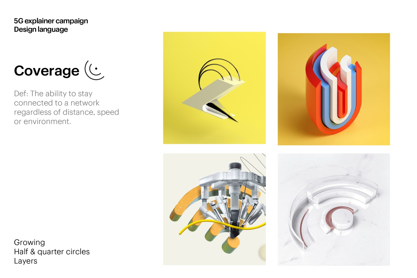
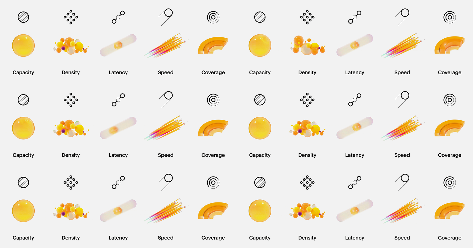
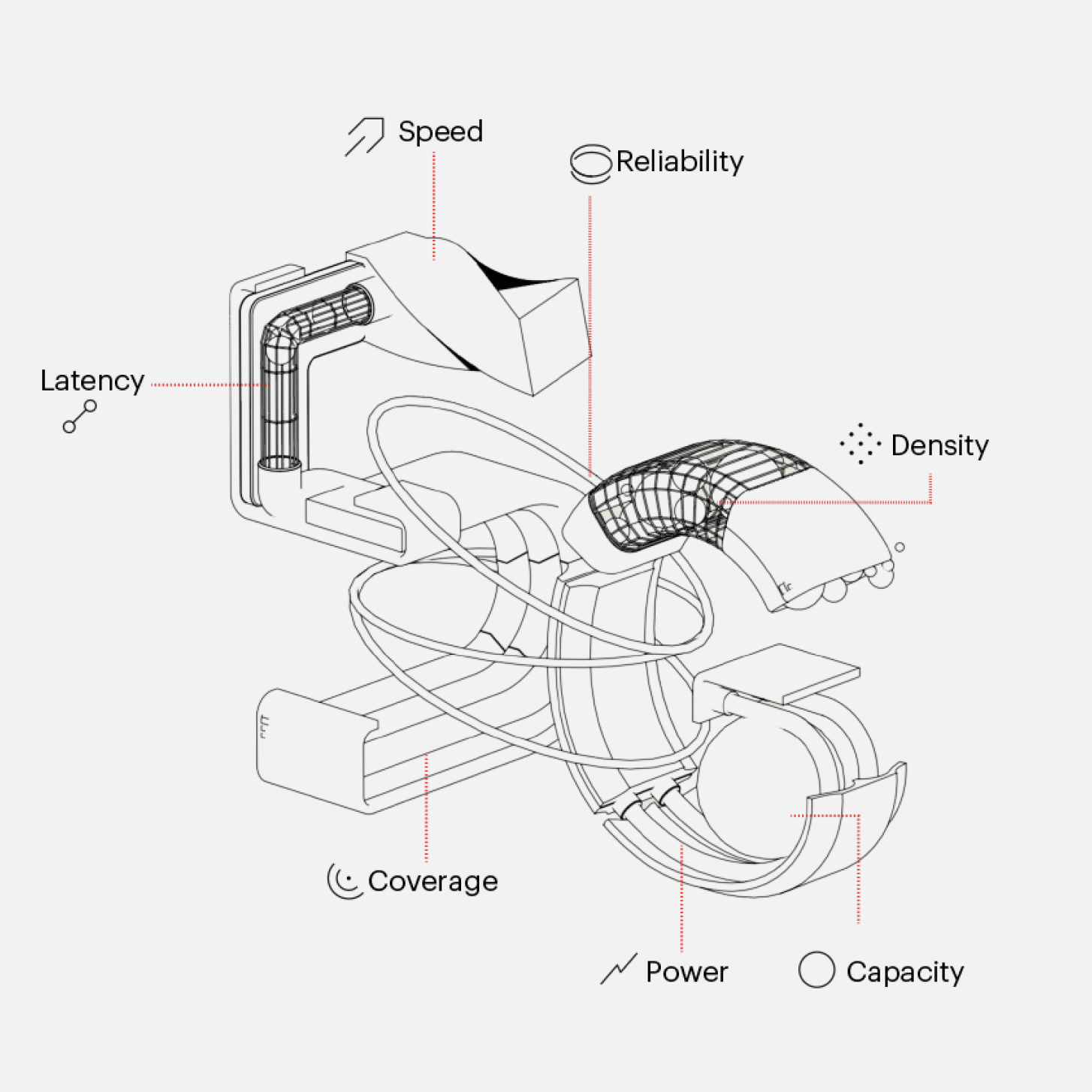
Together with the copy team, we defined the five main capabilities that differentiate 5G from previous technologies — and created visual representation for each of these capabilities.
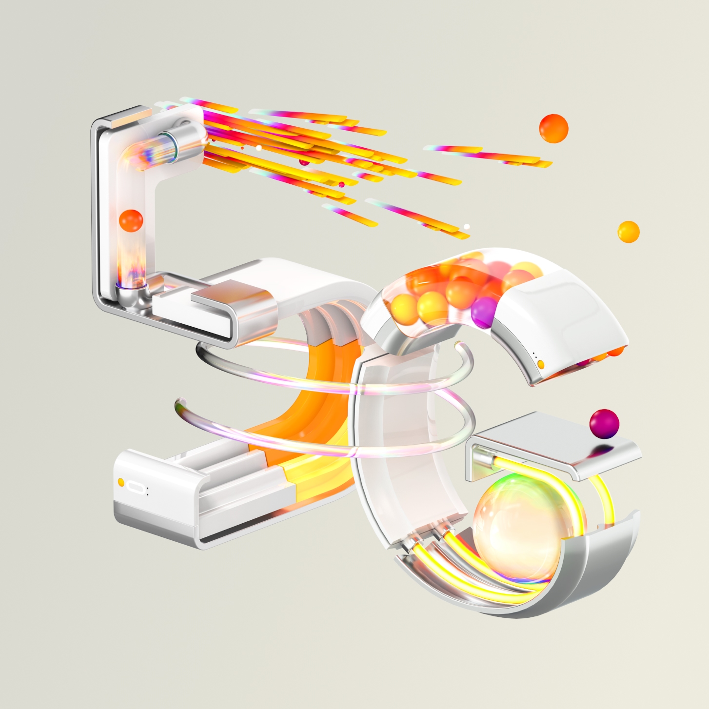
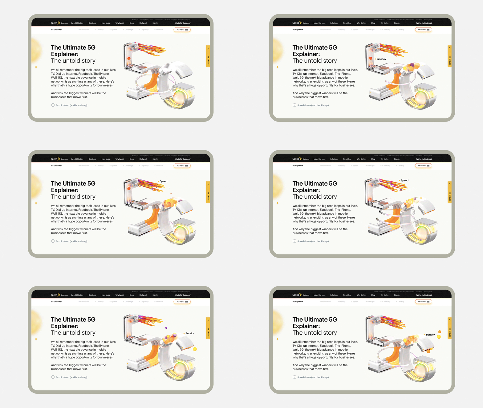
We then combined those five elements and created our final 5G hero mark.
Visual direction.
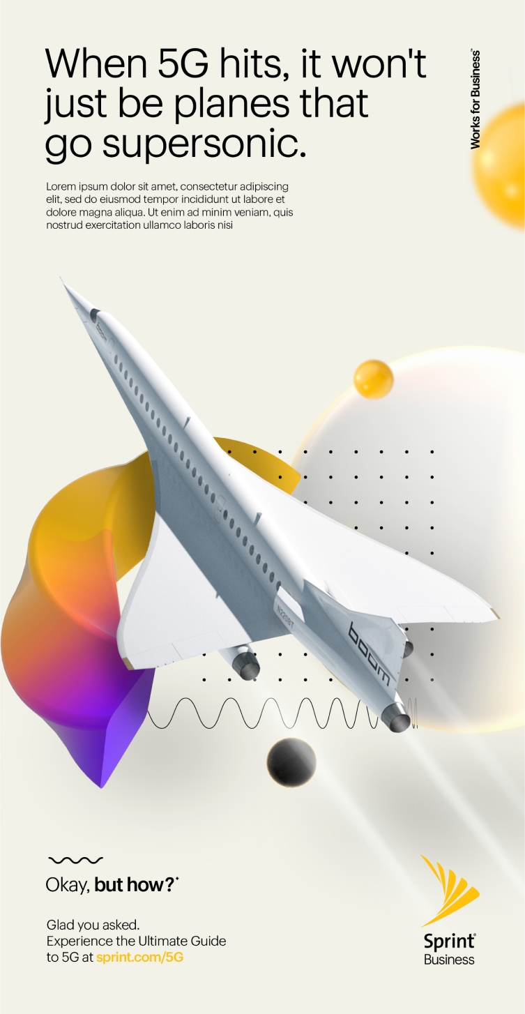
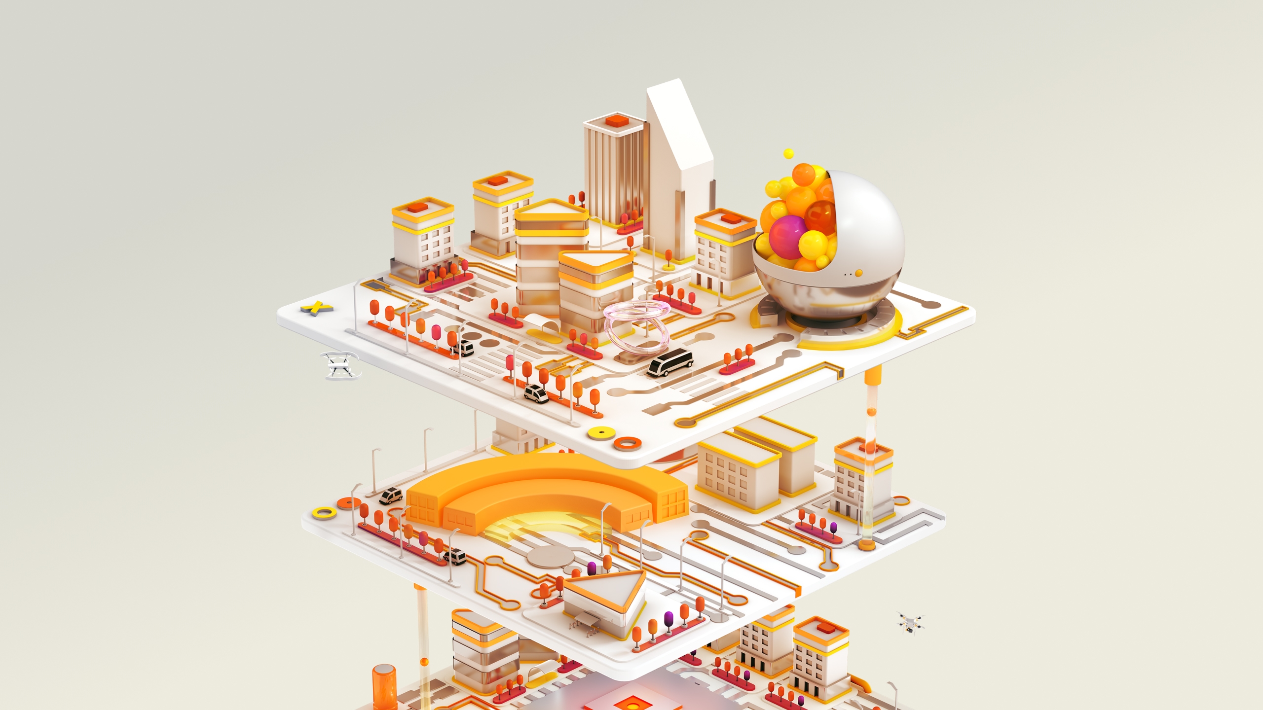
The specific use of CGI would help us create a distinctive style across the campaign, a language owned by Sprint Business that looked like no other operator.
Style
Expanding the brand.
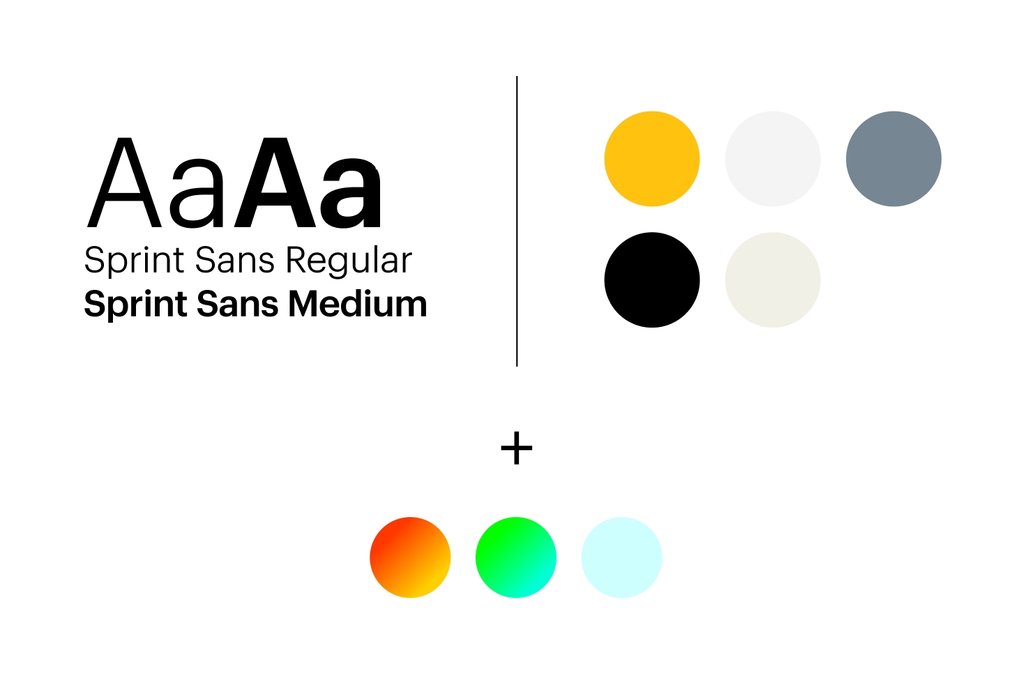
To enhance the disruptive nature of our campaign, we added a few energetic accent colours and gradients to our existing brand elements.
Flexibility
Providing scale and consistency.
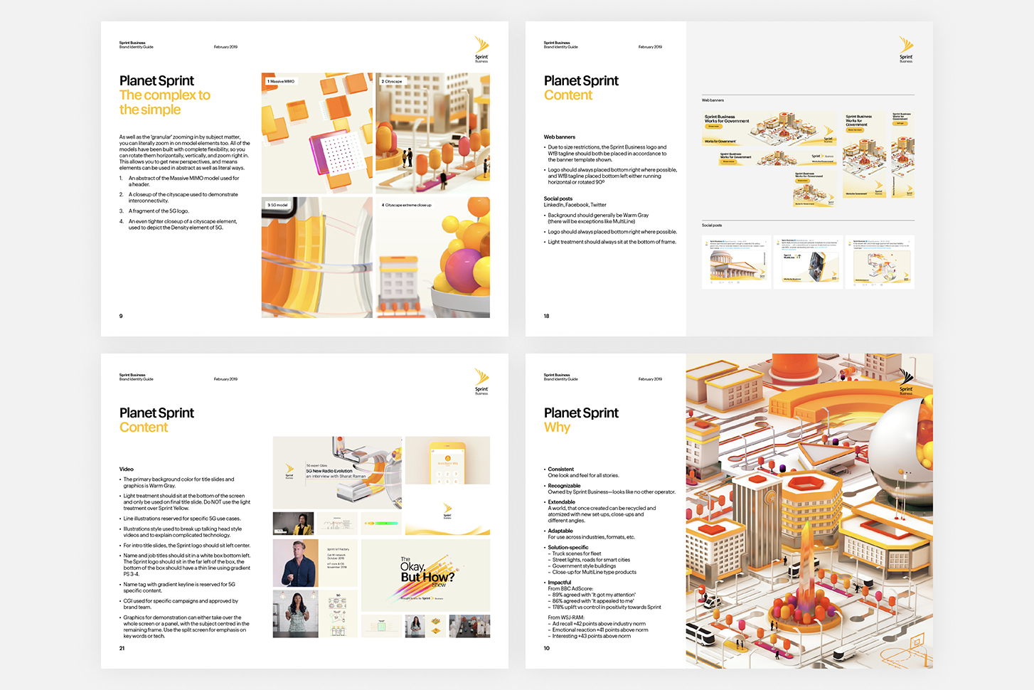
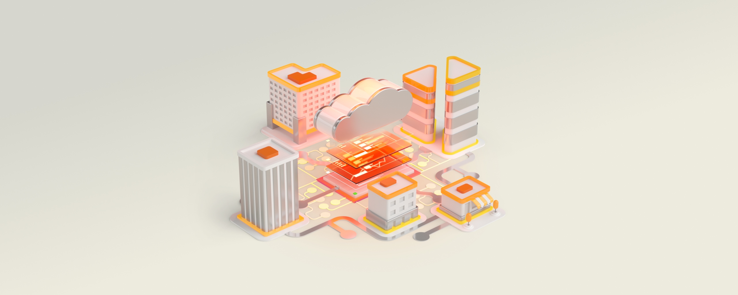
We created ‘Planet Sprint’, an entire world built in CGI which lets us zoom in for a more granular look at individual elements, or zoom out to show wider impact.
‘Planet Sprint’ ensures a consistent and recognisable look and feel across all assets, but it also provides the ability to choose between many set-ups, close-ups, and angles — the groundwork for all future visuals is done.
Illustration
Explaining the tech.
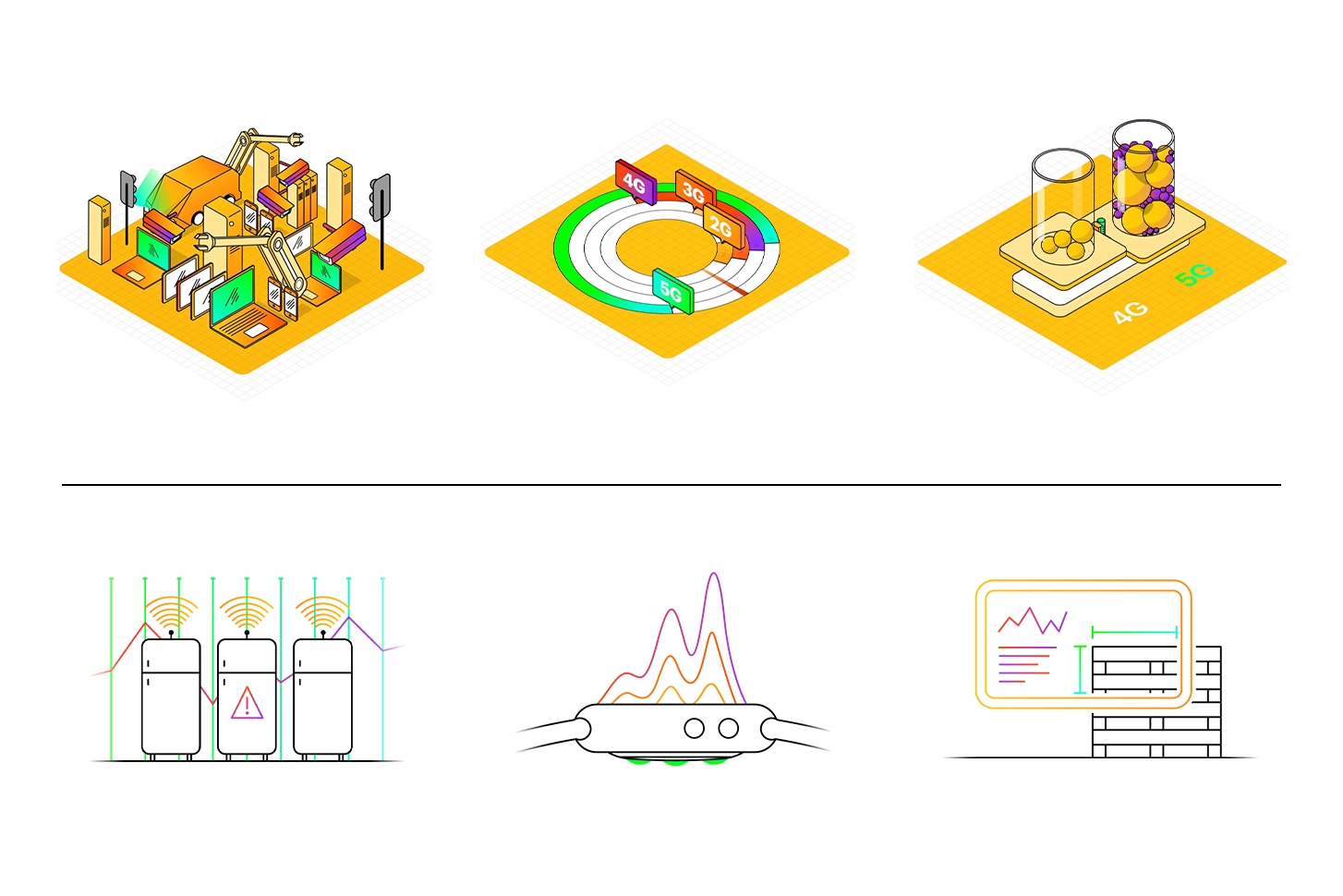
The CGI graphics cover our master hero assets, but we needed a more simplified illustration style to visualise complex concepts and technologies on our website and videos.
We created a set of isometric illustrations for our demos and use cases and a flat, schematic one for our complex deep dive explainers.
Explainer hub.
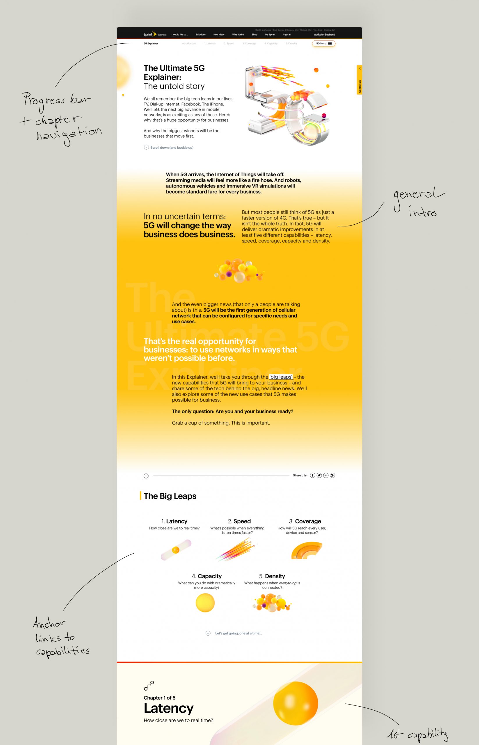
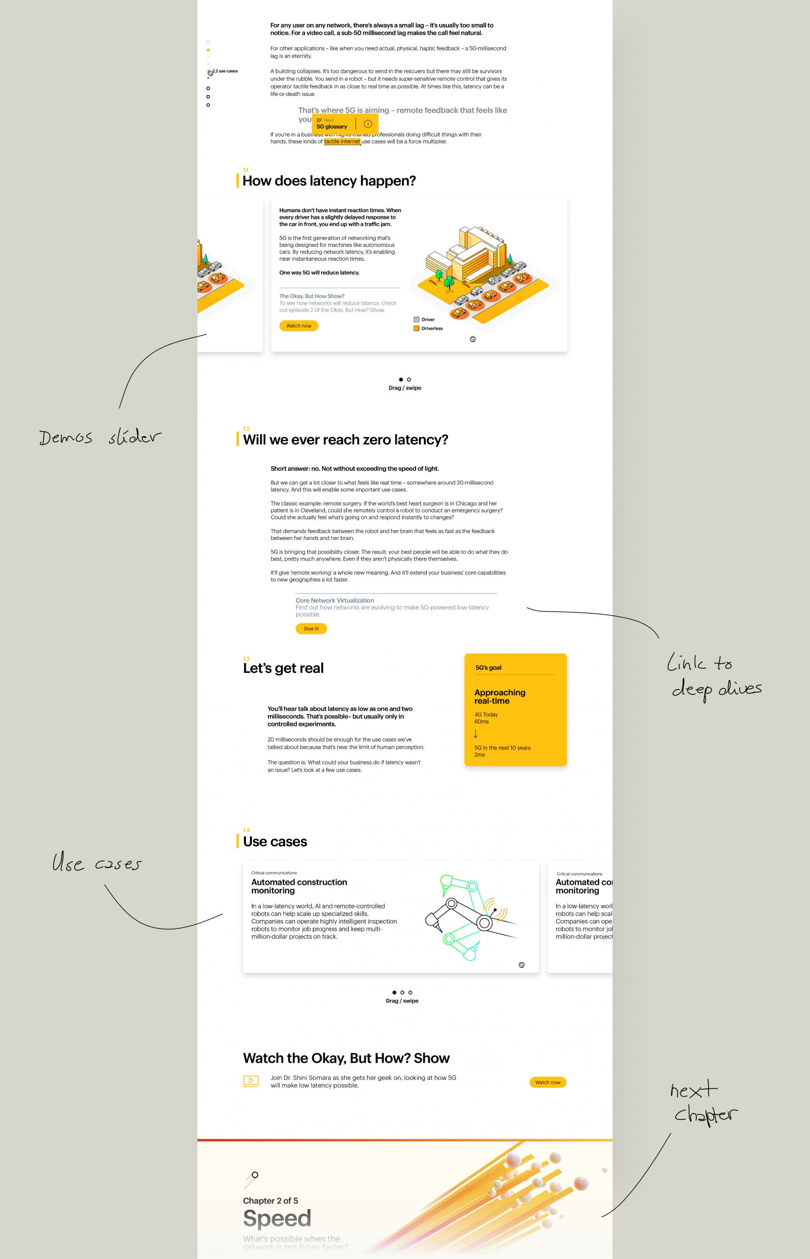
The Ultimate 5G Explainer is the heart of our campaign. It’s a dynamic, scrolling experience that explains 5G in five chapters — and drives the user to deeper content, like glossaries, use cases, and our ‘Okay, But How?’ show.
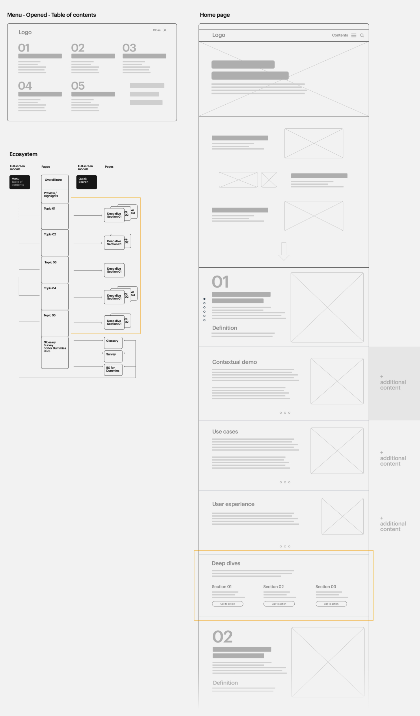
Wireframes
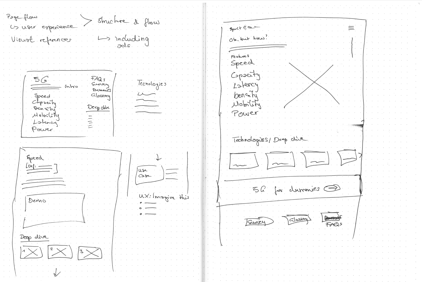
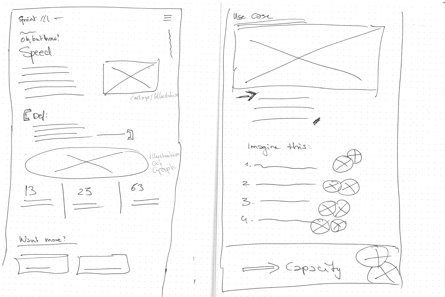
A linear journey.
It was important to create a seamless linear digital experience, providing an extensive amount of information, all combined in one hub.
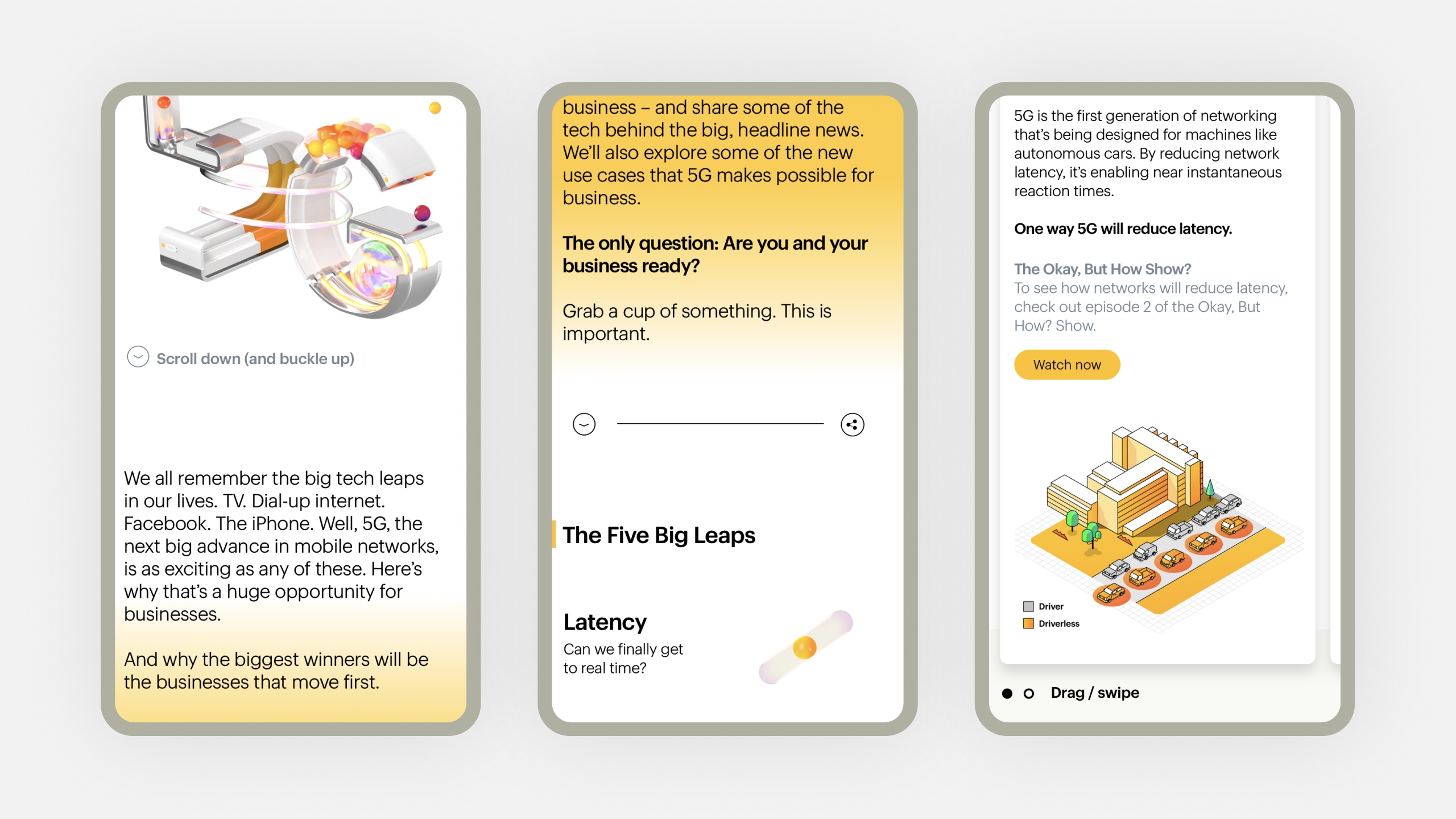
We wanted for the user to consume as much content as possible in one place without having to leave the page — a sticky navigation, animated demo carousels, and deep dive overlays made this possible.
Layout
Bringing it all together.
The final 5G explainer hub balances colourful animated assets and clean, minimal copy sections — making its content appealing and easy to digest.
See also
