Netcall
A new brand and website for a CX company.
Visual identity, Art direction, Web design, UX/UI

Context
Netcall offers a low-code platform that enables business users and IT to work together more efficiently with the goal to bring businesses closer to their customers — fast and inexpensively.
Challenge
Netcall approached us to redesign their entire brand and current website. They wanted to lose their corporate appearance and gain a more human look and feel which would set them apart from their competition.
Approach
We created a clean brand based on bold colours, strong typography and playful imagery, combined with flexible graphic treatments. These elements facilitated the build of a modular website that would allow the brand to grow.
Client
Netcall
Agency
Velocity Partners, London
Role
Lead designer
(Concept, visual identity, brand guidelines, overseeing and creative direction, website and manifesto design, user testing and digital process)
Team
Sara Chrostowska Degiorgi, Mathilde Evans, Ollie Rone-Clarke, Edu Escanho, Matthew Horsnell, Heidi Jones, Joe Richards, Lyle Kirby, Hannah Asprey, Sean Leahy, Addy Smith, Jennifer Stanbridge, Fay London
Date
May 2019
Results.
313%
conversion rate increase
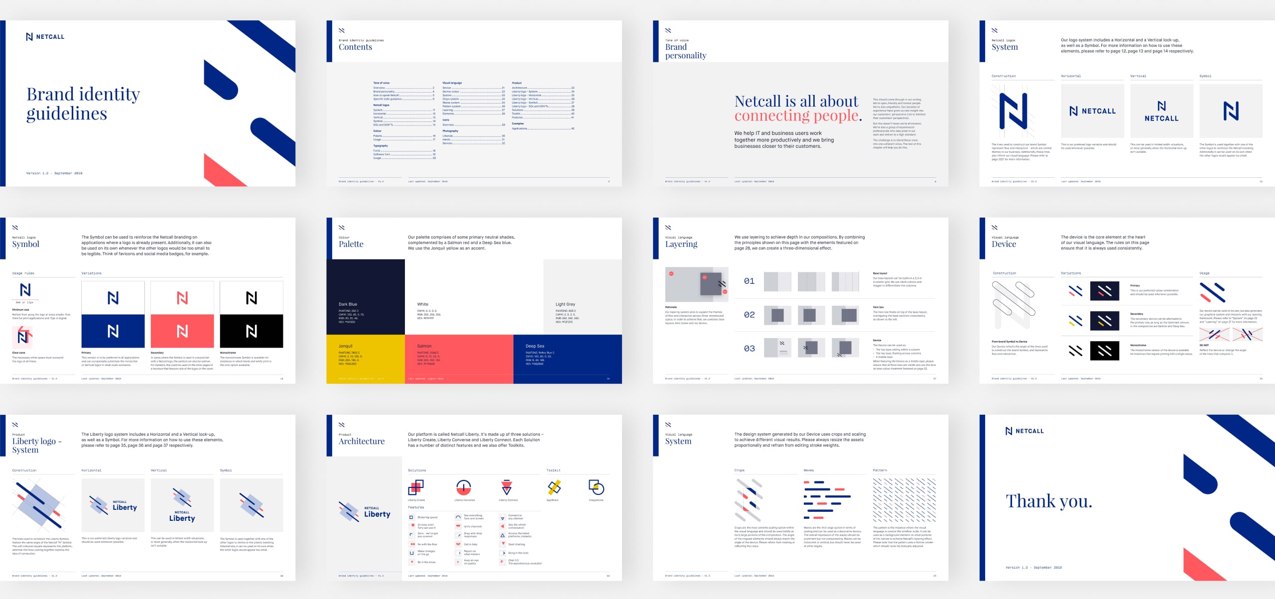
Brand identity.
Netcall’s new brand needed to ake on a completely new approach — honest and approachable that counts on flexibility, experience, and quality.
Brand personality & positioning
Getting to know the client.
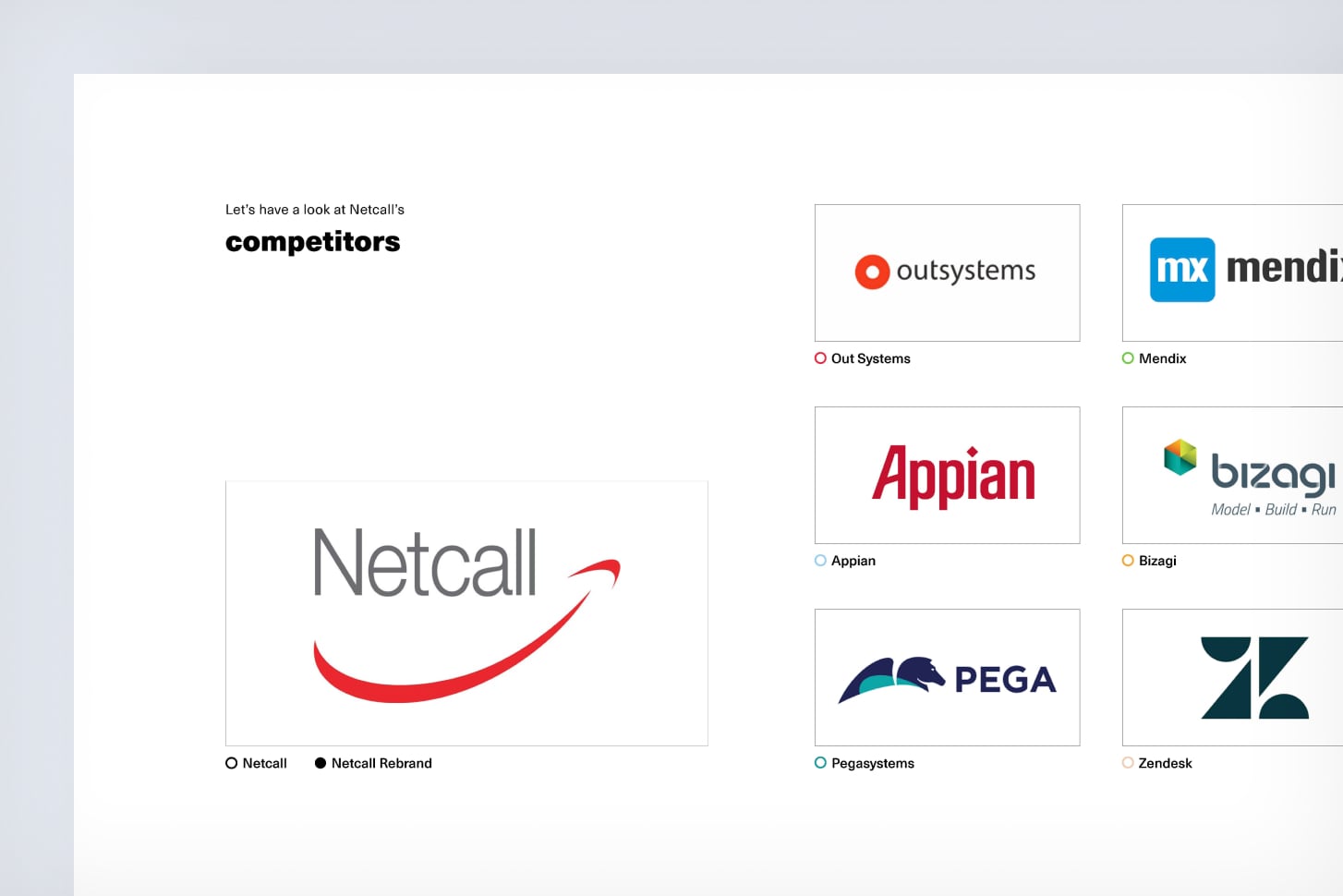
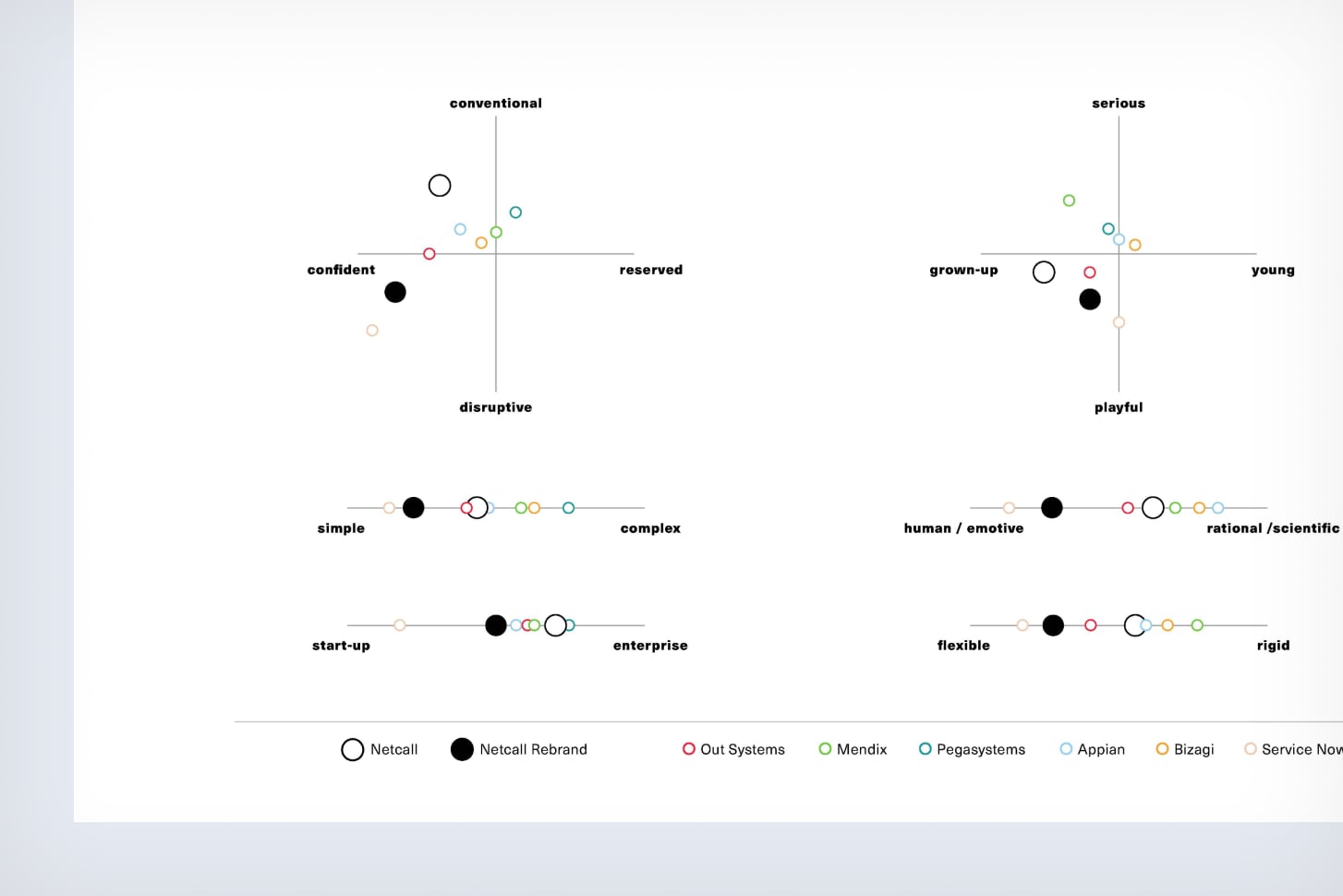
During our branding workshop with Netcall, we collaborated to define the company’s new values and how we would help achieve them.
Netcall needed to be more human and transparent, as well as bringing across their year-long experience and high standards.
Logo
Flow and interaction.
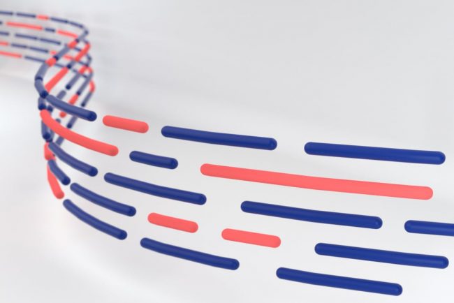
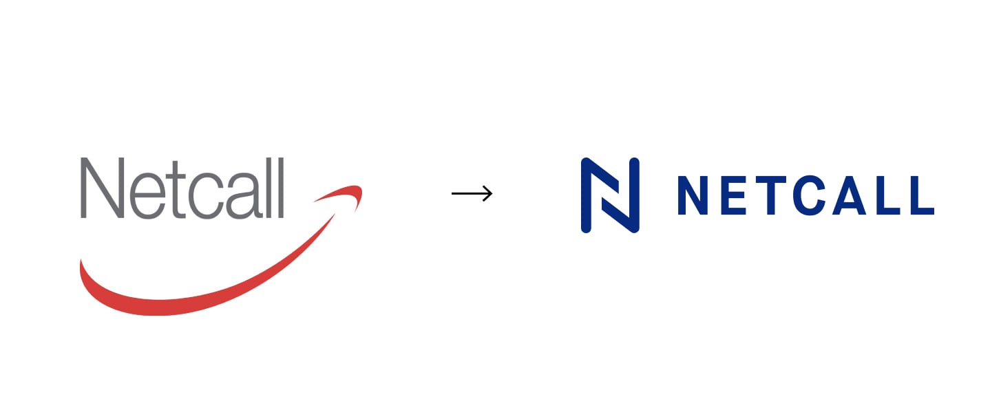
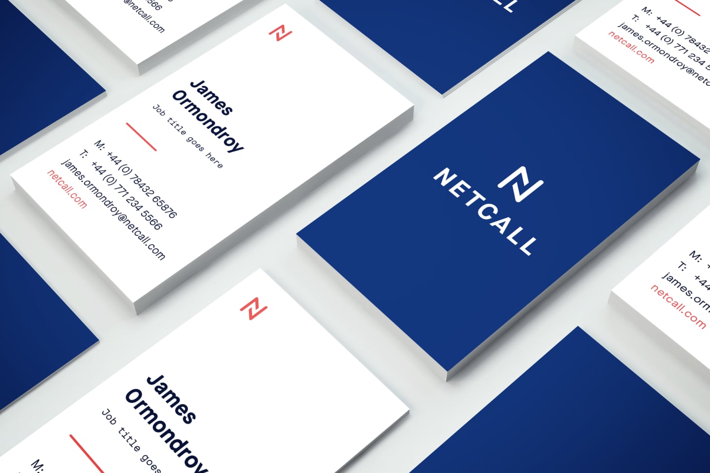
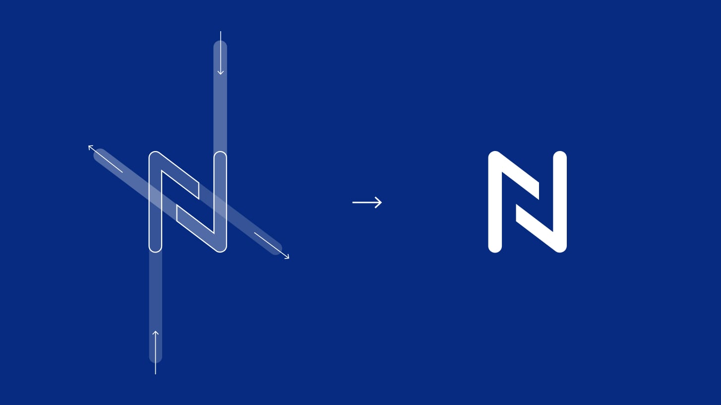
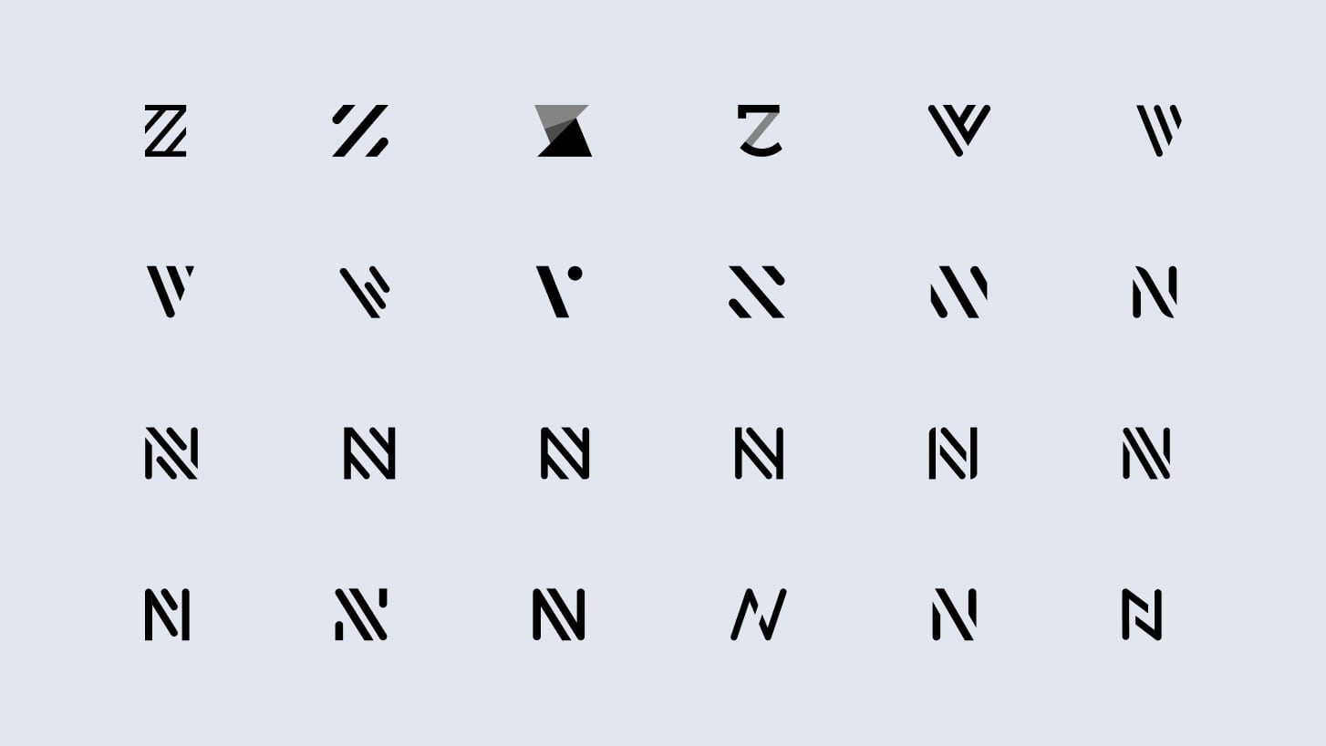
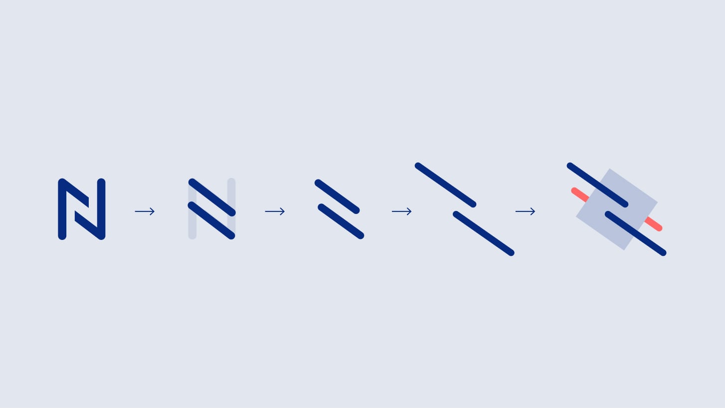
When we designed Netcall’s new logo, we focussed on multiple flows and how they interact with each other. The intersection of these flows constructs the shape of a simple mark, forming the letter “N”.

Design system
An expandable device.
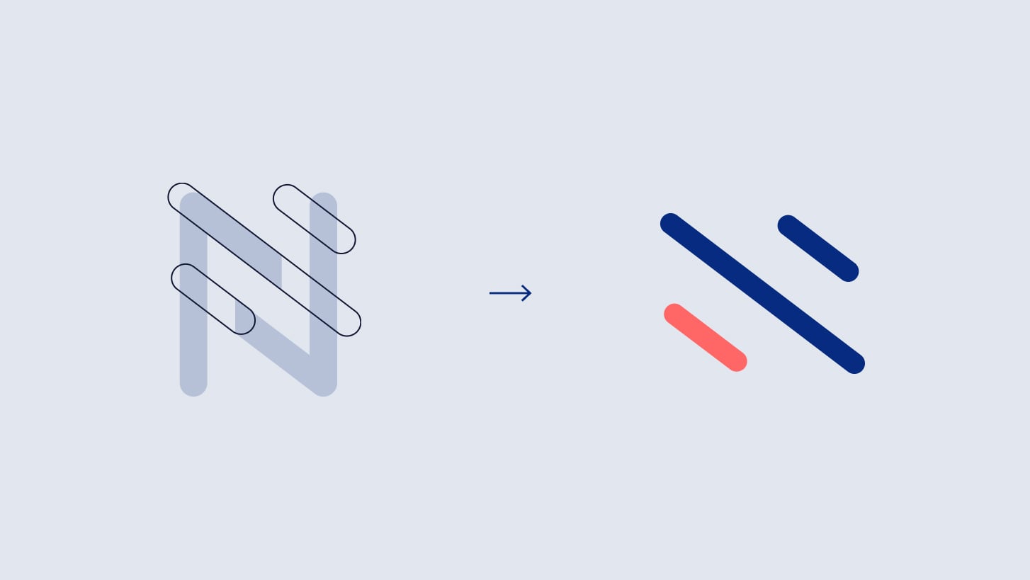
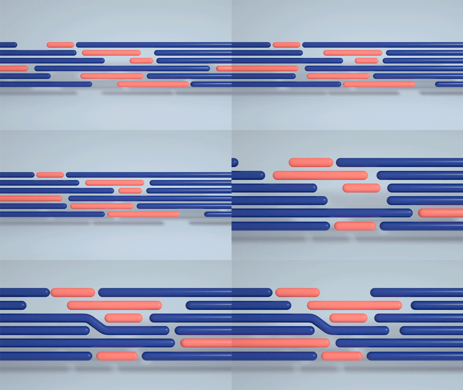
We based our primary visual device on the angle of our logo mark and continue the concept of “flow”.
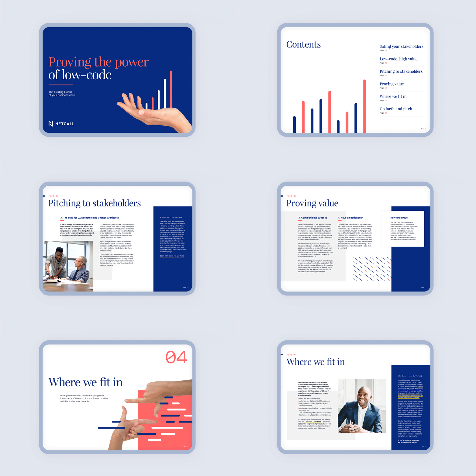
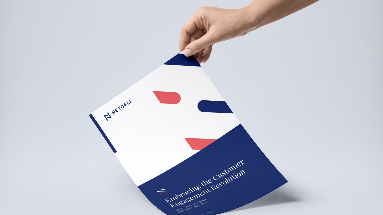
By cropping, rotating and scaling the device, we achieve different visual results — providing both flexibility and consistency.

Brand photography
Authentic, human, and playful.
Netcall is all about people and how they work together. That’s why we proposed to portray individuals and groups in authentic environments.
The need for something more playful, that would allow us to illustrate abstract concepts without losing the human element, drove us to direct a photoshoot featuring hand gestures on colourful backgrounds.


Product architecture
Branding the product suite.
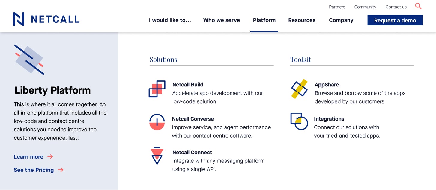
We also created a sub-brand for Netcall’s platform and solutions.
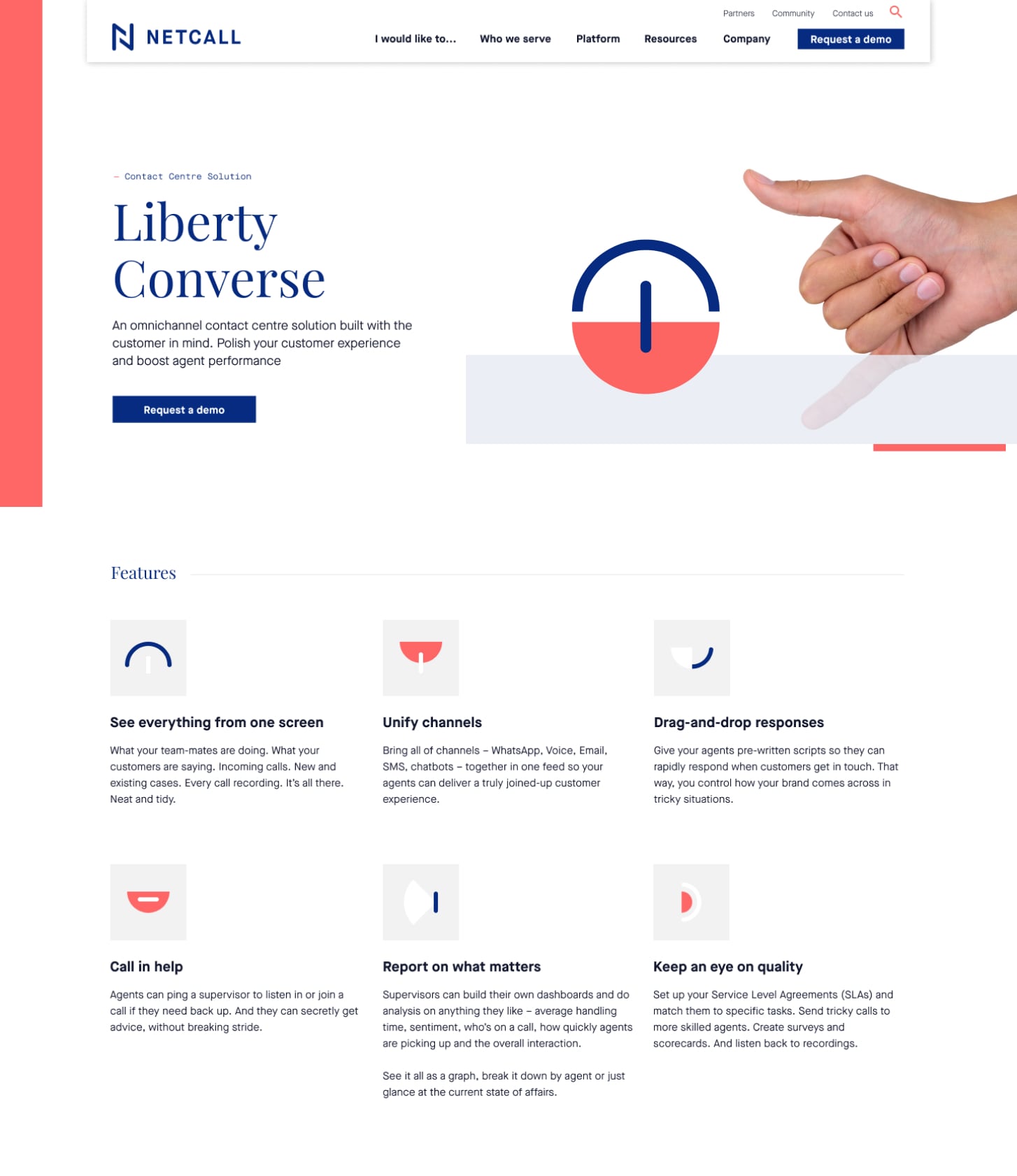
These solutions are represented by abstract symbols — we can take apart each of these symbols and rearrange them to visualise the respective features.


Website.
A thoroughly structured site with a clean and inviting look to provide a satisfying user journey.
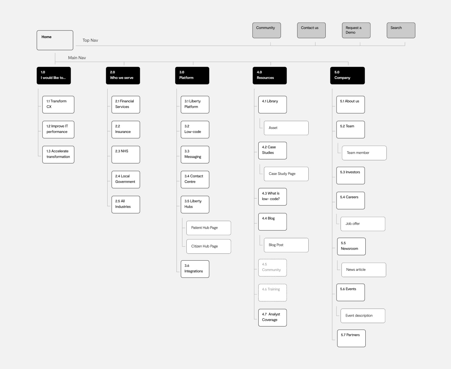
Sitemap
Keeping it simple.
We needed to cover a lot of information on the new Netcall website — our challenge was to keep the user journeys short and provide an intuitive and logical navigation.
Wireframes
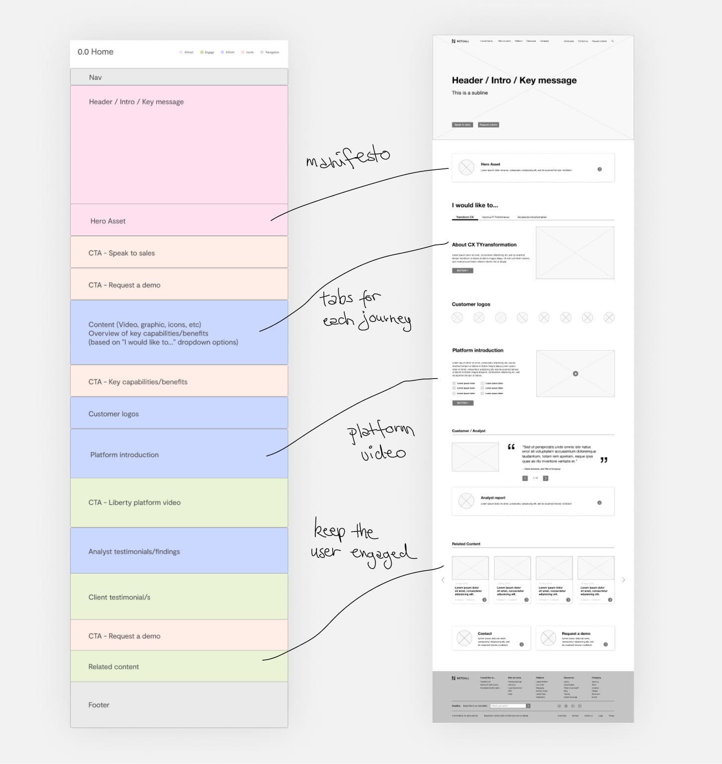
Defining structure and content.
Before starting with the wireframes, I would spend some time with the copywriter to go through the user journeys and get a sense of rough page contents and hierarchy.
We set up the pages for two purposes:
The busy one: Make it easy to reach the product offerings immediately and get in touch.
The explorer: Allowing to browse Netcall’s content and learn about CX.
Atomic design
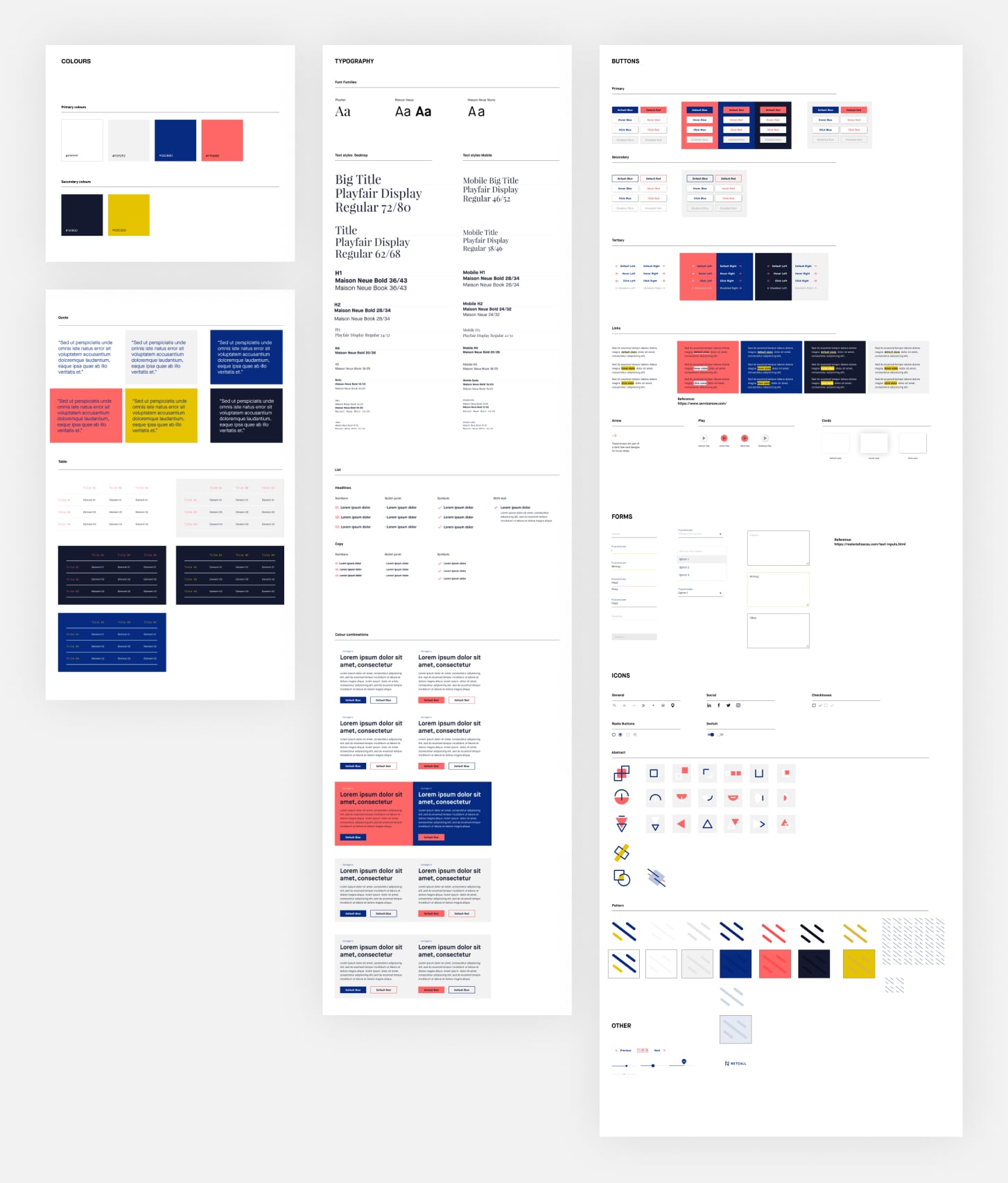
Building a website with a modular approach.
We created a framework with multiple content modules and UI elements for Netcall’s in-house team to evolve and scale the site.
Consistency was key here — that’s why we opted for the atomic approach. We wanted to keep things flexible, but keep control of the core look and feel.
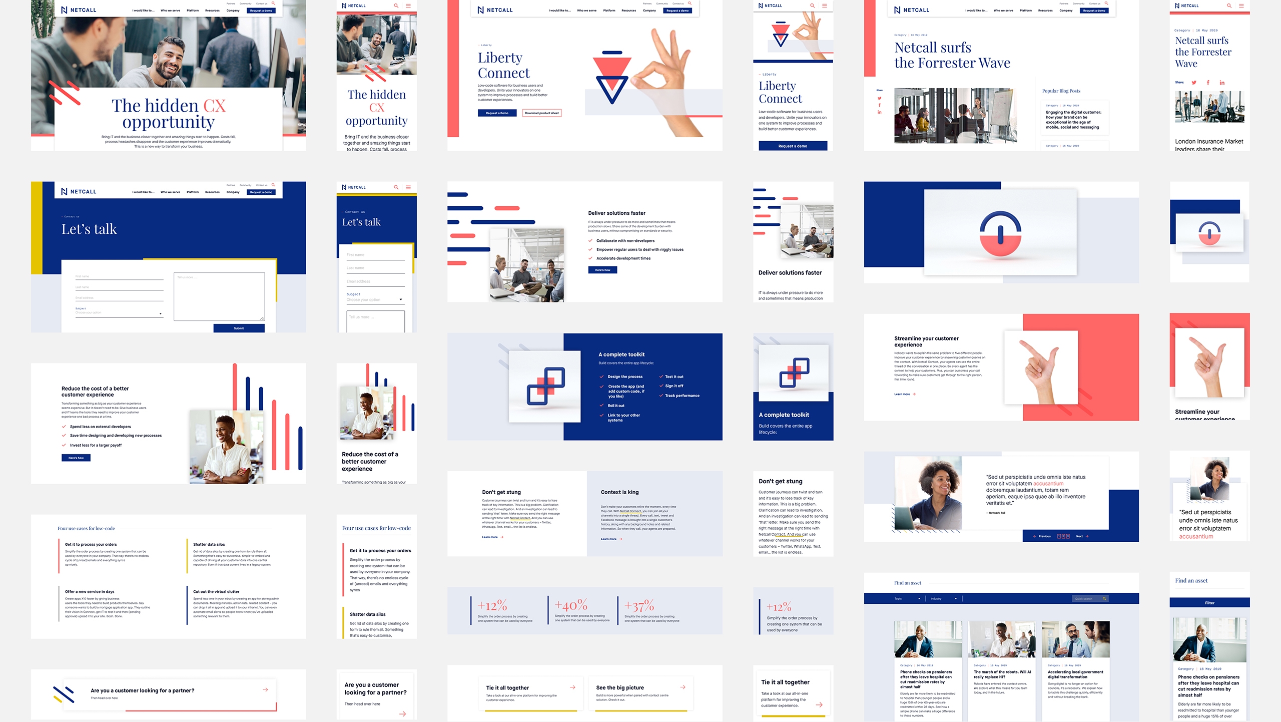
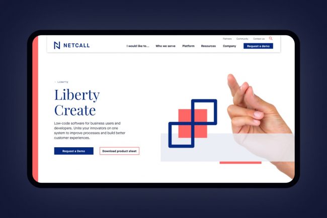
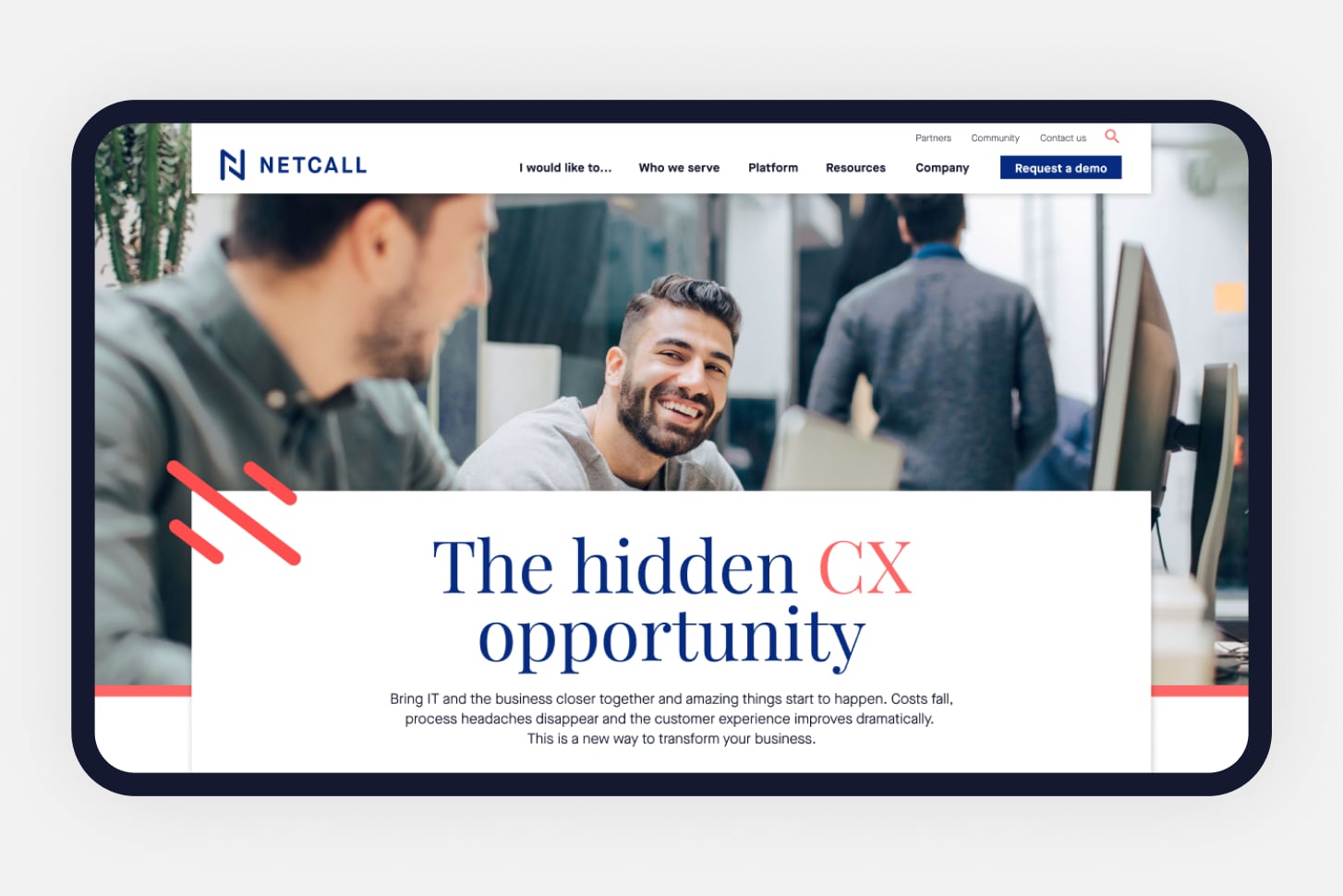
The new website
Clean and easy to read.
The final site layout is all about balance and visual rhythm.
One of the major challenges was to define a hierarchy system based on typography and colour, that would work across all pages — keeping style variations to a minimum.
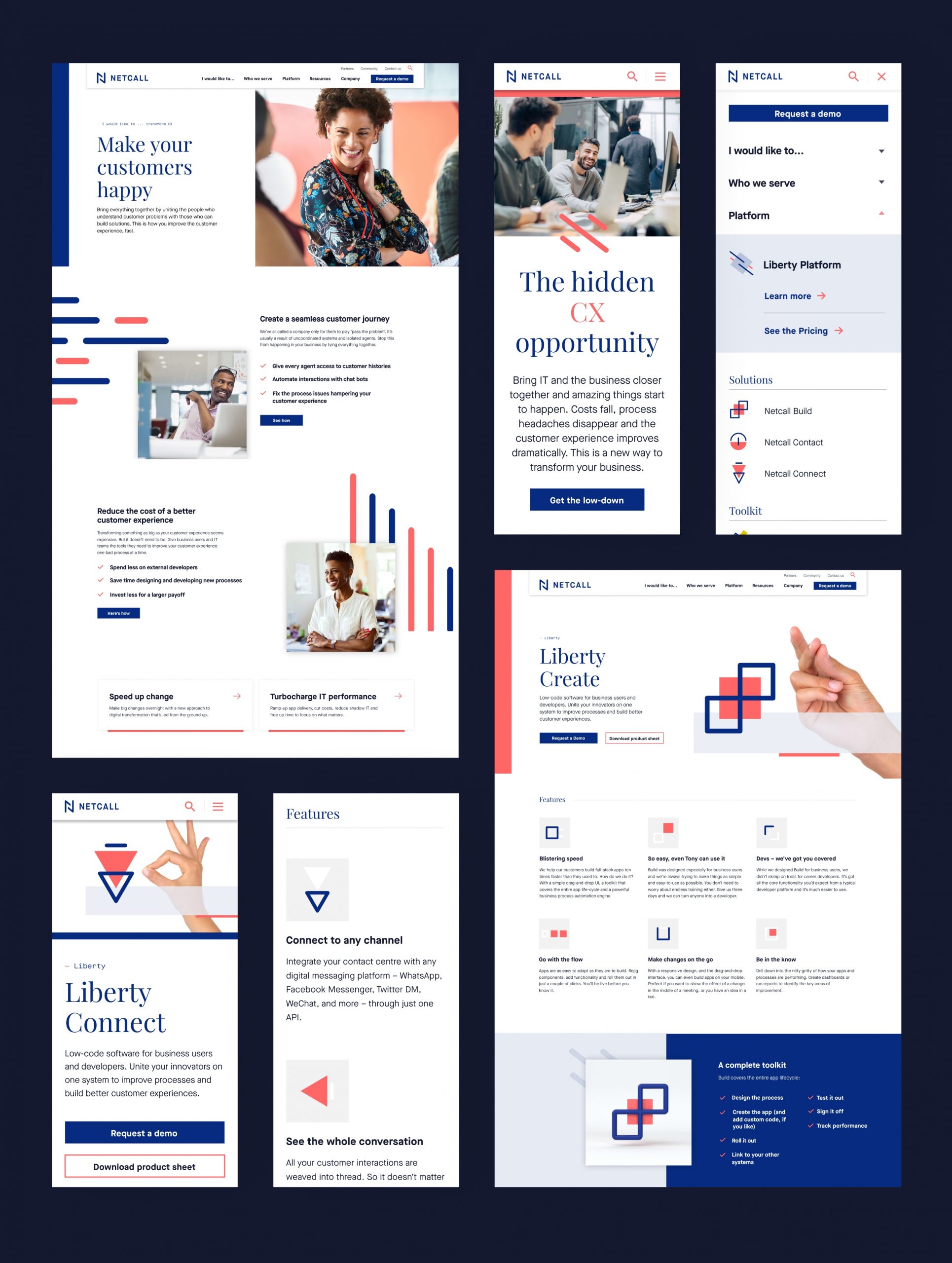
“Love it! It feels right and easier to see what the products do.”
— Netcall
Manifesto
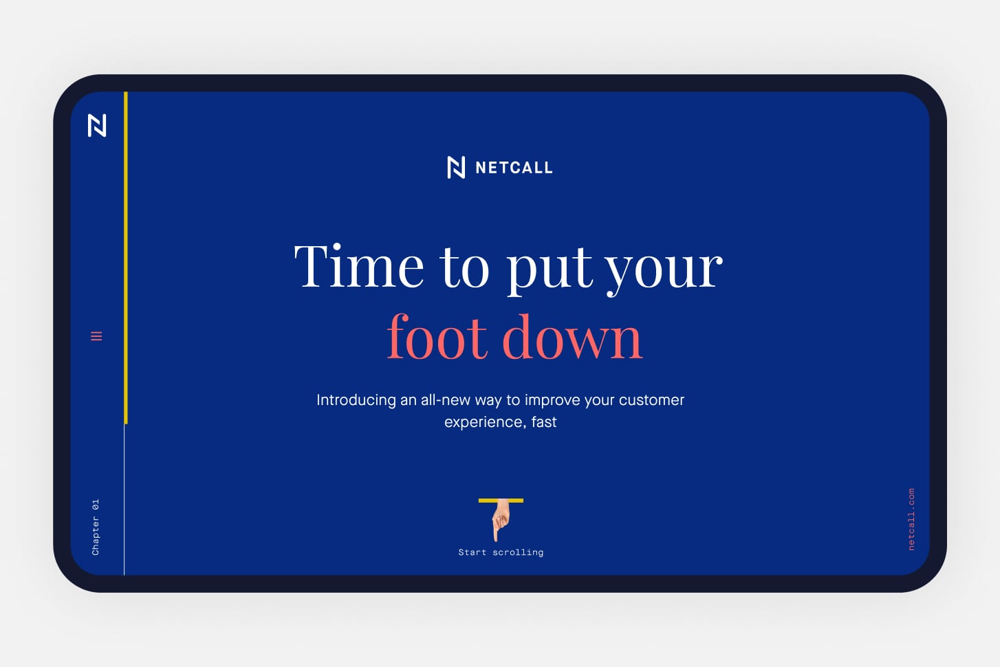
A scrolling experience.
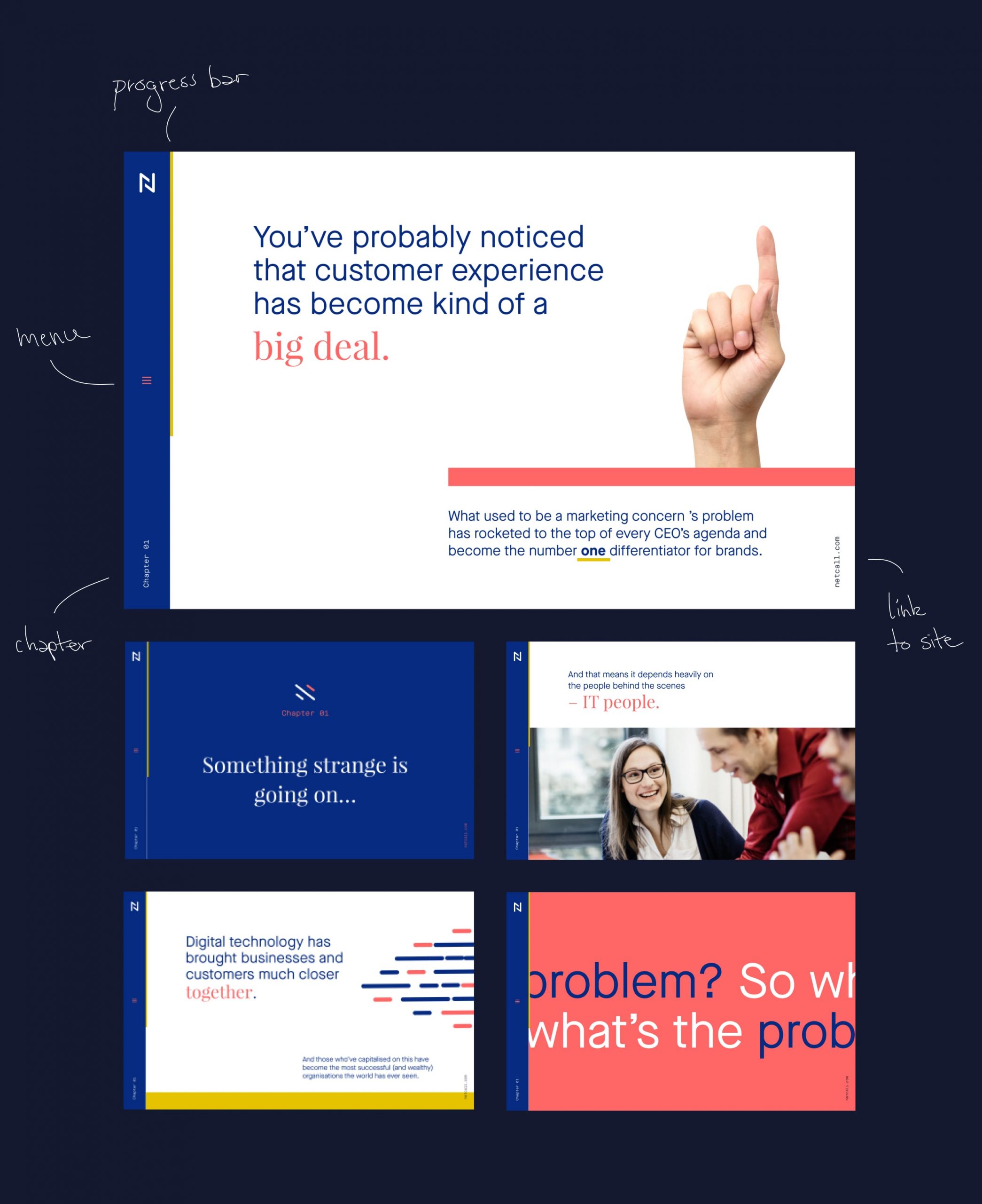
Netcall needed a dedicated manifesto page to highlight their innovative approach and core values.
We created a scroller that balances big typography, images, and animations to convert the written content into an engaging experience. We wanted to hide the main page navigation so the user could focus on the content with no distraction.

See also
